
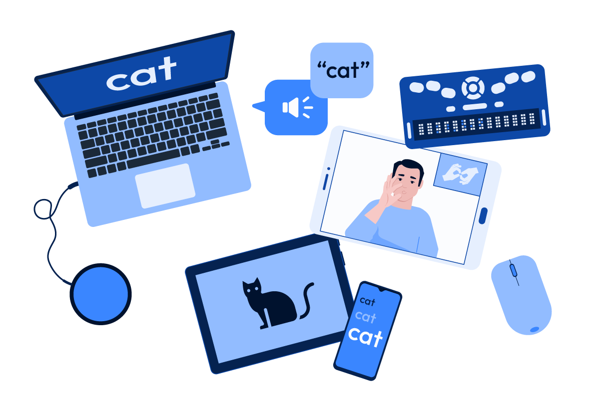
True accessibility isn’t just about meeting legal requirements—it’s about real people. It’s about ensuring that anyone, regardless of who they are, can interact with your website with dignity. It’s about respecting the civil right of equal access to information and services. True accessibility means individuals with disabilities can navigate, interact with, and benefit from digital spaces just as easily as anyone else. While WCAG compliance is a good starting point, it’s not the final goal.
The problem with a checklist mentality
WCAG guidelines are a crucial foundation for digital accessibility, but they just don’t capture everything. Think of WCAG as a baseline rather than a finish line. Meeting compliance requirements can ensure that your site meets a minimum level of accessibility, but true inclusivity requires going beyond those standards.
If we know one approach is more accessible, why do we need a rule to justify doing it?
You can follow WCAG to the letter and still not build an experience that is truly accessible to users, because accessibility is about more than technical compliance. Many organizations stop at compliance because they see accessibility as a legal safeguard rather than a user experience priority.
This mindset showed up recently in a conversation I had with someone asking about accessibility in a form. They wanted to use a heading instead of a fieldset and legend. I explained that while the two options might look visually similar, a legend is specifically designed to group related form fields and is announced correctly by screen readers, providing a significantly better experience for people who rely on assistive technology.
Their response? “Ok, thanks. But is it a WCAG violation?”
That question stopped me. Of course WCAG is important. But accessibility isn’t just about avoiding violations. It’s about creating the best possible experience for everyone.
If we know one approach is more accessible, why do we need a rule to justify doing it?
The best accessibility work happens when we go beyond the checklist. Instead of asking, “Is this a WCAG violation?”, we should be asking, “Is this the best experience for all users?”
Where WCAG falls short
Even in areas where WCAG offers guidance, it doesn’t always go far enough. Here are a few examples where simply complying with WCAG success criteria won’t quite get you to true accessibility:
Alternative text for images
WCAG requires that informational images have alternative text, but it doesn’t offer any guidelines on the length or quality of that text. Overly detailed or poorly written descriptions can be more of a hindrance than a help, especially when screen readers can’t pause or rewind that alt text easily.
Icon-only buttons
WCAG allows icon-only buttons as long as they have text alternatives, but if users can’t recognize the icons or are unsure what they do, they miss out on functionality or may have a hard time making sense of a user interface.
Color contrast exemptions
WCAG allows some elements to be exempt from color contrast requirements, such as logos and disabled form elements. Yet, these elements are still difficult to perceive for low vision users if they have insufficient contrast.
Disabled buttons
Speaking of disabled buttons, in addition to being exempt from color contrast requirements, they often can’t receive focus and are therefore invisible to screen reader users. Keyboard-only users might also have a difficult time understanding why they can’t move focus to a disabled button.
Switching color schemes
Alternating light-on-dark and dark-on-light sections of content on a single page is fine by WCAG standards as long as the text has sufficient contrast with whatever background color it happens to appear on. But switching color schemes like this can cause eye fatigue or make the page difficult to parse for users with low vision.
Auto-rotating carousels
WCAG allows carousels that animate on their own as long as they can be paused or stopped, but offers no guidance on the timing of the animations. Screen readers can’t always keep up. Sometimes the screen reader is interrupted in the midst of reading a panel when the carousel advances to the next panel.
What WCAG doesn’t cover at all
Some design and development choices can have a huge impact on users, yet WCAG does not address them at all. For example:
Font size and readability
Believe it or not, there are no WCAG rules about minimum font size or typeface legibility. A site could use a tiny or overly stylized font and still pass.
Content layout and readability
Dense blocks of unstructured text can be overwhelming, especially for users with cognitive disabilities. Structuring content with clear headings, bullet points, and concise paragraphs improves readability, but it’s not a WCAG requirement.
QR codes
Alternative text that reads something like “Scan QR code” gives no context about what users are scanning. There are no WCAG requirements to describe where QR codes will take users.
Chart and data accessibility
A chart might meet technical accessibility requirements, but without audio descriptions, ARIA instructions, or clear guidance on how to explore the data, screen reader users may struggle to understand or navigate it effectively. And while these enhancements can make a chart more usable, WCAG does not currently require them—leaving a gap between what passes and what works well for real users.
Overuse or misuse of ARIA
Just adding ARIA attributes doesn’t make something accessible—especially if the roles or labels are outdated, misleading, or improperly used. Misapplied ARIA can interfere with screen reader behavior, confuse users, or override native HTML semantics in ways that hinder rather than help. It’s important to use ARIA thoughtfully and only when necessary, complementing a solid foundation of semantic HTML.
Inclusive usability testing matters
Inclusive design doesn’t just benefit users with disabilities
Usability testing often focuses on the “general public,” but this can leave out a wide range of user experiences. If no one in the testing group uses a screen reader, relies on keyboard navigation, or has cognitive or motor challenges, the results may not reflect how accessible the site truly is.
People with disabilities are frequently underrepresented in usability studies, despite making up a significant portion of the population. As a result, accessibility barriers may go unnoticed and unaddressed. A site that feels intuitive to someone using a mouse and a screen might be frustrating for someone using assistive technology.
Inclusive design doesn’t just benefit users with disabilities. Accessibility makes the experience better for everyone. High-contrast text, clear headings, captions, and plain language improve usability across the board.
Truly inclusive usability testing includes participants with a variety of disabilities, ensuring your website works for as many people as possible.
Understanding real-world accessibility
Real accessibility means considering the entire user experience, not just technical compliance. This requires engaging with people with disabilities, gathering feedback, and conducting usability testing that goes beyond automated scans.
What real users experience
People with disabilities have diverse and sometimes conflicting needs. What improves usability for one user may create a barrier for another. That’s why accessibility work must be iterative, inclusive, and rooted in real user testing, not just the technical specs.
- Cognitive load matters. If website is cluttered with too much information or poor layout, it can overwhelm users with cognitive disabilities.
- Assistive technology isn’t perfect. Screen readers, voice recognition software, and other tools are incredibly helpful, but they don’t work well if websites aren’t designed with them in mind.
- Situational disabilities exist. Accessibility benefits everyone, including users in temporary situations, like someone using a phone in bright sunlight or a person with an injured hand navigating one-handed.
Moving beyond compliance to true accessibility
Accessibility isn’t just about passing a test. It’s about making sure real people can use your site.
Accessibility isn’t just about passing a test. It’s about making sure real people can use your site.
If your accessibility efforts stop at WCAG compliance, you might be missing the bigger picture. By prioritizing usability and engaging with real users, you’ll not only meet compliance standards but also create a better, more inclusive digital experience for everyone.
To create genuinely accessible experiences, organizations should:
- Test with real users. Automated tools are helpful, but nothing replaces testing with people who rely on assistive technology.
- Focus on usability, not just compliance. Design with empathy and real-world scenarios in mind.
- Provide continuous training. Accessibility knowledge should be embedded in every part of an organization, not just left to one team or person.
- Make accessibility an ongoing effort. Websites evolve, and accessibility should be a continuous process, not a one-time fix.
AAArdvark can help!
AAArdvark goes beyond automated testing to provide the tools you need to identify, track, and fix accessibility issues that impact real users. Take accessibility beyond compliance.
Try AAArdvark for free today and start making real improvements that matter.
No credit card required.
