

Web accessibility issues are everywhere — not because teams don’t care, but because they’re easy to miss.
According to the WebAIM Million report, 95% of the top one million websites have detectable WCAG (Web Content Accessibility Guidelines) failures. Most don’t come from complex edge cases. They come from everyday decisions: a missing label, low contrast text, or a component that works with a mouse but not a keyboard.
Most of them show up in the same handful of places, which makes them easier to fix once you know what to look for.
Here’s what they look like, why they matter, and how to address them.
According to the WebAIM Million report, 95% of the top one million websites have detectable accessibility failures — and the same six issues account for 96% of all errors found.
What Most Accessibility Problems Have in Common
Most accessibility issues come down to a few recurring causes:
- Missing structure
- Unclear communication
- Interactions that only work one way
These might seem like small details, but they create real barriers. If a form isn’t labeled properly, a screen reader user can’t complete it. If text doesn’t have enough contrast, someone with low vision can’t read the page.
Once you can spot these recurring issues, accessibility becomes much more manageable.
1. Low Contrast Text

Low contrast is the single most common accessibility failure, affecting 79% of websites according to WebAIM.
This includes:
- Light gray text on white backgrounds
- Buttons that blend into the page
- Links that don’t visually stand out from body text
Why it matters: Low contrast affects users with low vision, but also anyone reading on a phone in bright light or dealing with eye strain. WCAG requires a 4.5:1 contrast ratio for normal text. Most design tools can check this automatically, so there’s no reason to guess.
2. Missing Alt Text

Images without alternative text are the second most common web accessibility problem, present on more than half of all websites.
Alt text is what screen readers announce when they encounter an image. Without it, users either hear nothing or get a filename like img_23847.jpg, which tells them nothing useful.
Common gaps:
- Decorative images with no alt attribute at all
- Linked images where the alt text describes the image but not the destination
- Informational charts or infographics with empty alt attributes
Why it matters: Alt text isn’t just for blind users. It shows when images fail to load, helps search engines understand your content, and serves users who have images disabled.
Alt text isn’t just an accessibility requirement — it’s a basic description of what’s on your page. If you can’t explain an image in a sentence, it might not need to be there at all.
3. Missing or Incorrect Form Labels
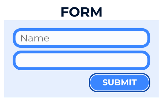
Forms are one of the most common places where accessibility breaks down.
You’ll often see:
- Inputs with no label at all
- Labels that exist in the UI but aren’t programmatically connected to their field
- Placeholder text used as a substitute for a real label
Why it matters: Screen readers rely on labels to explain what each field is for. Without them, users are left guessing, or unable to complete the form at all. Placeholder text disappears the moment someone starts typing, which is too late to be useful as a label.
A checkout form where “Email” vanishes as soon as you click the field is a real example of this. It’s frustrating for everyone, and invisible to automated tools that don’t test interaction states.
4. Keyboard Navigation Issues
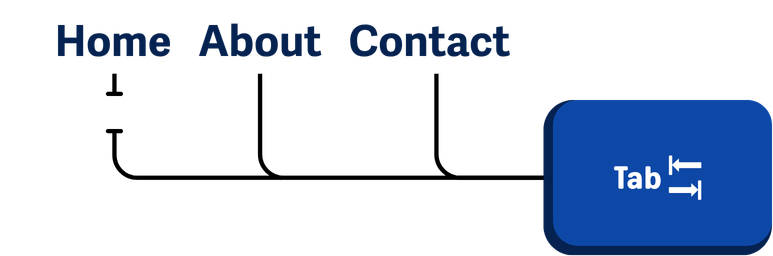
Not everyone uses a mouse. Some users rely entirely on a keyboard — because of motor disabilities, personal preference, or assistive technology like switch access devices.
Where it shows up:
- Interactive elements that can’t be reached using Tab
- Menus or dropdowns that only work on hover
- Tab order that jumps around the page in unexpected ways
Why it matters: If a user can’t reach an element, it doesn’t exist for them. Keyboard accessibility is also the foundation for other assistive technologies. If it breaks for keyboard users, it usually breaks for screen reader users too.
5. Missing or Invisible Focus Indicators
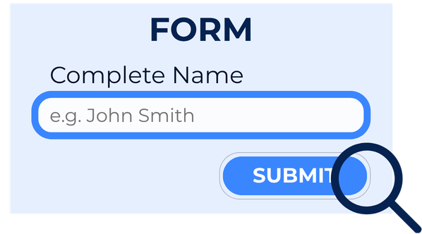
Focus states show keyboard users where they are as they move through a page. Without them, navigating a site is like using a mouse with the cursor hidden.
They’re often removed because designers find them visually intrusive, or accidentally suppressed with outline: none in a CSS reset.
Common issues:
- Focus indicators removed entirely
- Styles so subtle they’re invisible at a glance
- Inconsistent treatment across different interactive elements
Why it matters: Users lose track of where they are — and when that happens on a long page or inside a modal, recovery is difficult. WCAG 2.4.7 requires visible focus for keyboard-operable interfaces.
6. Improper Heading Structure
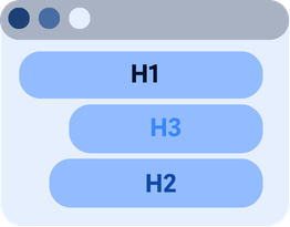
Headings are how screen reader users navigate a page. Many skip from heading to heading to get an overview of the content before reading, the same way a sighted user might skim.
What goes wrong:
- Skipping heading levels (jumping from H1 to H3)
- Using heading tags purely for visual styling
- Pages with no headings at all, or a single H1 followed by unstyled text
Why it matters: Poor heading structure means screen reader users have to read the entire page linearly to find what they need. It also affects SEO. Search engines use headings to understand page structure, and a page with no logical outline is harder to rank.
Why These Problems Keep Happening
If these issues are so common, why haven’t they been fixed?
A few reasons:
- Accessibility isn’t built into everyday development and design workflows
- Teams prioritize visual design and performance, and structure gets deprioritized
- Automated tools flag issues but don’t always explain what to do about them
- Accessibility gets scheduled for later, but by then, the same mistakes are already baked in
The result is that the same six issues account for 96% of all WCAG failures detected across the web. These aren’t obscure requirements — they’re basic, and they keep being missed.
How to Start Fixing These Issues
You don’t need to understand every WCAG criterion to make progress. The goal is to make your site clear, usable, and navigable for real people.
Forms: Use visible labels for every input. Connect them programmatically with for/id attributes or by wrapping the input inside the label element. Write error messages that explain what went wrong, not just “invalid input.”
Color contrast: Check text and background color combinations against the 4.5:1 ratio requirement. Most design tools have a built-in contrast checker. Run it before sign-off, not after.
Alt text: Every meaningful image needs a short description of what it shows. Decorative images should have an empty alt="" attribute so screen readers skip them. Linked images need alt text that describes the destination, not just the image.
Keyboard navigation: Tab through your site without touching the mouse. If you can’t reach something, neither can a keyboard user. Fix elements that trap focus or can only be triggered with hover.
Focus indicators: Don’t suppress the default browser focus style without replacing it with something equally visible. A clear :focus style takes five minutes to write.
Heading structure: Use headings to outline your content, not to style it. One H1, then H2s for major sections, H3s for subsections. Don’t skip levels.
Tools like AAArdvark can catch many of these issues automatically, especially contrast, alt text, and label problems, so you’re not finding them manually on every page.
Start With What’s in Front of You
You don’t need to fix everything today.
Pick one page, one form, or one user flow that matters to your users. Fix the issues there, then take what you learn to the next page.
The most common web accessibility problems exist on most websites, but they’re not permanent. Once a team learns to spot them, they stop showing up in the next build.