

Join Natalie Garza and accessibility expert Natalie MacLees for the 25th episode of the AAArdvark Accessibility Podcast, where they dive into quick wins for making websites more accessible using WCAG’s Easy Checks, designed especially for non-developers.
Natalie Garza: Hello, everybody, and welcome to the AAArdvark Accessibility Podcast. This is episode 25, I’m Natalie Garza, and joining me today is,
Natalie MacLees: Natalie MacLees.
Natalie Garza: And she is an accessibility expert here to answer all of our questions. And in this episode, we’re gonna talk about quick wins for websites in terms of accessibility. So, what do we mean when we say quick wins?
Natalie MacLees: Yeah, so things that you could fix probably in just a few minutes, or things that you could at least test for very quickly and easily without having to have any kind of special equipment or special software packages or anything like that installed.
Natalie Garza: Yeah. And I would even add that quick wins also include, you don’t have to be a developer. You could do this if you’re pretty new to working with websites or new to accessibility.
Natalie MacLees: Yeah, so our list is based on the WCAG Easy Checks, which are specifically designed for non-developers. Don’t have to be technical. You don’t need any special equipment or any special software. Anybody could check these things and most people could fix most of them.
Natalie Garza: Yes, so to get started, let’s kick off the list with page titles.
Natalie MacLees: All right, so the page title is what shows up on your tab of your browser when you have a page open, and otherwise, you don’t really see it much. But it is the first thing announced to a screen reader user when they land on a page. So it is important that the page title be an accurate description of what the page is about.
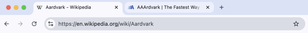
So that if somebody lands there, they can immediately understand what this page is all about? And why would, why am I here?
Natalie Garza: Yeah, and they have to be unique, because if they go between pages and they’re the exact same, it’s super confusing.
Natalie MacLees: That’s a very good point. Yes. You want to be able to tell one page from another, just from the page titles.
Natalie Garza: All right, next on the list, image text alternatives.
Natalie MacLees: Yeah, so this is a huge topic. We could probably do a whole episode just on this, but basically, you wanna make sure that you have alternative texts for all of your images. That gives somebody the reason why the image is on the page, and if there’s any information conveyed by that image, to also convey that information.
So your alt text for the exact same image might be different on different pages, just depending on the context that the image gets used in. And generally, you wanna avoid saying things like photo of or image of, because we already know it’s an image or a photo, and you wanna keep your description short and concise. And so cut out all of that filler stuff.
Natalie Garza: And also, don’t worry, not every image needs alt text, especially if it’s purely, purely decorative.
Natalie MacLees: Yeah, if you just have some pretty curly cues or something like that, it should actually not have alt text. It should have an alt attribute that’s just empty, and then that’s the signal to assistive technology that that image is just decorative. It is not conveying any kind of information, and it doesn’t need to be described.
Natalie Garza: Next on the list, headings.
Natalie MacLees: Yeah, so sometimes people think all headings do is make text big and bold, and by default, it does do that. If you use a heading tag, it does make the text large and bold, but it actually gives meaning to that text, and it actually tells assistive technology, it tells search engines, it tells any other kind of robot that might be scanning your page that this is a heading for the content that follows.
Like this line of text describes the section of content that follows this. And then also the headings are at different levels, right? All the way from H1 to H6, and those should be nested correctly. So, one H1 on the page to describe what the page is about.
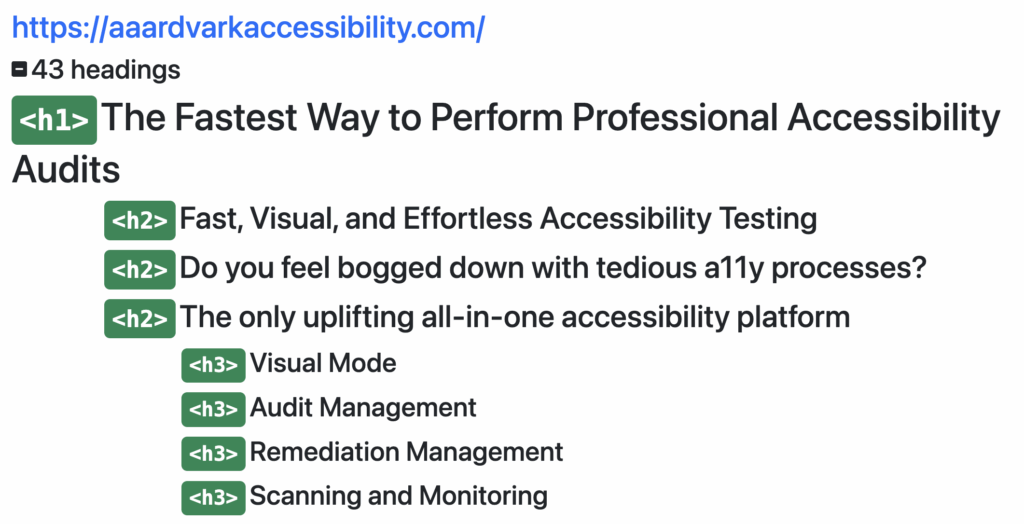
The sections of the page should each have an H2. And if you have subsections inside of those sections, those should be in H3 and so on. They should just be used in order.
Natalie Garza: Yeah. They’re meant to structure the page.
Natalie MacLees: Yeah. If you remember creating an outline for a paper in like sixth grade, how you learn to make an outline, they’re basically the outline of your page.
Natalie Garza: Yeah. So, having useful headings is really important.
Natalie MacLees: Yes, they should be accurate. They should describe the content that they’re heading up.
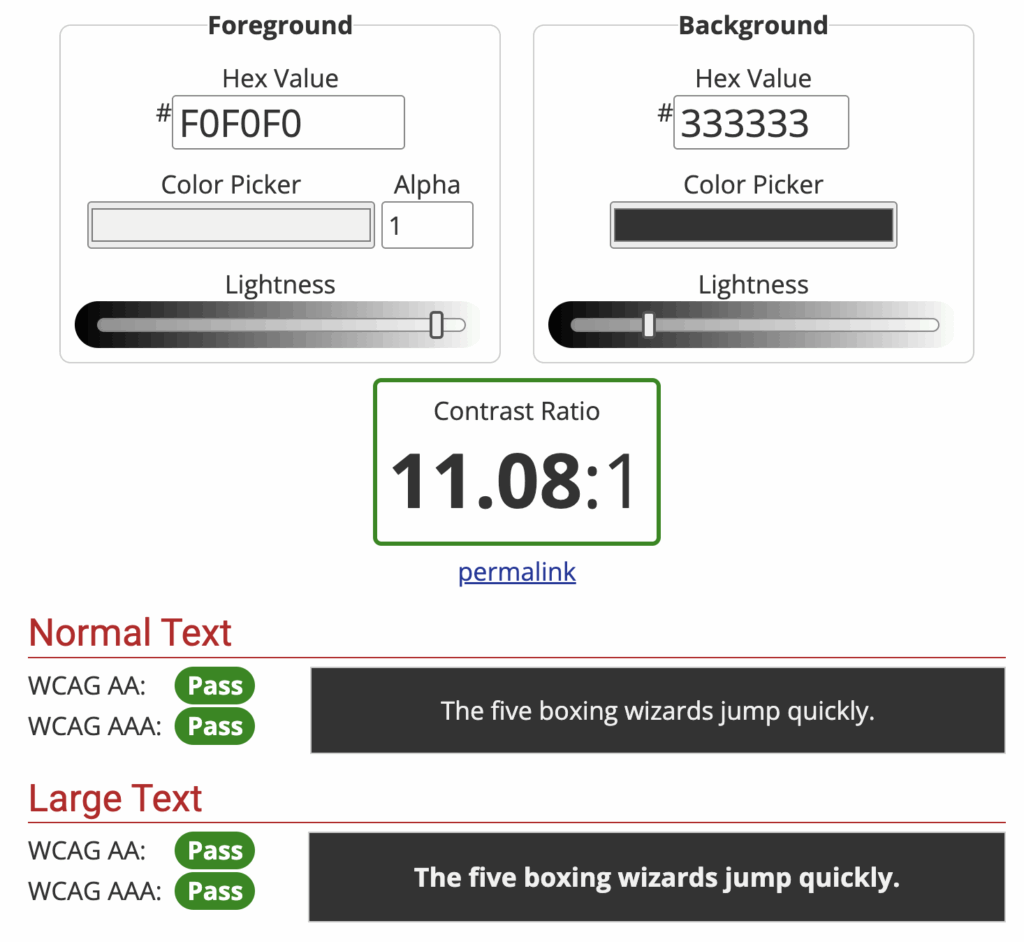
Natalie Garza: All right, next on the list, contrast ratio.
Natalie MacLees: Yeah, so this is just making sure that we don’t have pale gray text with a white or pale gray background with white text on it, or vice versa. There should be lots of contrast between the background and foreground. So that it’s really easy to read and understand the content that’s there. We don’t have to squint at it.
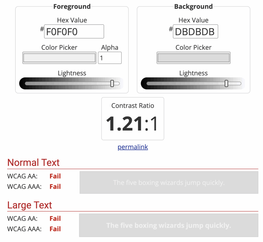
If we’re outside on a bright, sunny day, we can still see it. So just making sure that there’s plenty of contrast, right? We have a white background with dark text or a dark background with white text and things like that.
Lots of contrast between the background and foreground, and be especially careful of that if you’re using images or gradients or something like that in the background. Keeping in mind that on a responsive design, that’s gonna be shifting around on different screen sizes, that that text could be over any part of that image.
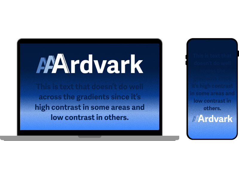
So you have to check all different screen sizes to make sure that there’s enough contrast, whether you’re on a little mobile screen or on a big desktop screen, or anywhere in between.
Natalie Garza: Next is resizing text.
Natalie MacLees: Yeah, so there are lots of users who will zoom in on web content for different reasons. Mostly to make it easier to see, make it bigger, if you forgot your reading glasses that day, you can also, of course, pinch a zoom right on most touchscreen mobile devices. And this is just to make sure that you can go up to 200%, so double the size of your text, and it’s still all going to be readable.
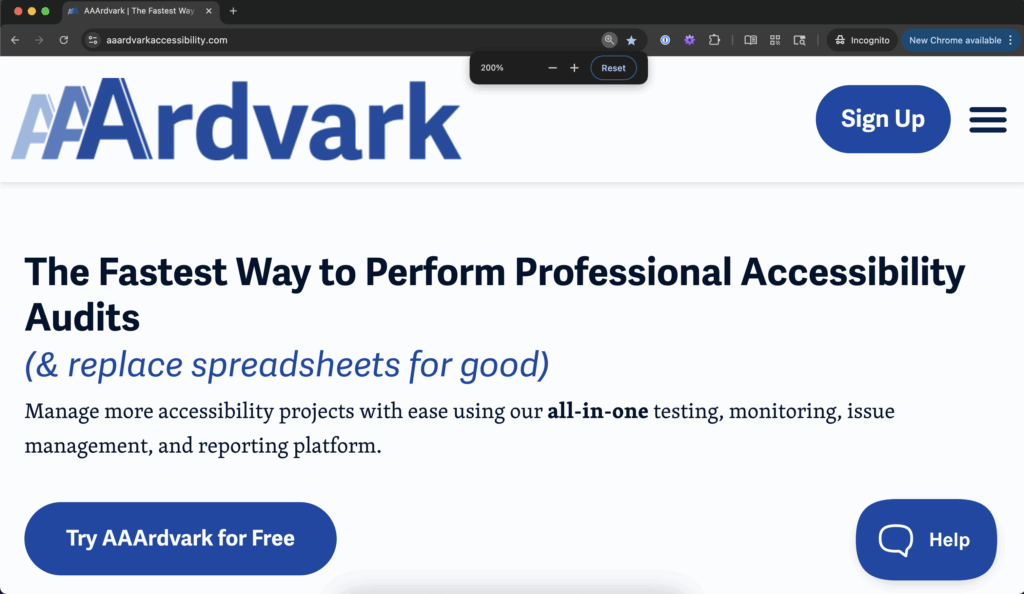
You’re not gonna end up with things overlapping. You’re not gonna end up with things running off the side of the screen where we can’t see them, and other kinds of problems like that. So you do wanna make sure that you can zoom into 200% and you can still see all of the content. You can click all the buttons, click all the links, get to all the content that’s on the page.
Natalie Garza: All right. Next up on the list is keyboard access.
Natalie MacLees: Yeah. So we’ve talked about this, I think just in the last episode, right? We talked about how there are all different kinds of assistive technology that people can use if they can’t use a traditional mouse or keyboard for whatever reason, and that, as far as the computer is concerned, those are all keyboards.
And we also have people who have vision disabilities who can’t use a mouse, right? ’cause they can’t see where the cursor is on the screen. So they’re gonna rely on using a keyboard. So there’s a very large population that relies on the keyboard alone to navigate through websites and to accomplish tasks online.
So you always wanna make sure that every button can be clicked, every link can be clicked. That any kind of interactive element, like going through the slides of a slider or opening and closing an accordion can all be done with just the keyboard and without having to use a mouse.
Natalie Garza: Next on the list are forms, labels, and errors.
Natalie MacLees: Yeah, so don’t be using only placeholders on your forms. You wanna make sure that you have a label that is always visible. The problem with the placeholder is as soon as you type one character in that field, the label disappears.
And if you get interrupted and you have to come back, you forget, “What was the label? What was I filling in?” So we wanna make sure of that, and then of course, make sure that we can fill in those forms with just the keyboard and not have to touch our mouse to fill in a form.
Natalie Garza: Hmm. Yeah, because even the labels are super important for screen readers.
Natalie MacLees: They’re super important for screen readers. They’re super important for people with cognitive disabilities, and they’re super important for anybody who gets distracted in the middle of doing tasks, which I can’t think of anybody who doesn’t happen to.
Natalie Garza: Yeah, and then having enough instructions, and if there’s a mistake, tell people how to fix them.
Natalie MacLees: Yes, I’m sure we’ve all had that experience of, “there was an error on this form.” What was it? How do I fix it? How do I keep going? I’m looking at you, IRS. Alright.
Natalie Garza: Next on the list, moving, flashing, or blinking.
Natalie MacLees: Yeah, so if you have animation or a video that plays automatically or something that flashes, you wanna make sure that there is a way to pause or stop that or hide it. Preferably, you just wouldn’t have anything like that happening automatically anyway. Like a user would have to click a play button or opt into that in some kind of way.
But if you have something that does offer some kind of value or explanation that you do feel is necessary, you do still have to provide a way for a user to pause it or stop it.
Natalie Garza: Yeah. This one in particular can be really dangerous.
Natalie MacLees: It could be. You could actually cause physical injury to somebody by having animations or flashing that can’t be stopped. Yeah.
Natalie Garza: Yeah. Next on the list is multimedia, like videos and audio.
Natalie MacLees: Yeah. So, like we said, you don’t wanna autoplay anything, and if you have to, you have to provide a way to pause it. But then, you should be able to work with that media with a keyboard. So you shouldn’t have to use a mouse to click the play button, the pause button, or adjust the volume. You should be able to do all of those things with the keyboard.
And then of course, you also wanna make sure that you have either captions or transcripts or both. for any kind of multimedia that are on the page for people who can’t either see or can’t hear, what you’re sharing. So you wanna have an alternate way to get that same information.
Natalie Garza: Because not everyone can hear. Not everyone can see.
Natalie MacLees: Exactly.
Natalie Garza: So that is the end of our quick checklist. Each one of these can be fixed within a either one minute to a few minutes.
If you wanna go beyond the quick wins, though, where can you get started?
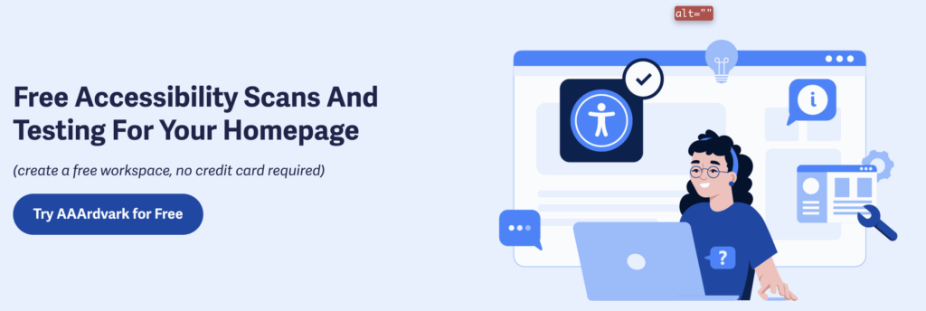
Natalie MacLees: Yeah, you can come over to AAArdvarkAccessibility.com. Add your homepage for free. Run a scan and find all of the issues that can be found by an automated scanner. You could also learn how to do manual testing and find some more issues on your website, and learn how to fix them.
Natalie Garza: And if you wanna see this quick checklist in action, where can you go check it out?
Natalie MacLees: Yeah. I do a live stream every other Wednesday, and I have gone through the WCAG quick checklist, showing you how to do it a few times on those live streams. You could find those on the AAArdvark page on LinkedIn, or they are on our live tab on our YouTube channel.
Natalie Garza: Yes. Every other Wednesday, Natalie is working away, showing everybody how to do this. It’s really, really awesome. Go check it out.
And with that, thank you for joining us. We’ll talk to y’all next time.
