1.4.3 Contrast (Minimum)
Text contrast against its background must be at least 4.5:1 for normal text, or 3:1 for large text (over 24px, or bold and over 19px).
What is it?
In the context of web accessibility, contrast is the difference in color and brightness between text and the background of the page. Black letters on a white background are high-contrast, while pale gray letters on a white background are low-contrast. Low-contrast text is difficult to read because the text color is similar to the background color. Having good contrast is important because it helps people easily read the text on your website and distinguish between different elements on the page.
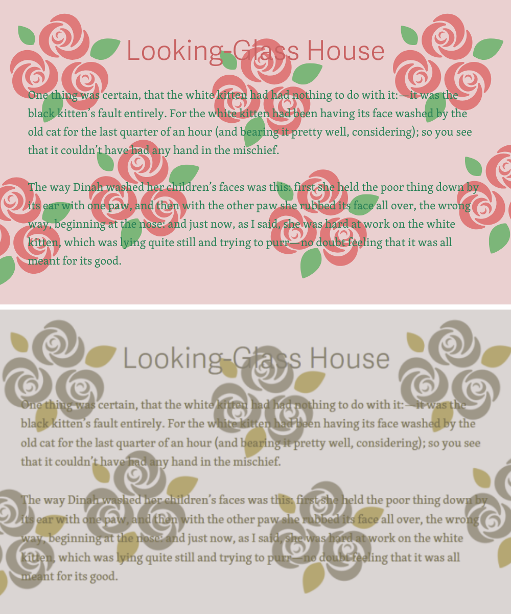
Text that is purely decorative, as in text that forms a background and words could be rearranged or substituted without changing meaning, would not need to meet this criterion.
Why does it matter?
If there is not enough contrast between the text and the background, it can be difficult to distinguish the words and letters. This can cause eye strain and make it harder for people to read the content.
Imagine landing on a web page where the background color and text color are too similar. Low-contrast text like this is challenging for anyone to read. It can be especially challenging if you’re trying to read on your phone outdoors on a bright sunny day or if your eyes are tired from a long day of working at the computer. The challenges with low-contrast text are multiplied for users with low vision, color blindness, and other visual impairments.
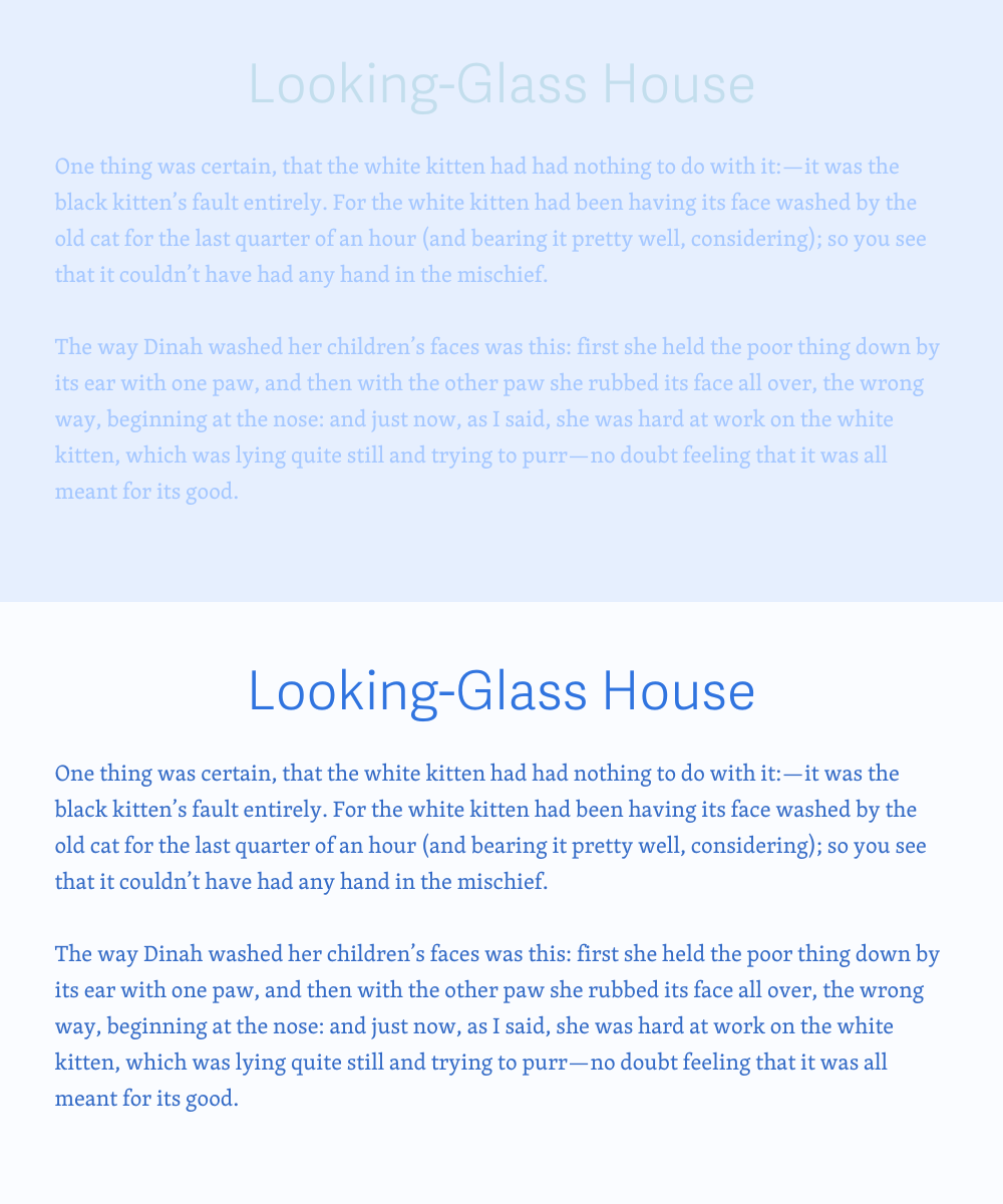
For some users, the first set might not be too bad. They might be able to see that the text is legible over the blue background. But, for users with vision impairment, the contrast being so similar makes it difficult to read because the text almost disappears into the background. It’s frustrating to have to squint or manually highlight text to be able to read this at all.
This can be addressed by changing the background color to white and text to #3866B2, which will bring the ratio to 5.65:1.
WCAG 1.4.3 seeks to ensure that text is legible and easy to read without difficulty or eye strain. This guideline ensures that all users can access the information provided on a website.
Who is affected?
Low-contrast text can affect anyone, but it is particularly problematic for people with vision impairments such as low vision or color blindness.
Low or limited vision is a condition that reduces a person’s ability to see details, colors, and contrast. If text and its background have low contrast, it makes it even harder to distinguish letters and words, which makes it difficult to read and understand the content on a webpage.
For people with color blindness, low-contrast text can also cause problems. Color blindness is a condition in which a person has difficulty distinguishing between certain colors, such as red and green. If the text color and the background color appear to be too similar, someone with color blindness may not be able to read the text at all.
Basically, low contrast text can make it more difficult for everyone to read and understand content on a webpage. It can cause eye strain, headaches, and make focus and concentration more difficult. By ensuring that there is a good contrast between text and background, web designers and developers can create websites that are more accessible and easier to use for all users.
How to implement 1.4.3
About This Section
This section offers a simplified explanation and examples to help you get started. For complete guidance, always refer to the official WCAG documentation.
Normal vs Large Text
When it comes to contrast between the text and background, there are actually two separate rules. One addresses "normal" size text, and the other addresses "large" size text. To help determine whether a text is categorized as "normal" or "large", let’s dive into what sets them apart.
"Large text" is defined as text that has at least a font size of 24pxor 19px with a bold font weight. The contrast requirement for larger text is 3:1. This allows designers to use a wide range of color choices for the large text to help design the page, e.g., the titles.
"Normal text" is all text smaller than the large size threshold, but all text should be at least 16px in size. To meet the requirements for 1.4.3, normal text must have a contrast ratio of at least 4.5:1.
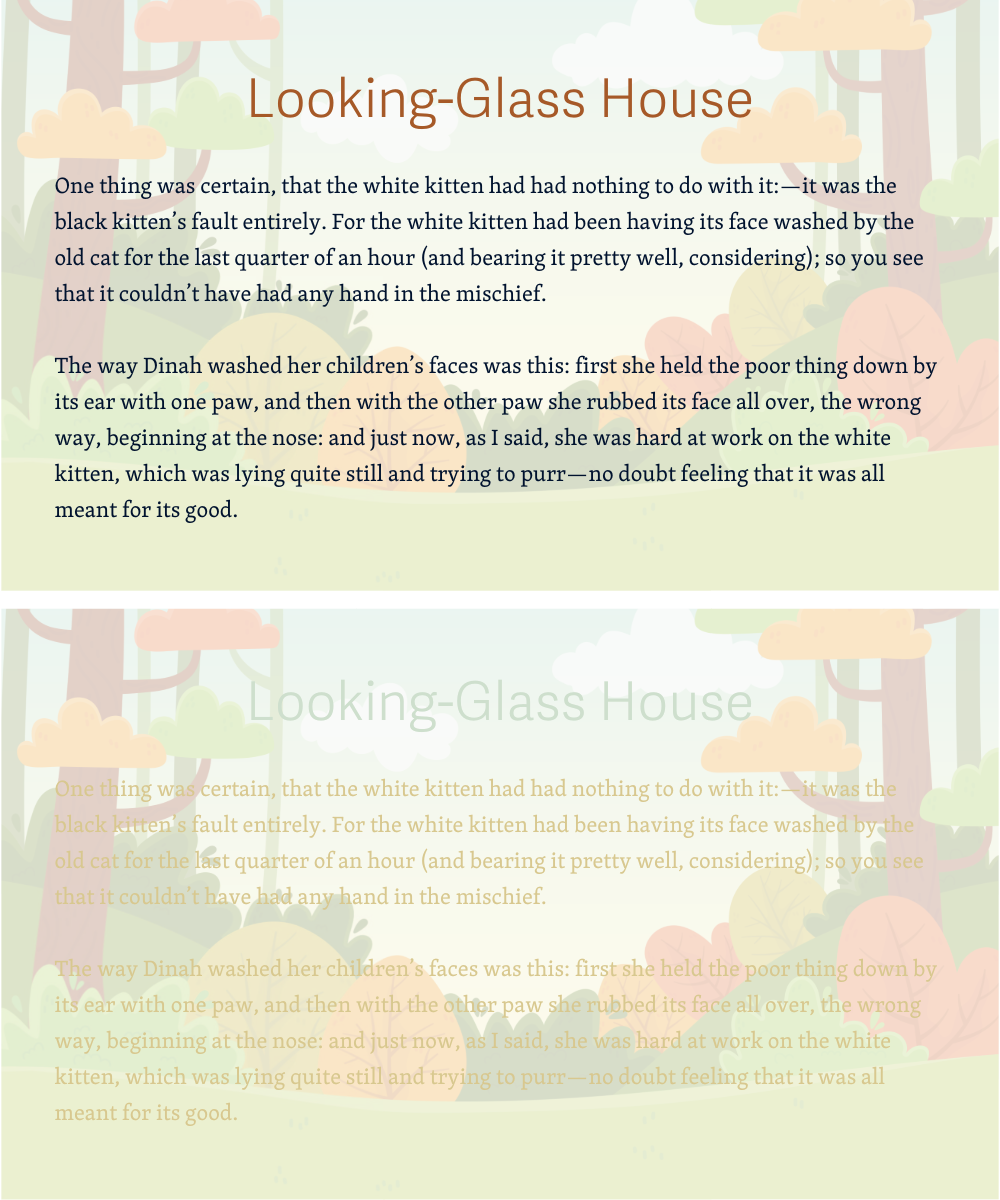
The same rules apply to all text, even text overlapping images - 3:1 for large, and 4.5:1 for normal.
There are plenty of useful tools out there that can help you calculate the contrast between the text and background easily. We would recommend using WebAIM’s contrast checker or a11y’s Color Contrast validator.
Ensure Contrast Ratio between Foreground and Background is sufficient
To ensure that users can read text that is presented over a background, make sure that the text is both the appropriate size and contrast ratio. For example, if a background is a solid color like all white or all black, then the luminance of the normal text should have a ratio of at least 4.5:1.
If the background is an image, or has a pattern of some kind, then the background around the letters must provide an acceptable contrast with the text color to maintain the recommended contrast ratio.
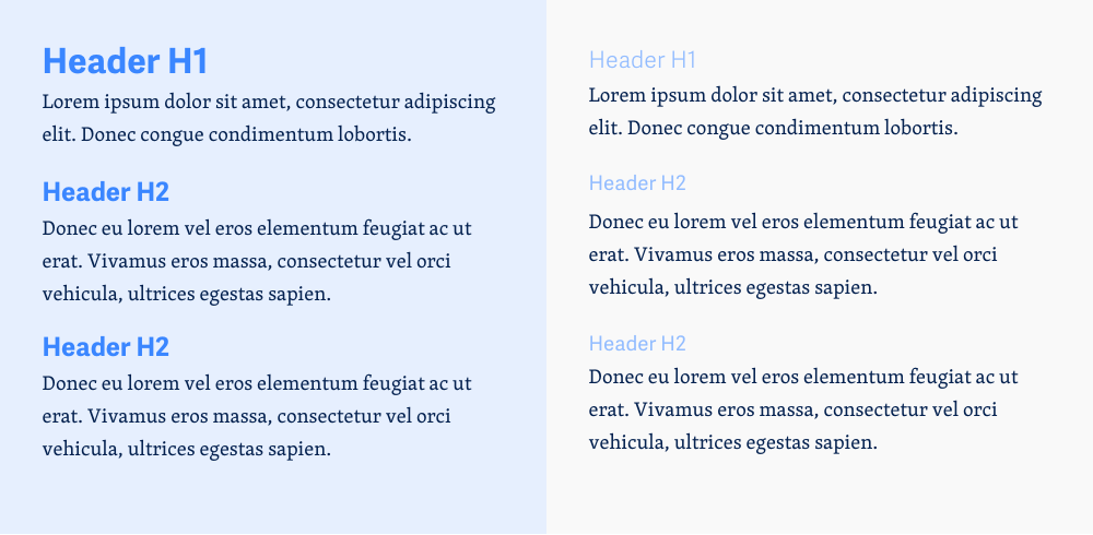
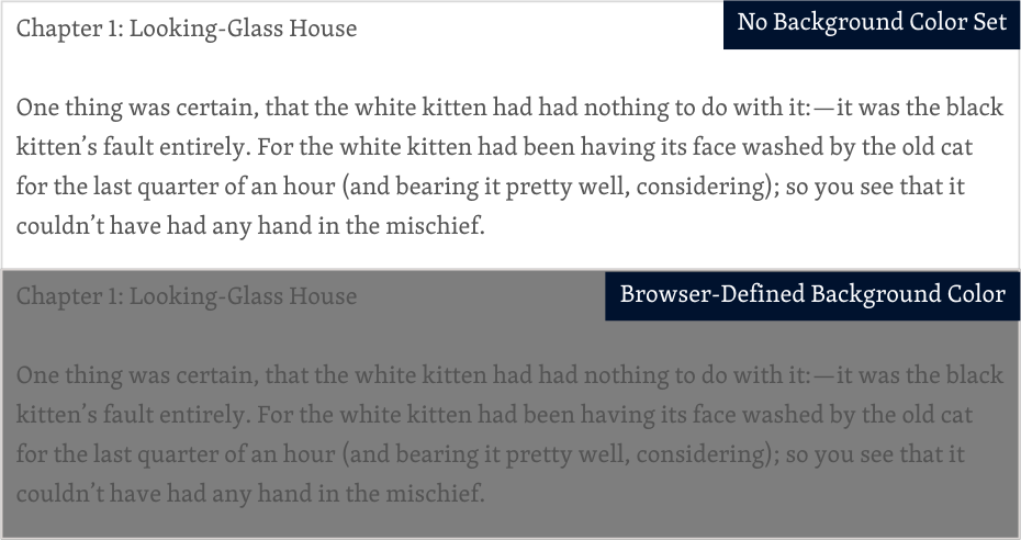
Specify Both a Text Color and Background Color
If you neglect to specifically set a background color on your websites, users’ browsers will use whatever background color they may have selected as their default background color. This could leave some users with a background color you didn’t expect and make it difficult to see your content. Be sure to set a background color for your websites, even if it’s just plain old white.
Additionally, a good rule of thumb is to remember to set a background color any time you set a text color. So, if you adjust the text color on buttons, for example, be sure to always set a background color for buttons that contrasts nicely with the text color.
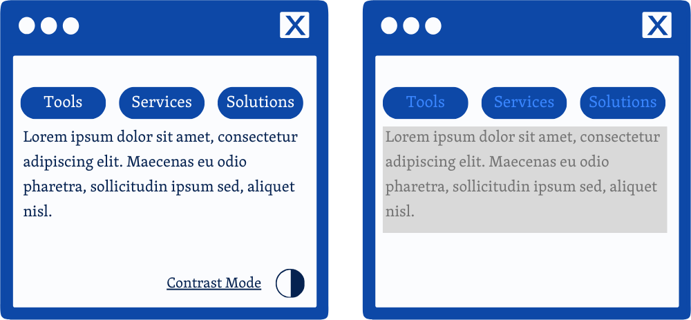
Provide a control with sufficient contrast ratio
Sometimes, sites need to have certain colors assigned to the background and text and, unfortunately, cannot meet the contrast ratio requirements. As a last resort, if you find yourself in this situation, the best solution is to provide a control, such as a toggle, that will allow users to easily switch to a high-contrast mode.
Conclusion
Sites that meet the contrast ratios for normal and large text outlined in 1.4.3 will provide a seamless experience for users with low vision. And, this will allow users of all kinds to easily navigate and understand the site and its content. Ensuring that users with low vision have a means of accessing your site will lead to more engagement and happier users.