2.5.1 Pointer Gestures
All actions that are carried out using a gesture (swiping, pinching, and so on) or drawing, can also be done with a button or buttons.
What is it?
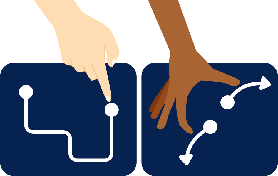
When using gestures like swiping, pinching, or dragging to interact with web content, it's important to make sure these functions can also be controlled with simple, single-point actions like taps or clicks. This is also true for path-based gestures, which require a specific movement path, and multipoint gestures, which need more than one touch point. By providing alternative methods, such as a tap or a click, users can still interact with the content without needing to perform complex gestures.
Examples of pointer gestures include:
- Swiping a slider or carousel element
- Drawing a specific shape
- Two-finger pinch to zoom
- Multiple finger taps or swipes
This success criterion aims to ensure that content can be controlled without relying on complex gestures alone. However, exceptions are made for content that inherently requires complex gestures, such as drawing your signature.
Why does it matter?
Many users cannot perform the multipoint or path-based gestures needed to interact with certain web content. This requirement can make it hard for people to access essential features, leading to frustration and a poor user experience.
People with limited mobility or motor impairments might struggle with performing gestures, leading to accidental actions or difficulties using the site. Specialized device users also find these gestures challenging due to the limitations of their assistive technology. Lastly, people with cognitive or learning disabilities might find complex gestures confusing and complicated to remember. All of which can lead to frustration, reduced engagement, and even site abandonment.
Who is affected?
People with limited mobility. People with cognitive disabilities. People with low or limited vision. People who are blind.
People with limited mobility or motor impairments, such as those with Parkinson's disease or arthritis, benefit from this guideline as it offers them more straightforward ways to interact with content. Some of these users also rely on head pointers or eye-gaze systems to interact with web pages, and the devices' lack of dexterity can make it challenging to complete pointer gestures accurately or efficiently. This guideline also aids elderly users, who might have reduced motor skills, and anyone using a device in challenging conditions, like a bumpy commute.
People with cognitive or learning disabilities might find complex gestures confusing or difficult to remember, making navigation and interaction with the site challenging. Simplifying these interactions helps create a more intuitive and user-friendly experience for them.
People with low or limited vision often have a tough time with gestures that need precise visual alignment, like dragging or swiping. They depend a lot on clear visual feedback to guide their actions. Without this feedback, it's hard for them to know if their gestures are working, which can lead to frustration and mistakes.
People who are blind rely heavily on screen readers and other assistive technologies to interact with web content. Since they cannot see the screen, visual gestures like swiping or pinching are not accessible to them. Ensuring that all functionality can be operated through simple, non-visual commands allows blind users to navigate and use the site effectively.
How to implement 2.5.1
This section offers a simplified explanation and examples to help you get started. For complete guidance, always refer to the official WCAG documentation.
Control Alternatives
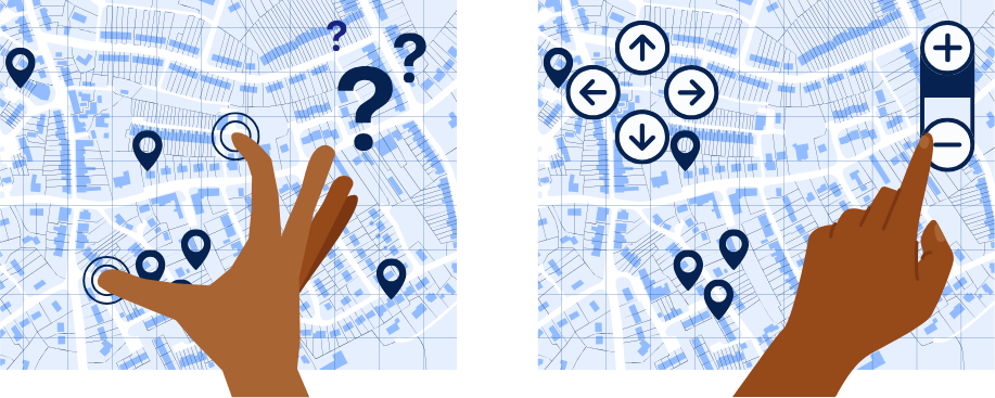
When path-based gestures are present, such as image carousels that require swiping, make sure that simpler controls like buttons or tapping mechanisms are also available. The control alternatives should be placed over or adjacent to the content that uses them. It should also be clear what the added controls do and how to use them.
For example, a map allows users to pinch using two fingers across the frame to zoom in and out and swipe to pan. However, two buttons with a plus and minus symbol, as well as navigational arrow buttons, are also placed on the top corner of the map so that the user can zoom and pan across the map without the need to pinch or swipe.
Control Slider Tracks
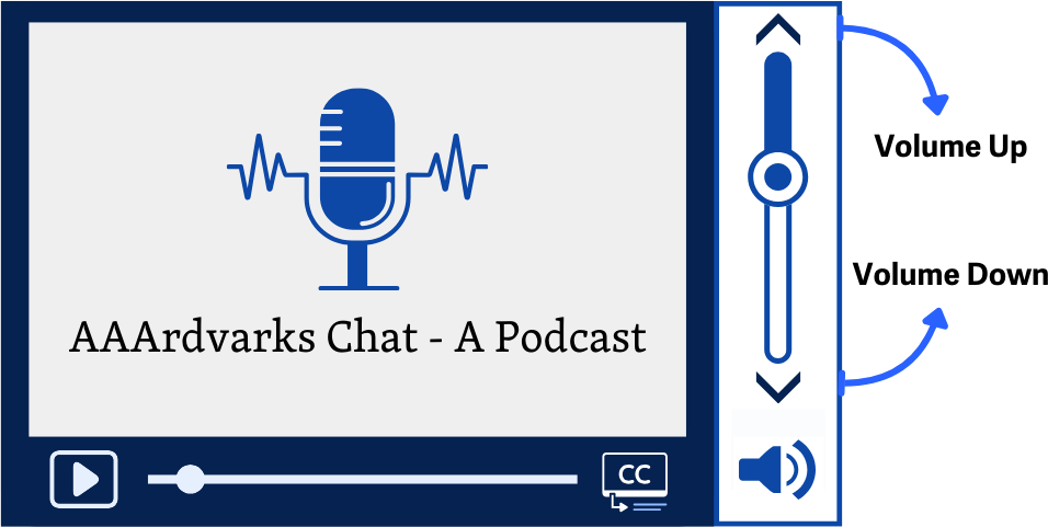
Alternatives are particularly important for control sliders, which solely rely on the precise dragging of the slider thumb to adjust their values. Providing other inputs, such as taps or clicks through buttons or links, can help users set the value without a path-based gesture.
An example of common control sliders are the ones used on video content to control the volume. They allow users to set a value within a certain range using a set track.
Conclusion
Making sure your website works with simple actions like taps and clicks, instead of complex gestures, is key for accessibility. By implementing alternatives to multipoint and path-based gestures, you make your site usable for people with a variety of disabilities, including those with motor impairments, cognitive disabilities, low or limited vision, and blindness.