3.2.3 Consistent Navigation
Navigation is consistent from page to page.
What is it?
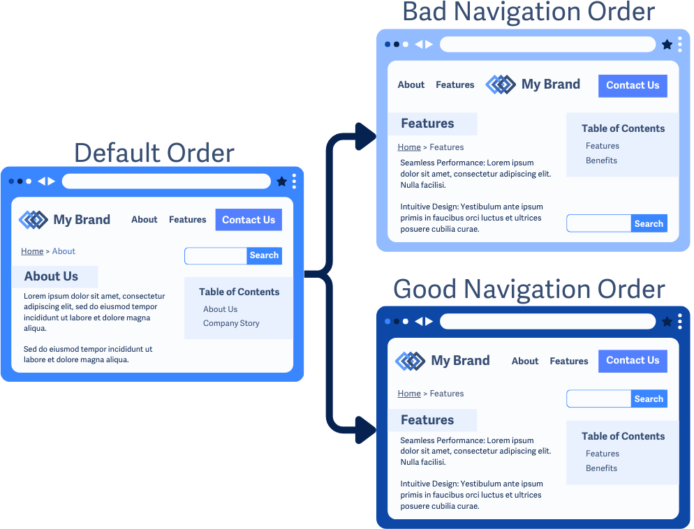
Users expect familiar features like menus, search bars, and skip-to-content buttons to stay in the same place as they visit different pages on a website. If they move, it can be frustrating and confusing. Keeping them consistent makes it easier for users to find them quickly and rely on their placement without having to search each page.
For example, if your website has a navigation menu in the top left and a search bar in the top right, they should always stay there. If they switch places or disappear on some pages, users will struggle to find them.
Why does it matter?
When menus, search bars, or other navigation elements aren’t in a consistent place, it can be confusing and frustrating for users. By moving navigation items to different spots or changing their order, users with cognitive disabilities can get confused or struggle to figure out how to move between pages.
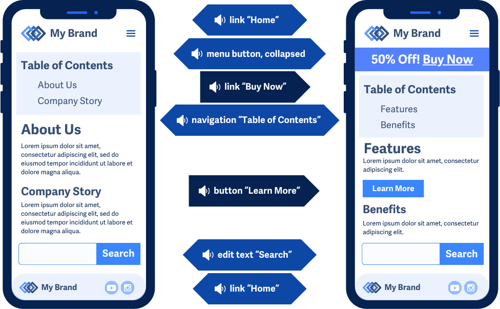
People using screen magnifiers must carefully scan each page. If navigation moves around, they have to waste time hunting for it. Similarly, screen reader users depend on a predictable order. If items move, it makes browsing much harder.
Who is affected?
People with low or limited vision. People with cognitive disabilities.
People with low or limited vision may rely on assistive technology such as screen readers or screen magnifiers to navigate a website. If navigation items shift around, they have to waste time searching for them again.
People with cognitive disabilities, such as learning impairments, rely on consistency and predictability when navigating a site. If things aren’t in the same place, it can be confusing or even prevent them from using the site altogether.
How to implement 3.2.3
This section offers a simplified explanation and examples to help you get started. For complete guidance, always refer to the official WCAG documentation.
Keep Navigation Elements In The Same Spot
If something appears on multiple pages, it should always stay in the same place and order relative to the other navigation elements. This applies to:
- Header menus
- Footer menus
- Table of Contents
- Skip to content buttons
- Search bars
- Breadcrumbs
For example, if you have a ‘Contact Us’ button in the header, don’t move it to the footer on different pages.
You can add new content to a page, but the navigation itself, including menus, search bars, and breadcrumbs, should always stay in the same place.
Conclusion
A predictable website layout makes life easier for everyone. When users always know where to find key navigation elements, they don’t waste time searching or get frustrated. Keeping things consistent isn’t just helpful; it’s essential.