What is it?
Text content should be used instead of images of text to allow users to customize and adjust to their preferences. Images of text can be used only if they meet specific conditions, such as requiring a unique design or being part of a logo.
Why does it matter?
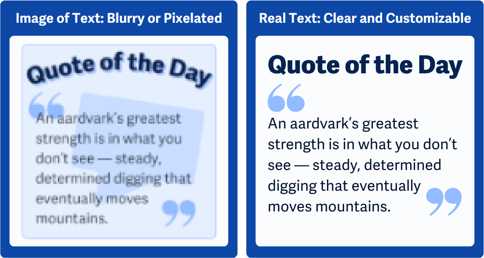
Static pictures of text make it impossible for people to change how text looks to improve readability. Text in images doesn’t scale well and can become pixelated, blurry, or unreadable when users zoom in. Unlike actual text on the page, image-based text won’t adjust to different screen sizes or user settings, making it harder to read on mobile or larger screens.
Users who need to change font size, color contrast, or background color to improve readability can’t do so with text embedded in images. This is challenging for users with low vision, color blindness, or cognitive disabilities who benefit from specific text formatting.
Screen readers can’t interpret text inside images, so people who rely on these tools won’t be able to access the content unless the image is properly captioned or has alt text.
Who is affected?
People with low or limited vision. People with visual tracking issues. And people with cognitive disabilities.
People with low or limited vision may struggle to read small, fixed-size text within images, and enlarging images to read the text can lead to blurry or pixelated visuals.
People with visual tracking issues can benefit from adjusting text alignment and spacing to help with eye strain and fatigue. Text in images prevents these users from making the customizations they need.
People with cognitive disabilities may need specific fonts, colors, or line spacing to help them read, and text inside of an image limits their ability to change the text settings.
How to implement 1.4.5
This section offers a simplified explanation and examples to help you get started. For complete guidance, always refer to the official WCAG documentation.
Avoid Images of Text
Whenever possible, use text instead of images of text so users can customize how the text is displayed, including font size, color, style, or spacing.
Exceptions for Essential Images of Text
Exceptions apply when the specific visual presentation of the text is essential, such as text in logos or branding. Or, if the text on the image can be customized to the user's preference, in the case that you're creating dynamic images.
If you must use images of text for essential reasons, like in brand logos, make sure the information from the image is still accessible by including captions or alt text.

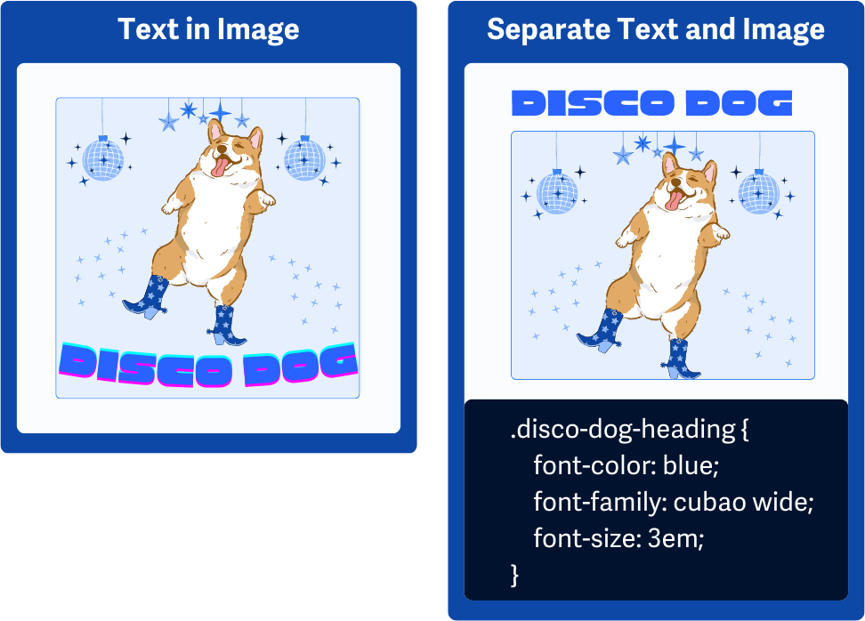
CSS To Style Text
Use CSS to get a similar look as the text in the image and stick with relative measurements like em, rem, %, vw, and vh. This way, the text scales smoothly on different screen sizes and adjusts easily when users zoom in or tweak their settings. Using relative units keeps things flexible, so the layout stays intact and readable across all devices.
This is also a success criterion of its own; check out WCAG 1.4.4 Resize Text for more information.
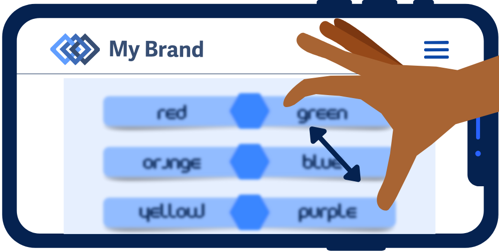
Switch Between Image of Text and Plain Text
Another option is to give users a way to toggle between the image of text and regular text. This lets users choose what works best for them—whether they prefer the styling in the image or need the flexibility of plain text. A simple toggle or link to switch views can make it easy for everyone to access and read the content in their preferred format.
Conclusion
Using actual text instead of images of text is key to making content flexible, accessible, and user-friendly. Real text allows users to make changes to suit their needs, whether it’s resizing, adjusting colors, or modifying spacing for better readability.