1.4.6 Contrast (Enhanced)
Text has a contrast ratio of 7:1 to 1. Large text can be a 4.5 to 1 ratio if it’s over 24px, or bold and over 19px.
What is it?
All text on your website should be easy to read, especially for people with low vision. That means making sure there’s strong contrast between the text and its background so the words don’t fade away or get lost.
This guideline goes beyond the basic contrast rules and asks for an even stronger contrast between text and background. The goal is to make content readable without eye strain, even for people who don’t use assistive tools but still need extra visual support.
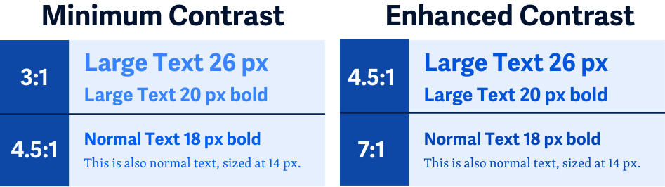
Quick comparison: While WCAG 1.4.3 Contrast (Minimum) requires a contrast ratio 4.5:1 for normal text, this criterion at the AAA level raises the ratio to 7:1. This helps support users with more significant vision loss who still read visually and don't necessarily rely on screen readers.
Why does it matter?
Some people simply can’t read text that meets the WCAG 1.4.3 minimum contrast ratio. Their vision might be blurry, or they might have trouble distinguishing certain colors. For them, increasing the contrast can be the difference between reading comfortably and giving up entirely.
Think about tyring to read a website on your phone in bright sunlight or when your eyes are tired at the end of the day. That's what it's like all the time for people with vision around 20/80, and this guideline is here to help make sure your content works for them too.
Who is affected?
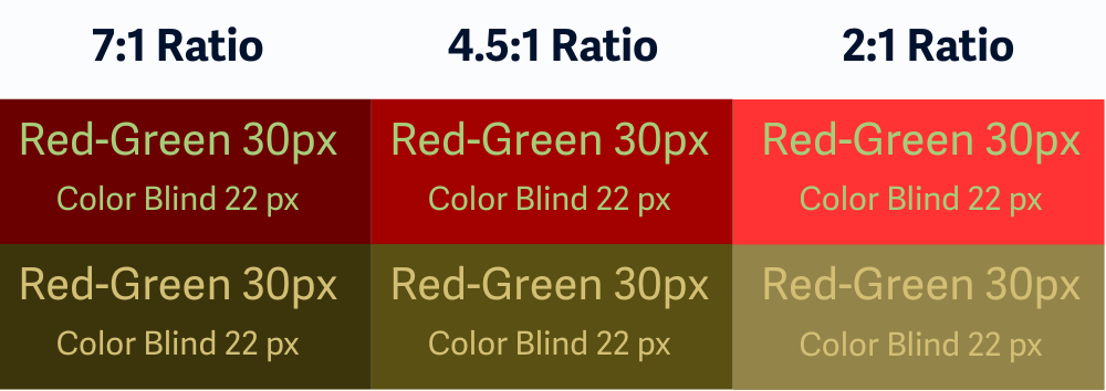
People with low vision. People with color blindness.
People with low vision may struggle to read text with low contrast, even if it meets the basic standard. Higher contrast makes things easier to see and reduces eye fatigue.
People with color blindness may miss certain hues entirely. Since this guideline is based on luminance (brightness) instead of color alone, it helps ensure text remains readable no matter what colors are used.
How to implement 1.4.6
This section offers a simplified explanation and examples to help you get started. For complete guidance, always refer to the official WCAG documentation.
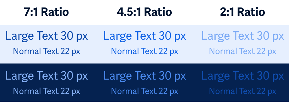
Contrast Ratios for Normal vs Large Text
Here's what you need to know:
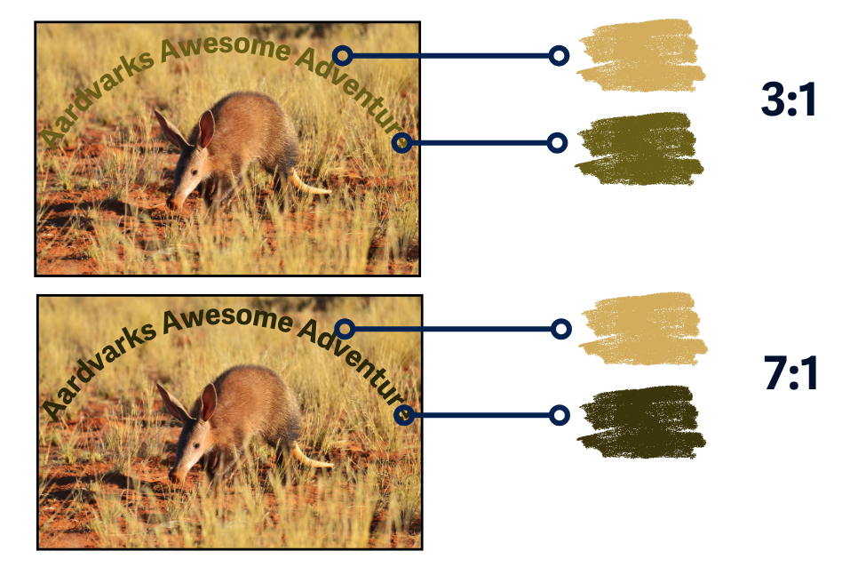
- Normal text (under 24px or under 19px bold): Needs at least a
7:1contrast ratio - Large text (over 24px or 19px bold): Needs at least a
4.5:1ratio
This gives you a bit more flexibility with headlines and titles, while still making sure paragraph content stays super legible.
One of the easiest ways to check is using the free WebAIM Contrast Checker. Just plug in your text and background colors and see how they measure up.
Decorative text (like background words or flourishes) doesn’t need to meet contrast requirements if it’s not conveying important information.
Contrast for Images of Text
If your images include text (like a banner or infographic), the same contrast rules apply. Text should be just as readable in an image as it is in regular HTML.
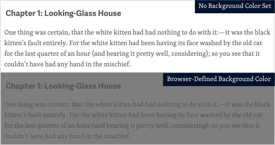
Set Both Text and Background Colors
When you change text color in your CSS, make sure to also set a background color. If you don’t, users with custom settings or high contrast modes might end up with unreadable combinations.
Text on Top of Images or Patterns
If you're placing text over an image—like a hero banner, background pattern, or decorative graphic—be careful because contrast can vary depending on what part of the image the text is sitting on.
Tips for better readability:
- Use a semi-transparent overlay to darken or lighten the image behind the text
- Add a solid background behind important text
- Avoid busy areas and place text in simpler, less cluttered areas of the image
- Alwasy test contrast directly where the text appears
Text that happens to appear in the background of a photo (like a street sign or product label) doesn’t need to meet this rule unless it’s part of your website’s actual content.
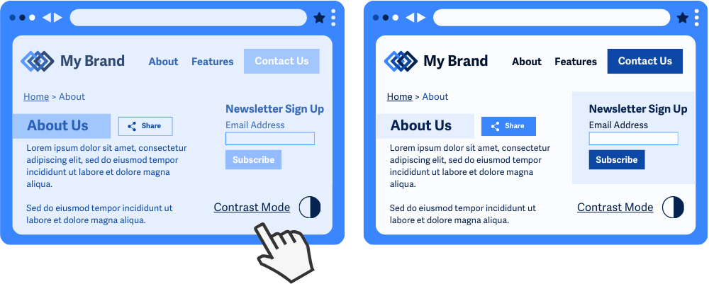
Add a High-Contrast Mode
If your design uses colors that don’t meet enhanced contrast—for branding or aesthetic reasons—consider offering a high-contrast mode.
This gives users a choice: they can switch to a more accessible version when needed.
Conclusion
WCAG 1.4.6 is about making your text easy to read for everyone, especially people with low vision or color blindness. By going beyond the minimum contrast requirement, you’re creating a more inclusive and user-friendly experience for people who might not use assistive tech but still need better visual support.
Clearer text means less squinting, less eye strain, and more access for all.