1.4.10 Reflow
Content remains functional and easy to read when; zoomed to 400% or; viewed at 320px width, without needing to scroll in two directions (except for tables, maps, and similar content).
What is it?
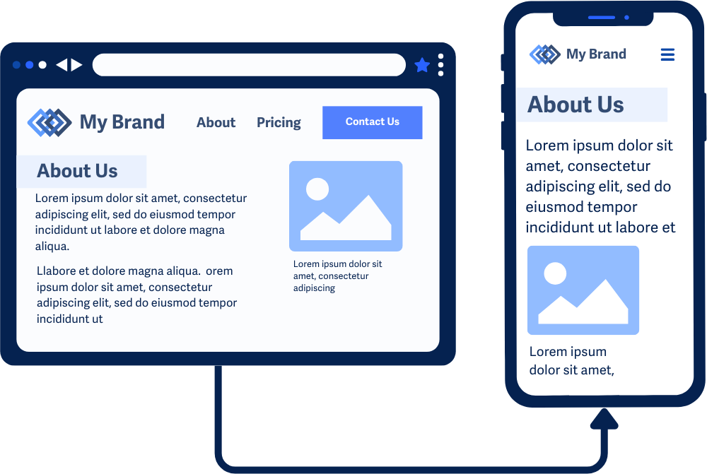
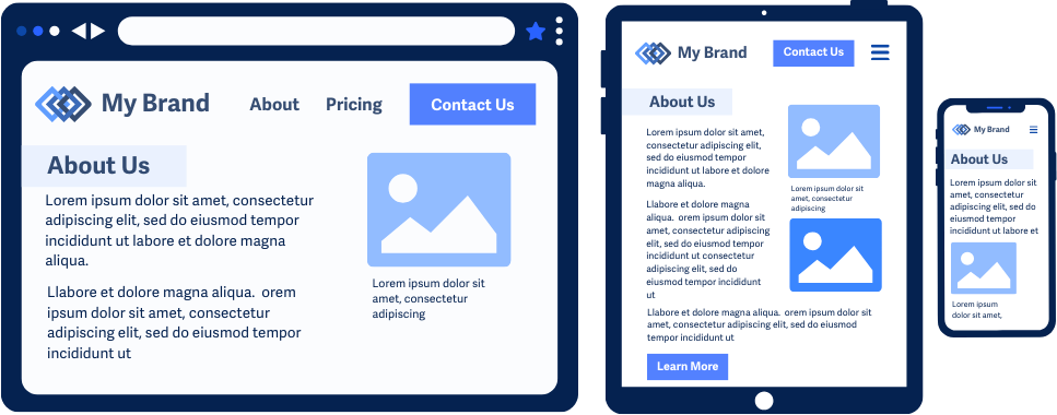
Web content should adjust dynamically across different screen sizes or zoom levels. That means users should never be forced to scroll in two directions to read or interact with the content. Instead, the layout should reflow - that is, reorganize itself - so everything fits within the available viewport.
WCAG 1.4.10 specifically requires that content be usable without horizontal scrolling at a viewport width of 320 CSS pixels (typically a mobile phone screen in portrait mode). One common way to test this is to zoom a desktop browser to 400%, but zooming isn't required—the key is whether the layout works at small widths.
Some exceptions apply, such as for content that genuinely requires a two-dimensional layout, like maps or data tables.
Why does it matter?
When content doesn’t reflow, users with low vision may need to scroll horizontally for each line of text—which can be exhausting and confusing. Reflow allows users to enlarge content or use smaller screens while still keeping everything visible, readable, and usable.
This benefits users with:
- Low vision who magnify text
- Motor impairments that make horizontal scrolling difficult
- Cognitive disabilities that make scrolling back and forth mentally taxing
- Small screen devices, like phones or tablets
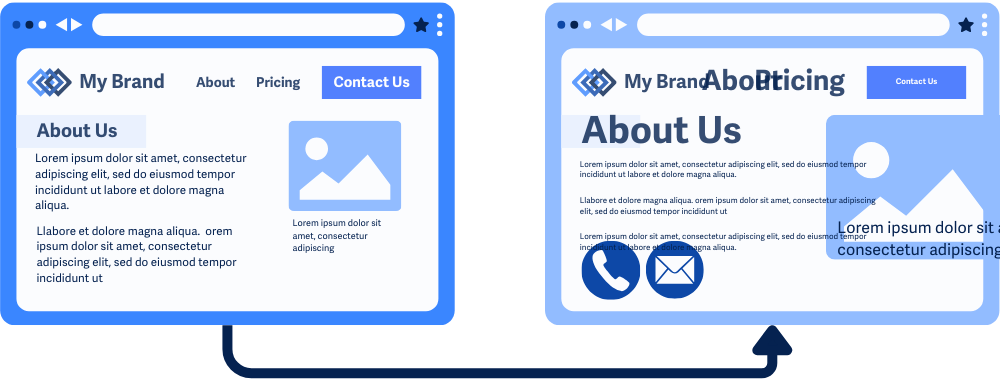
Example of bad support for reflow, the content becomes unreadable due to small text size and overlapping text, the image and captions are overflowing off the edge of the screen, and the links in the menu are overlapping making it unusable.
Who is affected?
People with low vision often need to enlarge text to see it clearly, and without reflowing, the zoomed-in content may fall out of the viewport, forcing these users to scroll horizontally to read each line.
People with motor impairments or limited motor skills may struggle to scroll horizontally to see hidden content since it requires precise movements.
People on mobile devices or smaller screens benefit from reflow because it makes sure that content adjusts to the smaller viewports, making it easier to navigate without excessive scrolling or zooming.
How to implement 1.4.10
About This Section
This section offers a simplified explanation and examples to help you get started. For complete guidance, always refer to the official WCAG documentation.
To meet this criterion:
- Content must be usable at a viewport width of 320 CSS pixels
- Horizontal scrolling should not be necessary for text or controls
- Content should reflow to fit the screen, usually in a single column for most languages
Note: Testing at 400% zoom is a common method, but not a requirement. WCAG is focused on layout adaptability, not a specific zoom level.
Responsive Web Design Techniques
Use flexible layout techniques to ensure content reflows properly:
- Using CSS
@mediaqueries - Using relative units such as
em,rem,%,vw,vh - Using CSS
overflowandwrapproperties - Using CSS
max-widthandheightfor images - Avoiding
fixed-widthlayouts orabsolutepositioning
CSS Media Queries
Media queries allow you to create responsive designs and layouts that adapt to different specified screen sizes. Using breakpoints, you can offer alternate styling and layouts at different screen sizes. This comes in handy when:
- Switching between multi-column and single-column content
- Adjusting font sizes for text and headings
- Hiding non-essential elements on smaller screens
- Applying the other techniques listed below
In this media query example for mobile devices with screen sizes smaller than 768px, the font-size of the body text is adjusted, a sidebar widget is hidden, and a container element is adjusted to display only one column.
@media (max-width: 768px) {
body { font-size: 1.2rem; line-height: 1.6; }
.sidebar-widget { display: none; }
.container { grid-template-columns: 1fr; }
}
Relative Measurements
For scalable designs, replace fixed units like px with relative units like em, rem, %, vw, and vh. These units adjust proportionally based on the user's settings or viewport size.
CSS Overflow and Wrap Properties
Use overflow, overflow-wrap, white-space, text-overflow strategically to manage content that might spill outside the viewport. This helps avoid forcing horizontal scrolling by ensuring content wraps within its container, especially when dealing with long text strings or large amounts of text.
overflow: Control what happens when the content exceeds its container’s boundaries.overflow-x/overflow-y: Control overflow behavior separately for horizontal and vertical axes.overflow-wrap: Make sure text breaks onto a new line instead of overflowing its container.text-overflow: To handle text that overflows its container by adding visual indicators like ellipses…white-space: Controls how whitespace inside an element is handled
In the example below, the text is set to a fixed width of 200px, and we use a few overflow-related properties to neatly handle any extra text. The white-space property keeps the text on a single line, overflow hides anything that doesn’t fit, and text-overflow adds ellipses to show the text has been truncated.
.truncated-text {
width: 200px;
white-space: nowrap;
overflow: hidden;
text-overflow: ellipsis;
}
<div class="truncated-text">
    This is an example of a very long sentence that will be truncated with an ellipsis when it overflows.
</div>
Visible output:
This is an example of a very lo...
Avoid Fixed-Width or Absolute Positioning
Avoid hardcoding widths, positioning elements, or layouts absolutely, which can prevent reflow. Instead, use flexible layouts with flexbox or grid and relative dimensions.
.container {
display: flex;
flex-wrap: wrap;
width: 100%;
}
CSS max-width and height For Images
With CSS max-width and height, images can resize to fit the space without losing their proportions. Responsive layouts and smart sizing make sure images stay in their spot, even in single-column layouts or when zoomed in.
Exception for Horizontal Scrolling When Two-Dimensional Layout Is Needed
Some layouts require two-dimensional presentation, such as:
- Maps
- Data tables
- Spreadsheets
- Musical notation
- Toolbars
In these cases, horizontal scrolling within that component is allowed. But the rest of the page should still reflow normally.
Linearizing Two-Dimensional Content
If appropriate, convert tabular data into stacked, single-column formats using lists or headers. This makes the information easier to read on small screens without scrolling sideways.
Conclusion
Reflow is essential for responsive design and accessibility. It helps users magnify content or use small screens without extra effort or frustration. Design with flexibility, avoid fixed layouts, and make sure content fits within a 320 CSS pixel-wide viewport. This creates a better experience for everyone.