2.4.3 Focus Order
Focus must follow a logical and meaningful order that preserves relationships and matches how the page is naturally read, regardless of layout or language direction.
What is it?
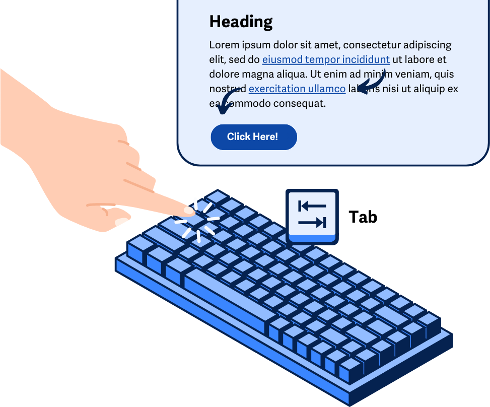
Interactive content such as links, form fields, or buttons receive focus when a user tabs through a page with a keyboard. Users who rely on keyboard navigation or assistive technology expect the order of their tabbing or navigation to follow a logical sequence.
To successfully meet this criterion, the page’s interactive content should offer a way to navigate through all the focusable elements in a way that makes sense for the page and the content. This is opposed to a tabbing order that jumps the user across the page without any rhyme or reason.
And, a quick note: while the 1.3.2 Meaningful Sequence guideline helps by correcting the reading order of all the content, by contrast, 2.4.3 Focus Order concentrates on the order in which interactive elements receive focus. While the overall content could be structured and found to meet the 1.3.2 guideline, the tabbing order could still be broken and fail to meet the 2.4.3 Focus Order guideline.
Why does it matter?
When a webpage’s focus order doesn’t make sense or is scattered, it can cause a lot of confusion to users who rely on keyboard navigation. Users can get disoriented and frustrated from jumping across the page without any logical flow to the interactive content they’re navigating through.
In turn, users put more effort into navigating through the interactive elements and either lose the context of the content or end up in situations where they don’t know how to access certain elements since the expected navigational pattern is broken.
Who is affected?
People with limited mobility who rely on their keyboard navigation benefit when the element focus follows a reasonable order across the page. Otherwise, they can get frustrated by having to put more energy into trying to move focus to a specific link they want to follow or a specific form field they wish to complete.
People with cognitive disabilities, specifically ones that affect reading ability, can find it challenging to follow along when tabbing takes focus in unexpected directions. Following a logical focus order makes tabbing through the page smoother and less confusing.
People with low or limited vision may use the screen magnifier at higher levels of magnification and tend to see smaller portions of the page at a time. Scattered focus order makes it hard to understand the content when the page is jumping around or doesn’t follow a reasonable pattern.
People who are blind and rely on screen readers can find this helpful specifically when they’re interacting with forms, making sure the order that each field receives focus is logical helps them understand the structure and convey when fields are grouped together.
How to implement 2.4.3
About This Section
This section offers a simplified explanation and examples to help you get started. For complete guidance, always refer to the official WCAG documentation.
As you implement this guideline, it’s possible that multiple logical focus orders exist on the page. To successfully meet this criterion, it’s only necessary that there’s at least one logical navigation order for the interactive elements on the page. It should also withstand use by either screen readers or keyboard navigation.
Matching HTML Source Code to Expected Tabbing Order
Webpages sometimes rely on CSS to adjust the visual layout or structure of content. However, this method of rearranging sections or elements can cause jumpy tabbing sequences since the focus order is controlled by the arrangement of the HTML source code.
Therefore, the focus order can be resolved by simply correcting how the interactive content or elements are arranged directly in the HTML source code, as opposed to using CSS to rearrange the sections or elements. That way, the interactive elements match the expected tabbing order on the page.
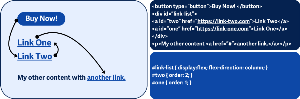
In the example below, we have a container with two links, “Link Two” and “Link One”. In the HTML, they are listed in backward order where “Link Two” precedes “Link One”, but CSS is being used to switch their order. While this would give us the expected order visually, the tabbing order would still focus on “Link Two” first, followed by “Link One”. The best way to fix the tabbing order here would be to rearrange the <a> elements in the HTML directly.
<div id="link-list">
    <a id="two" href="<a href="https://link-one.com">https://link-two.com</a>">Link Two</a>
    <a id="one" href="<a href="https://link-one.com">https://link-one.com</a>">Link One</a>
</div>

#link-list { display:flex; flex-direction: column; }
#two { order: 2; }
#one { order: 1; }
Check Tabindex
Most interactive HTML elements are tabbable by default; this includes the following tags:<a>, <area>, <button>, <input>, <object>, <select>, and <textarea>. However, there are cases where elements require the use of the tabindex attribute to make them focusable.
This is mainly needed when using custom user interface elements such as custom checkboxes or a custom select menu. The tabindex value, in combination with ARIA, makes these types of elements accessible.
When the tabindex attribute is present on the page; it must be checked closely, especially when using any value other than 0, since this can cause scattered focus order. When tabindex is set to a positive integer, the elements receive focus in ascending order, which can cause issues down the line when the content is edited or shifted around the page.
The best practice is to set the tabindex to 0 only and never use a positive integer. Positive integers interfere with the tab order on the page, but a 0 preserves the expected tab order.
Interactive Element Order
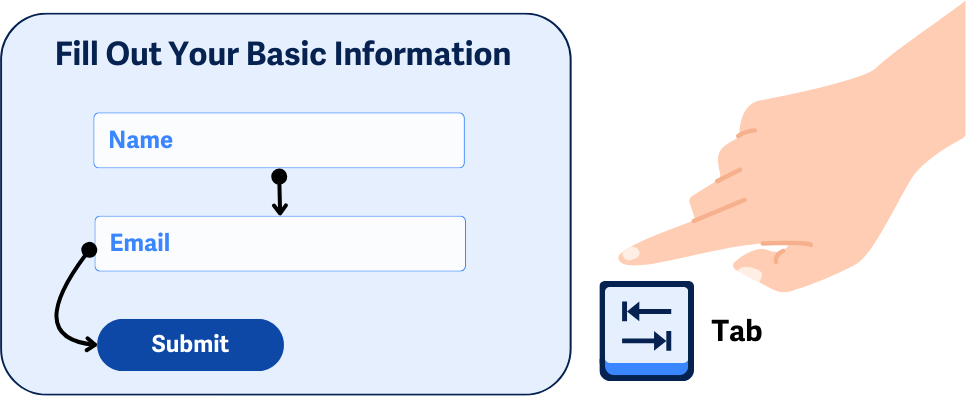
When reviewing the content, elements such as links and form controls should also be ensured to receive focus in a logical order. Tabbing through interactive elements should follow the content’s natural sequence and not break any relationships they have with each other.
For example, tabbing through a form should not randomly move the user across the fields. Instead, fields should follow a sequential order that makes sense, especially when groups of fields are involved, like collecting an address.
Or, think of a navigation menu where the user tabs through the links. Check that the order makes sense and doesn’t arbitrarily go through submenu items and parent menu items or go to a downright different place on the page.
Triggered Dialogs or Popups
Dynamic content such as triggered dialogs and popups are a unique case, where their content’s HTML source code is not embedded on the page during the initial load.
Because of this, some added functionality or scripts need to be in place to handle the focus order and make sure that the HTML source code for these new elements directly follows the button or link that triggered them. That way, the focus order can be retained, and the user’s next tab button press will take them directly to the dialog or popup content.
In summary, the following need to be true when using a dialog or modal:
- When a dialog or popup is opened, the focus moves to the modal
- While opened, the focus is trapped within the modal, and the user cannot focus on other elements on the page
- After a dialog or popup is closed, the focus is returned to the element that triggered the modal to open
Conclusion
Creating logical focus order on web pages is crucial for users who rely on keyboard navigation. When the focus order aligns with the content's structure, it helps users build a clear mental map of the site and navigate more easily.
Users who rely on assistive technology can become confused and frustrated if the focus jumps around unpredictably. Implementing a logical focus order, whether through matching the HTML source code to the visual layout or using tabindex appropriately, improves the user experience and accessibility for everyone.