What is it?
Use focus indicators to show users navigating by keyboard where the current focus is. For example, a button, link, or form field might have an outline, a color change, or an underline when selected. This helps keyboard users see exactly what they’re about to interact with.
Why does it matter?
Without focus indicators, users who navigate with the keyboard may struggle to understand where they are on a page. This is particularly frustrating for people with physical disabilities, cognitive impairments, or temporary conditions like a broken mouse. Focus indicators solve this problem by providing clear visual markers.
Imagine trying to fill out a form without knowing which field you’re typing in or navigating a menu without knowing which item is active. Focus indicators solve this problem by showing users exactly where they are.
Who is affected?
People with mobility impairments who rely on keyboard navigation use visual cues to help reduce errors when interacting with elements and make navigation easier, minimizing physical strain.
People with reading and learning disabilities use the focus element visual cues to help them stay on track while interacting on the page.
How to implement 2.4.7
About This Section
This section offers a simplified explanation and examples to help you get started. For complete guidance, always refer to the official WCAG documentation.
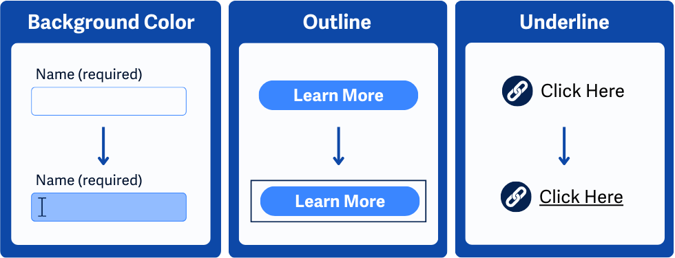
Visible Cue When Elements Are Focused
Navigate through the webpage with a keyboard and make sure all interactive components activate a visible cue or indicator when they receive focus. This includes buttons, links, form fields, custom components, etc.
Don’t Rely on Browser or Operating System Defaults
Most browsers and operating systems have options to automatically highlight standard controls like text fields and links when they receive focus. However, they may not be as thorough and may not be consistent across browsers or devices. It’s best to use one of the techniques listed below instead.
Style Focus Indicators with CSS
Use the CSS :focus-visible and :focus pseudo-classes to apply custom styles to elements when they receive keyboard focus. Unlike the :focus pseudo-class, :focus-visible targets keyboard navigation specifically, avoiding unnecessary focus indicators for mouse users.
In this example, we use :focus-visible to apply a blue outline around links when they receive focus from the keyboard.
a:focus-visible {
outline: 2px solid blue;
}
Focus indicators are also useful for mouse users. For instance, when filling out a form, it’s helpful to clearly see which field you’ve clicked on and are currently working in. In the following example, a text input field is highlighted with a red outline and a pink background when it’s focused.
input[type="text"]:focus {
outline: 2px solid red;
background-color: pink;
}
Conclusion
Focus Visible makes navigating with a keyboard much less confusing and less prone to mistakes. A clear, visible focus indicator lets users know exactly where they are and helps them stay on track.