What is it?
Color is vital to creating an inclusive and accessible web experience for users. It’s a way to convey information and distinguish visual elements from one another. WCAG 1.4.1 allows for the use of color to communicate information, but importantly doesn’t allow for the use of color alone to communicate information. Basically, feel free to use color, but have a backup method of communicating that same information for people who can’t perceive color. We’ll get into the nitty-gritty details of how this all works.
Why does it matter?
While color can enhance a website’s aesthetic appeal and provide an inviting experience, color can additionally convey a variety of information. It’s common to use color for things like color-coding points of interest on a map. Color allows people to absorb a lot of information with a quick glance.
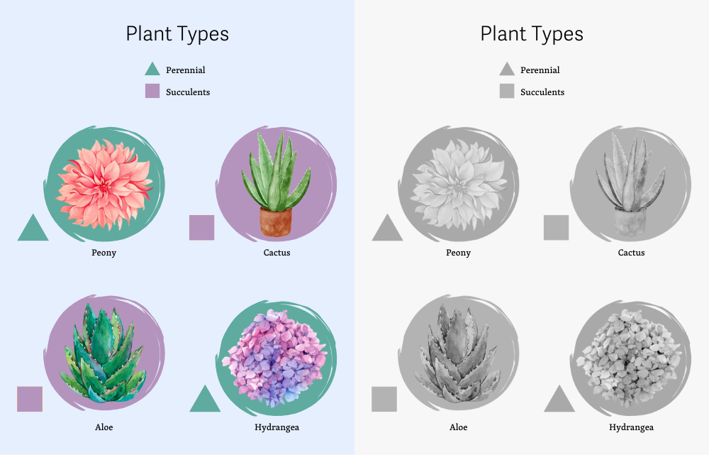
Imagine locating a list of plants on a website, all sorted into types. You’ve finally found the information you’re looking for. But the types are indicated by color alone - there’s just a long list of mosses and flowers, each in a different color showing its type.

This works great for users who can perceive color. They can easily see that flowers are shown in red and belong to Angiosperms, while mosses are shown in green and belong to Bryophytes. But for users who can’t perceive color, all the names look the same—and there’s no way to tell a flower from a moss. How frustrating to have the information you need right in front of you but to be unable to access it meaningfully.
It’s a reasonably easy problem to address. For example, we could add a different symbol or icon in front of each plant in the list, indicating the type it belongs to.
WCAG 1.4.1 seeks to address concerns regarding the use of color to communicate information. This guideline ensures that all users can access information that is communicated through color differences, even if the user can’t perceive color at all.
Who is affected?
People who are blind use assistive technology such as a screen reader or a refreshable Braille display to access the content on a website. These technologies do not distinguish or communicate colors, leaving these people out and unable to access information communicated by color alone. In this case, ensuring there’s a text alternative to the color is important. If we add a symbol or icon to indicate a category, we will be sure to add an alt text attribute to that symbol or icon so that information it communicates can be read by a screen reader or refreshable Braille display.
People with low or limited vision may also use a screen reader or a refreshable Braille display and face the same challenges. They might also utilize a magnifier that increases the size of the text and images to make them easier to perceive. But even with this help, it might be challenging to perceive differences in color alone, and an additional method of conveying information will be helpful.
Finally, there are many different forms of color blindness, all of which impact a person’s ability to perceive color. Color blindness is common, with as many as 10% of men unable to distinguish between red and green, for example. Users who are color blind and have no other disabilities are unlikely to be using assistive technology; some may not even be aware that there are colors they cannot perceive. For these users, an additional visual method of communicating color information, such as symbols, icons, or patterns, is helpful.
How to implement 1.4.1
About This Section
This section offers a simplified explanation and examples to help you get started. For complete guidance, always refer to the official WCAG documentation.
Provide Text Alternatives
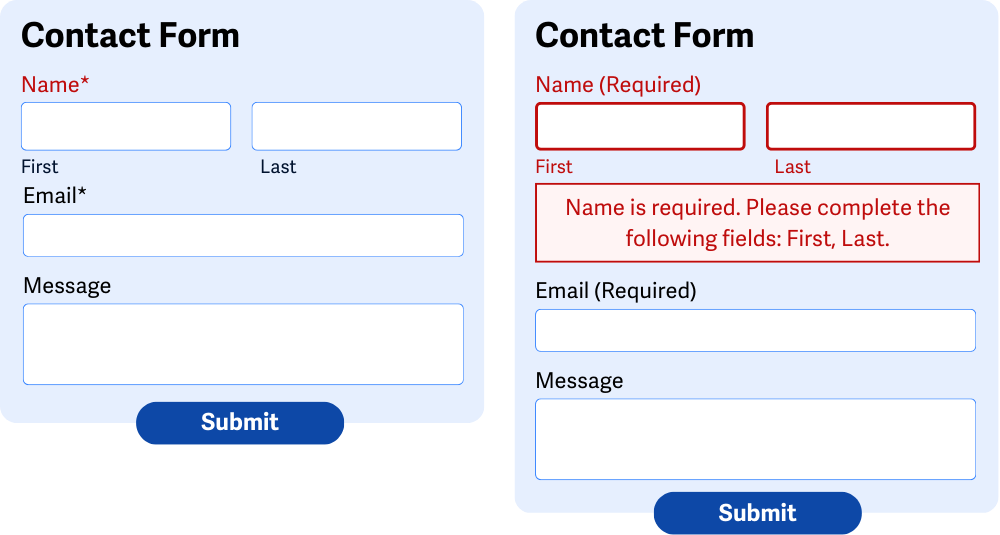
Ensure the information conveyed by color differences also has a text alternative. For example, if you create a form with several required fields, you might set the border color of the missed fields to red when the form has been submitted with missing data.
But a red border alone is not very helpful for users who have difficulty perceiving that color - you also need to include another way to distinguish these fields with errors from fields that don’t have errors. Adding text that identifies the error fields and explains the error is helpful not just for people who can’t perceive color but for anyone who might be puzzled about why a form field has an error.
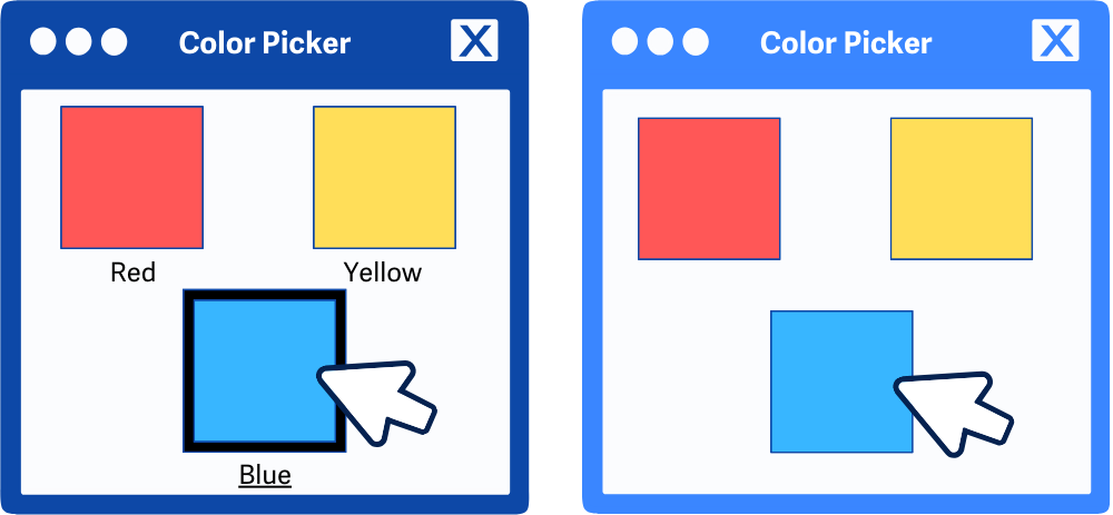
It doesn’t end there, though. If your site or form includes a color picker, you’ll want to ensure that the names of the colors are available with text. For example, you could add instructions that inform the user that the color swatch they are selecting is blue.
Links within Text
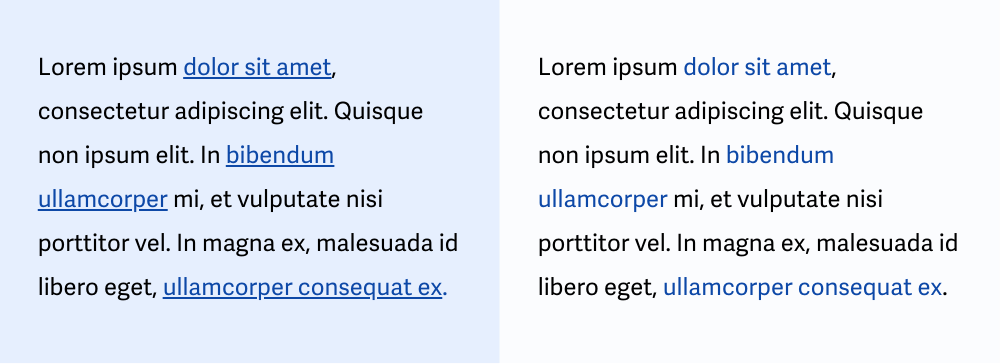
When it comes to hyperlinks situated within blocks of text, don't use color alone to differentiate between links and the surrounding text. Provide another visual cue. The preferred visual cue for links within the text is an underline for the links, but you might also opt to modify the font style, the font weight, the border, or even the font size to help differentiate links from the surrounding text.
Do convey additional information
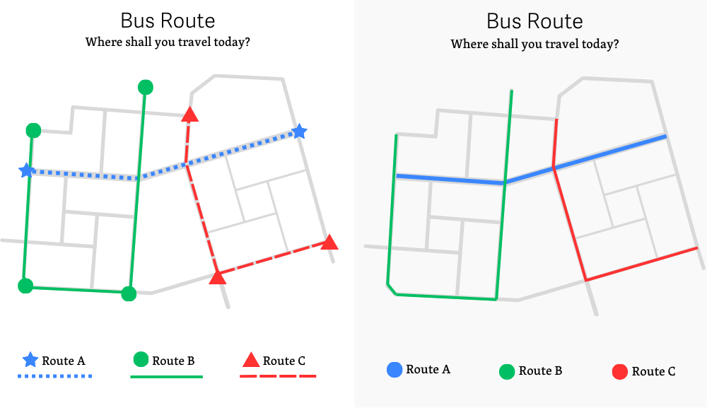
Say you have an image of a transportation map depicting various bus routes on a page. In this scenario, you will want to ensure color differences are being used to emphasize each route. You can’t just stop there, though - adding a symbol or icon for the route will also provide another means of differentiating routes from one another.
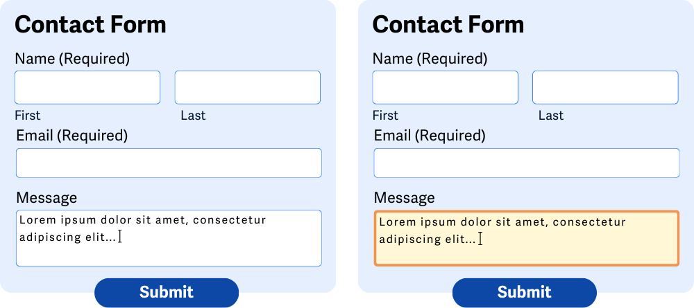
Make focus obvious
Many users are unable to use a mouse with comfort and accuracy and, therefore, navigate the web using just a keyboard. A user can move between buttons, form fields, and links using the Tab key alone. WCAG 2.4.7 Focus Visible requires that when an element receives keyboard focus, it has a clear visual indication. This helps keyboard-only users easily identify which element on the page currently has focus so they can be sure to follow the right link or click the right button.
We can add a clear visual indicator to an element by modifying the CSS to change the appearance of an element when it receives focus. That way, the element stands out and it’s easy to see where you are on the page.
Where WCAG 1.4.1 and WCAG 2.4.7 meet is that we can’t use color alone to indicate that an element has focus. For example, if we’re working with a form field, we might change the background color when the field has focus. However, we would also want to add an additional non-color indicator, such as changing the border width or adding an outline to the form field.
Conclusion
Sites with fantastic color usage and emphasis are easier to read, navigate, and understand - leading to greater engagement and happier visitors all around. Ensuring users who can’t perceive color can still access any information communicated by color doesn’t take much extra effort and goes a long way toward making your website and content available to everyone.