1.4.8 Visual Presentation
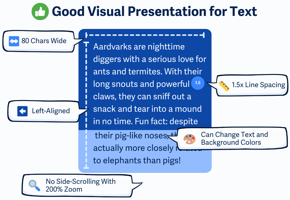
Blocks of text (like paragraphs) must have a line height of at least 1.5, not be justified, and stay within 80 characters (or 40 for CJK scripts). Allow users to adjust spacing and colors using custom styles.
What is it?
Blocks of text should be easy to read and flexible enough that users can adjust them based on their needs. This guideline outlines best practices for how text should be displayed—like using good line spacing, avoiding full justification, limiting line width, and letting users change colors.
Some people need more control over how text looks to read comfortably. So this rule helps ensure the design doesn’t get in the way of comprehension.
Why does it matter?
If users can't control how text looks — whether that's the color, text size, line spacing, or text width — it can make reading difficult or even impossible. Certain text styles, like full justification or squished lines, can be confusing or hard to track, especially for people with cognitive disabilities or low vision.
On top of that, long lines of text that stretch across the screen can cause people to lose their place, making it frustrating to read even simple content. Allowing users to adjust things like color, width, and spacing makes it easier for them to read and stay connected with your content.
Who is affected?
People with low vision might need to change colors, zoom in, or add space between lines to see more clearly.
People with dyslexia or other learning disabilities often benefit from shorter line lengths, generous spacing, and simple left-aligned text.
How to implement 1.4.8
About This Section
This section offers a simplified explanation and examples to help you get started. For complete guidance, always refer to the official WCAG documentation.
This guideline has several parts—and all of them must be met to fully pass. Let’s break them down:
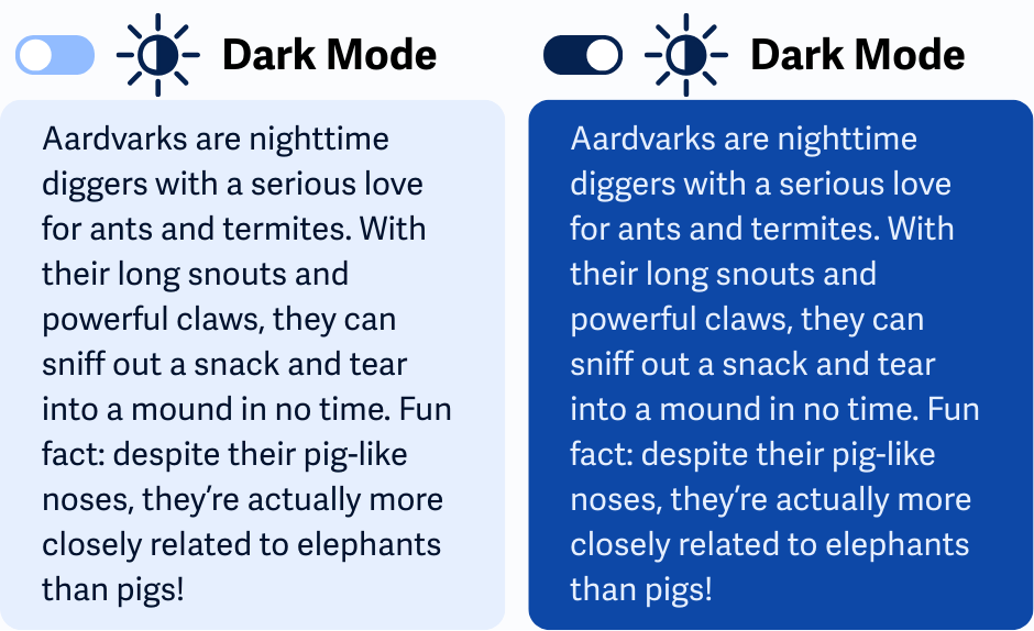
Allow for Background and Text Color Overrides
Let users change the text and background colors. You don’t need to build a color picker—just don’t block users from using their own browser settings or extensions.
Avoid:
- CSS that uses !important when setting colors
body { background-color: #ffffff !important; color: #000000 !important; } - Inline styles to hardcode colors.
<p style="color: #000000;">This is hard to override.</p> - Background images behind text, since users can't control the colors in the images.
To test, use a browser extension or a simple custom stylesheet to override the page’s text and background colors. If all blocks of text update correctly, you’re meeting this requirement.
Here's an example of a basic stylesheet you can add to the page for testing purposes only:
body {
color: yellow !important;
background-color: black !important;
}
Note: Developers should avoid !important for colors in a site's CSS, as it prevents user overrides. However, user stylesheets like these may use !important o enforce their preferences.
Maintain max-widths for Blocks of Text
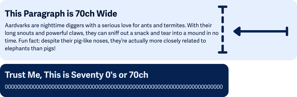
Keep line lengths reasonable. Blocks of text shouldn't be more than about 80 characters per line (40 for languages like Chinese, Japanese, or Korean since their glyphs are wider). This is helpful because narrower columns make it easier for users to keep track of where they are when reading blocks of text.
Setting max widths in the CSS is the best way to make sure your blocks of text don't get too long. Using relative units like ch, em, rem, or % helps keep the layout flexible and readable across different screen sizes and zoom levels.
Avoid full-width blocks for body text or long-form content.
.article-content {
max-width: 70ch;
}
While it's not a requirement, using the ch unit to set the width can be helpful. 1ch is roughly the width of the 0 (zero) character in the page's font, so setting a text container max-width to 70ch would help you achieve this requirement.
Even though the WCAG guidelines allow up to 80, you might consider using 70 instead of 80 to leave a little extra breathing room for things like padding, margins, or slight font differences that could otherwise push the line too long.
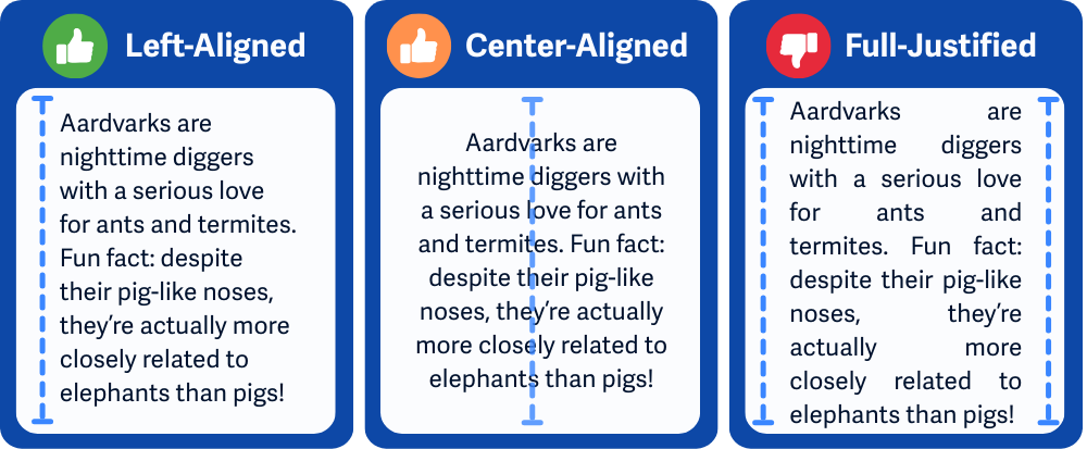
Align Text to One Side
Avoid full justification of text, which is when the text is stretched to touch both the left and right edges. Align text left or right, depending on the language, to keep the spacing between words consistent and easier to follow.
Center-aligned text is technically better than full-justified text, but it’s still not ideal for large blocks of content. Since there’s no consistent left edge, it makes it harder for your eyes to track where the next line begins. Centered text works fine for short pieces like headings, quotes, or invitations, but for blocks of text and long reading, it quickly becomes tiring and confusing.
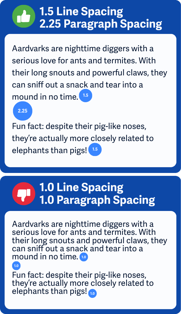
Add Extra Spacing Between Lines
For clear spacing, use at least 1.5x line spacing within blocks of text and 2.25x line spacing between blocks of text. This breathing room helps users read line by line without losing their place.
Applying explicit line-height and margin-bottom CSS properties let you control the minimum spacing inside and between blocks of text. Here's an example adding explicit line-height and margin-bottom to the <p> elements:
/* Add extra spacing for better readability:
- 1.5 line height spaces out lines within paragraphs.
- 2.25em margin adds extra space after each paragraph (about 1.5x the line height).
*/
p {
line-height: 1.5;
margin-bottom: 2.25em;
}
Though similar, WCAG 1.4.12 Text Spacing (AA) focuses on preserving spacing when users make changes. This guideline is about setting good spacing by default.
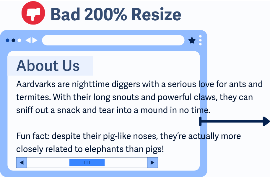
Allow Resizing Without Side-Scrolling
Your layout should reflow when users zoom in up to 200%. That means no horizontal scrolling just to read a sentence. Design responsively so blocks of text wrap properly and adjust to fit the screen—even on tablets or mobile devices.
Resizing without breaking the layout is also covered in WCAG 1.4.4 Resize Text and WCAG 1.4.10 Reflow.
Conclusion
WCAG 1.4.8 is all about keeping blocks of text easy to read and flexible to use. Giving users control over things like color, spacing, and layout isn’t just helpful—it’s essential for people with visual and cognitive disabilities. And honestly, it just makes a better experience for everyone.