What is it?
As a user moves through content on a web page, focusing on an element shouldn’t cause any unexpected changes to the context of the page. Focusing means that an element on the page can get keyboard input, but whatever actions are tied to the element shouldn’t be triggered just by having the item in focus.
Changing context can include big shifts like:
- Moving users to a new tab in the browser
- Scrolling a user to a different part of the page
- Changing the focus to a different element on the page
- Swapping the content so that the meaning of the page changes
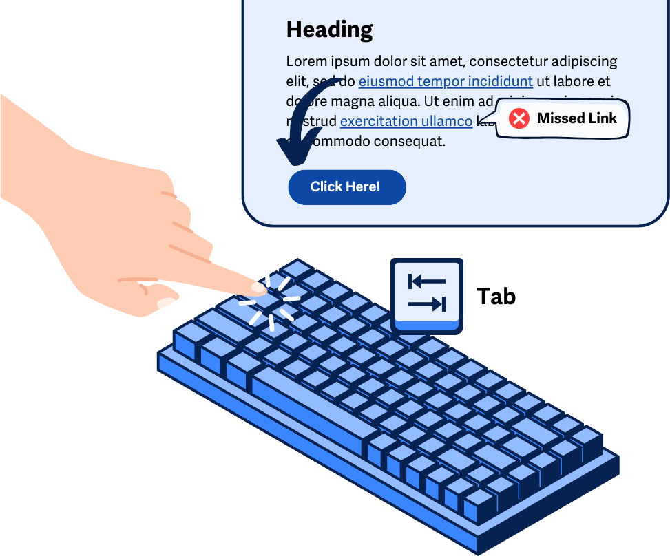
For example, tabbing to a submit button should not automatically submit the form. Or, focusing on a text field should not open a new window without warning.
The goal of this guideline is to make navigating content predictable and avoid throwing users off or confusing them out of nowhere.
Why does it matter?
Unpredictable behavior when interacting with a web page can be frustrating and can even render the content unusable for some people.
People with visual impairments may become confused and disoriented when the context changes unexpectedly, while those with cognitive disabilities may struggle to understand why the changes happened, which can lead to frustration.
For users with motor impairments, unexpected context changes can disrupt tasks and make it difficult to recover, often leading them to give up on the site. Even people without disabilities might find these changes annoying, which can add up to an overall bad user experience.
Users who rely on assistive technology can even find themselves stuck in a loop where they can’t get past certain elements on the page since focusing on them would cause other actions to happen that take over the focus each time.
Who is affected?
People with limited mobility might find it hard to get back to where they were before the unintended actions happened which ends up creating unnecessary movements that could be stressful or painful.
People with cognitive disabilities may find it difficult to process unexpected shifts in focus, or might not even realize that the context has changed at all.
People with limited vision or who are blind typically rely on assistive technology to navigate content, and as they tab through and move their focus, can find it confusing and frustrating if context changes without warning.
How to implement 3.2.1
About This Section
This section offers a simplified explanation and examples to help you get started. For complete guidance, always refer to the official WCAG documentation.
Use “Activate” As A Trigger for Changes in Context
Instead of triggering actions just because an element is focused, you should wait until the element is activated. This means the user intentionally takes an action, like clicking a button or pressing a key, to make something happen. This way, when users are tabbing through the content, they won’t accidentally trigger changes.
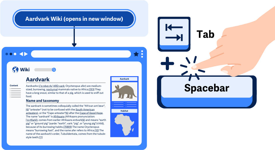
For example, a button should only do its job (like submitting a form) when the user both focuses on it and then presses the spacebar or Enter key.
To make sure this works correctly, use a keyboard to tab through all the content and check that nothing unexpected happens, just from moving focus to different elements.
Activating will be different depending on the element, in any case, it’s just important that the user is taking a purposeful action to trigger something to happen on the page.
Other Recommendations
While not specifically required to meet this guideline, there are a few other suggestions that will make the overall experience much smoother for users navigating through content.
Open New Tabs Only When Necessary
In general, it’s better to cut down on the number of links or buttons that open new windows or tabs since this can throw off users who can’t visually see the changes. It’s recommended that when links are opened in new windows, there’s some advance warning.
Giving Users Advance Warning When Opening a New Tab
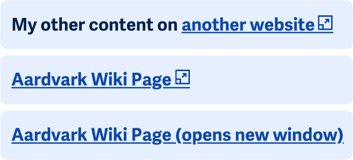
Clearly stating or showing when an element will open a new tab or window can help users decide if they want to activate that element. It’ll also help them understand that the ‘back’ button won’t work on that new tab they’ve been sent to.
This can be done through a text warning, such as “Aardvark Wikipedia (opens in a new window)”. Or, it can be done through icons/symbols, aria-hidden, and CSS.
<a href=" <a href="https://en.wikipedia.org/wiki/Aardvark">https://en.wikipedia.org/wiki/Aardvark </a>" target="_blank">Aardvark Wiki Page <i aria-hidden="true"class="fa-solid fa-up-right-from-square"></i><span class="hide-opens-new-tab">Opens in a new tab</span></a>
.hide-opens-new-tab {
position: absolute;
top: auto;
overflow: hidden;
clip: rect(1px 1px 1px 1px); /* IE 6/7 */
clip: rect(1px, 1px, 1px, 1px);
width: 1px;
height: 1px;
white-space: nowrap;
}
In this example, a span element is placed right after the new window icon but is hidden with CSS. This allows screen readers to read out the text “Opens in a new tab” along with the link text, but visual users only see the symbol.
Conclusion
Making sure that actions only happen when users intentionally trigger them, rather than just when they focus on something, is key to keeping things predictable and accessible. By sticking to these guidelines, you help avoid confusion and frustration, especially for people with disabilities.