3.2.2 On Input
No unexpected changes must happen when a field value changes (like auto-submit, reload, open new page).
What is it?
When someone uses a form or an input field on a web page, interacting with those elements shouldn’t cause any unexpected changes to what’s going on with the page. This could mean a person typing into a field, picking an option from a checkbox or radio button, or adjusting settings on a page.
Changing context can include big shifts like:
- Moving users to a new tab in the browser
- Scrolling a user to a different part of the page
- Changing the focus to a different element on the page
- Swapping the content so that the meaning of the page changes
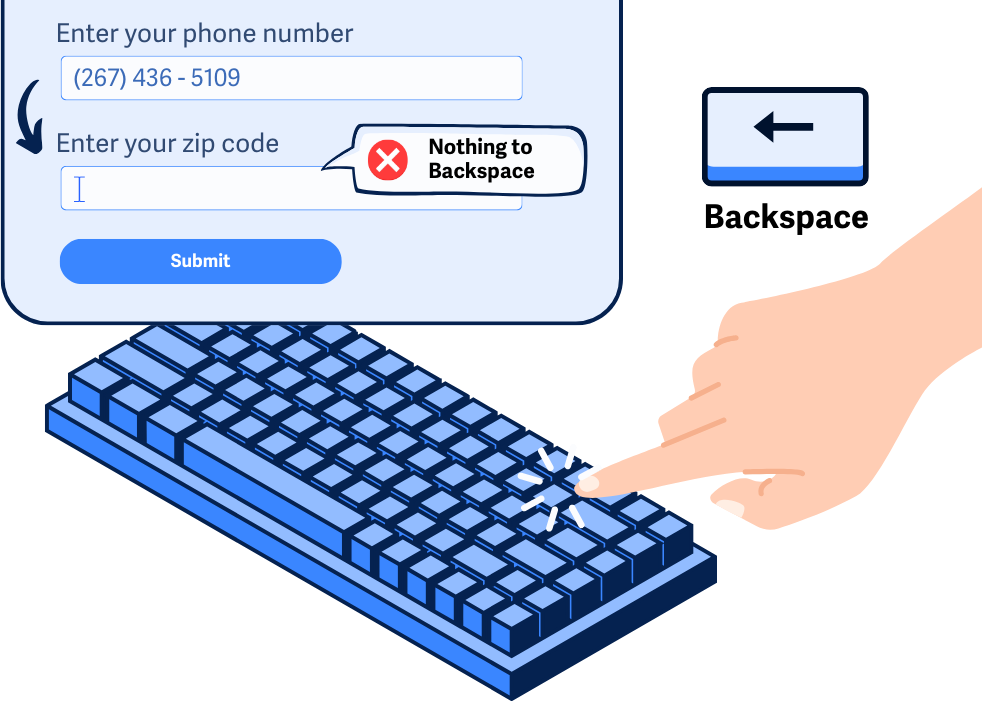
For example, imagine someone entering their phone number into a field, and once the number is fully typed, the focus automatically jumps to the next field in the form. If there wasn’t any heads-up that this was going to happen, this sudden change could cause a lot of confusion—especially if they need to fix their phone number and try to hit backspace.
The goal of this guideline is to make sure that entering inputs, like typing into fields or making selections, is predictable and doesn’t confuse people.
Why does it matter?
Unpredictable stuff happening when you’re using form fields or changing settings can be frustrating and might even make the page elements impossible to use. This, in turn, can make basic tasks like submitting a form or updating a profile page challenging.
Changing the context after making inputs can be really disorienting for folks with visual disabilities who can’t see sudden changes on the page. Without any heads-up that something is about to happen, these users can end up lost when they’re suddenly on a new page or in a different part of the form. At that point, it’s hard to say if they’ll be able to get back to where they were or if they’ll just decide to leave the site entirely.
Disruptive context changes can be confusing, and it can be hard to figure out what caused the shift and how to undo it. For those with cognitive disabilities, these visual cues and context changes can be tough to interpret, which can lead to anxiety.
Who is affected?
People with cognitive disabilities may find it difficult to process unexpected context changes, or might not even realize that the context has changed at all.
People with limited vision or who are blind typically rely on assistive technology to navigate content, and as they enter their inputs, can find it confusing and frustrating if context changes without warning.
How to implement 3.2.2
About This Section
This section offers a simplified explanation and examples to help you get started. For complete guidance, always refer to the official WCAG documentation.
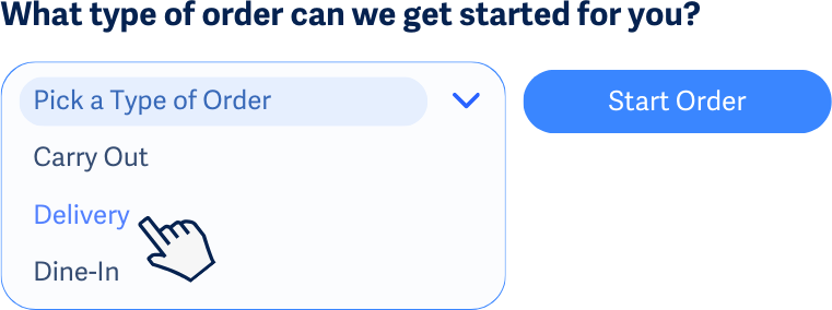
Use a Button For Changes of Context or to Perform Actions
Make sure users can choose when things change by clicking a button or a link since these elements are expected to activate an action. This way nothing happens until the user is ready, instead of the action happening as a side effect of interacting with a form or a field.
Imagine a dropdown menu where you pick an option, but nothing happens until you hit a "Go" button. This way, if you accidentally scroll through options, it won’t trigger anything until you confirm by clicking the button.
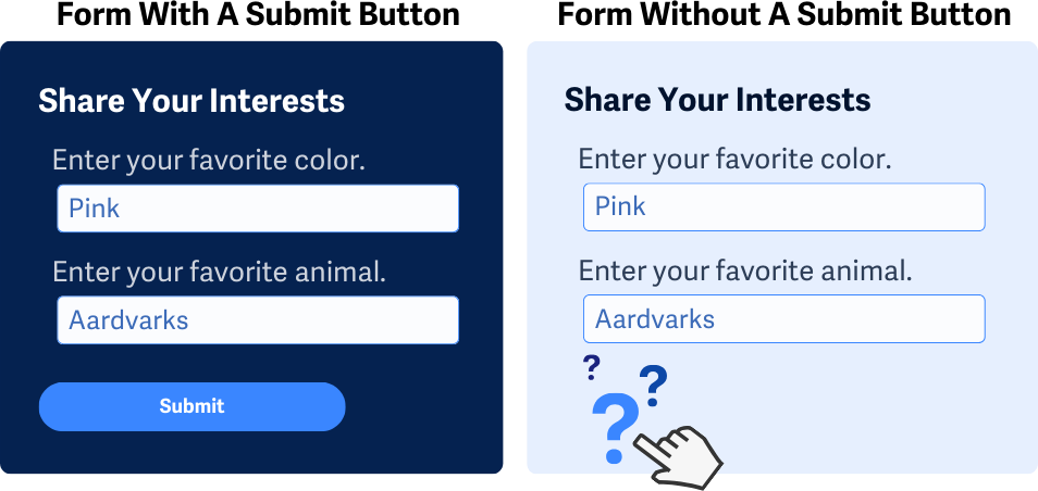
Submit Buttons for Forms
As mentioned above, buttons are expected to activate actions, with that in mind, forms should always have a submit button. Using a clear button helps people know how to send their info without getting confused.
For example, when you fill out an online order form, there’s a big “Submit Order” button at the bottom. It’s clear that pressing it will send your order, as opposed to having the order submission go through based on the credit card information fields getting filled in.
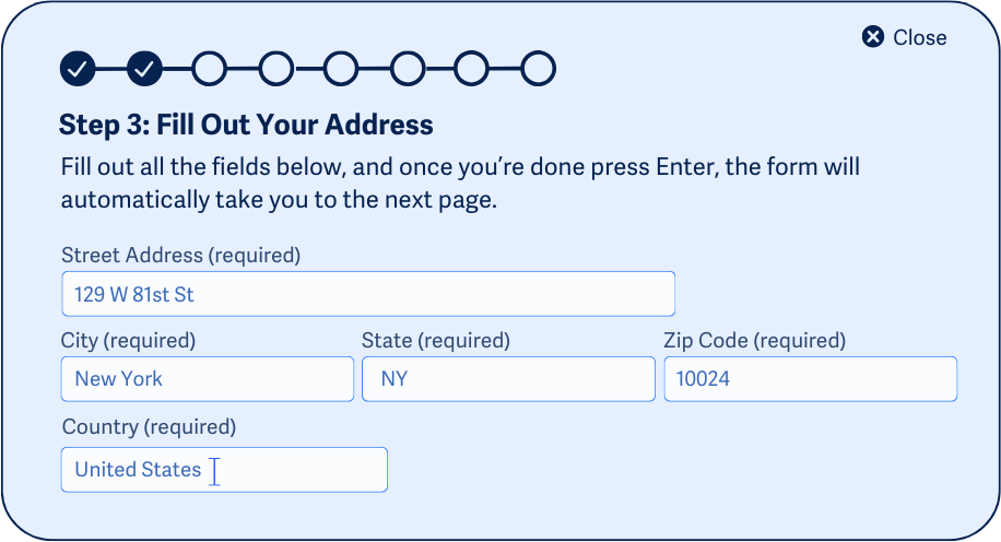
Give Notice Before Element Changes the Context
Let users know what’s going to happen in advance for every input that will change the page’s context. Since changing a form’s setting or entering info into a field usually doesn’t do that, it’s crucial to give users a heads-up if it will.
Ideally, these instructions should be tied directly to the form control itself so users see them right when they need them.
For example, in a multi-step survey where each answer leads to the next question, instructions at the beginning should explain that clicking an answer will move them forward in the form.
Conclusion
WCAG 3.2.2 is all about making sure using forms or input fields is straightforward and free of surprises. By giving users control over when things change and giving a heads-up when something will shift the page, you make your site easier and more accessible for everyone.