3.3.2 Labels or Instructions
Form fields must have clear labels or instructions to avoid confusion and help complete the input correctly.
What is it?
Form fields that require user input need to provide clear labels and instructions so that users know what information to enter. The goal is to provide enough direction so the user knows what to enter and in the correct format; however, not giving so much information that it becomes unhelpful (I’m looking at you, US tax forms!).
Clear labels and instructions help users avoid confusion or frustration, as well as make the form-filling process smoother by reducing errors and repeated submissions.
Note that the guideline does not focus on:
- Making sure the fields and labels are programmatically connected (WCAG 1.3.1 Info and Relationships, Level A)
- Requiring that the labels or instructions are descriptive (WCAG 2.4.6 Heading and Labels, Level AA)
- Checking if ARIA attributes were used to provide a label or description for the form field (WCAG 4.1.2 Name, Role, and Value, Level A)
- Elements such as buttons or links that don’t involve entering data
This criterion simply requires that data input fields have labels as well as any necessary instructions.
Why does it matter?
If a website or app doesn't have labels or instructions for data input fields, users may not know what information is needed, leading to confusion. This can be confusing for anyone and can present a huge barrier for people with cognitive disabilities.
Without clear instructions, users are more likely to enter the wrong information or enter the correct information in the wrong format. For instance, if it's not clear that a date needs to be in a specific format, users might enter it incorrectly. And when users make mistakes because of unclear instructions, they often have to go back and correct them, which can be frustrating and time-consuming.
For people using screen readers or other assistive technologies, the lack of proper labels can make it almost impossible to understand and fill out a form. Assistive technology relies on these labels to convey what each field is for. Users might skip fields if they're not sure what to enter, leading to incomplete forms that can't be processed.
Who is affected?
People with cognitive disabilities may have difficulty processing information, figuring out what information is required, or understanding the purpose of different fields without clear labels and instructions.
People with visual disabilities who rely on screen readers or other assistive technologies need properly labeled fields to understand what information is required. Without these labels, screen readers cannot convey the necessary details, making it difficult or impossible to complete the form.
People with mobility impairments might have difficulty using a mouse or keyboard efficiently may find it frustrating to correct errors or navigate through a form multiple times due to unclear instructions or labels.
How to implement 3.3.2
About This Section
This section offers a simplified explanation and examples to help you get started. For complete guidance, always refer to the official WCAG documentation.
Clear Labeling for Interactive Components
Check that form <input> fields have an always-visible <label> that clearly identifies:
- The purpose of the field or component
- Includes any necessary instructions to use the component
- Lists any formatting rules for data entry or provides an example
The data input label should always be visible to help all users understand the purpose. Using placeholders that disappear as soon as the user begins typing in a field is not sufficient for labeling input fields.
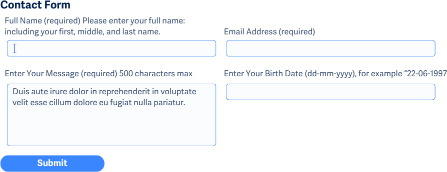
<label for="date">Enter Your Birth Date (dd-mm-yyyy), for example "22-06-1997"</label>
<input type="text" name="date" id="date" />
Please note that for this technique, you must follow the instructions listed above as well as combine it with the suggestions in one of the following subsections.
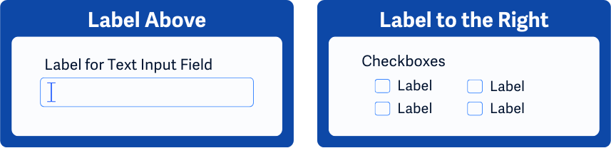
Proper Label Positioning for Form Fields
In addition to providing clear labels, the position of the labels is also important to meet this guideline. When labels for form fields are placed where users expect them, it's easier to understand and navigate complex forms.
For left-to-right languages (such as English), labels usually go to the left or above the field, while for right-to-left languages (such as Arabic), they go to the right or above. For radio buttons and checkboxes, labels are usually placed after their respective checkbox or button.
Indicating Required Form Fields
The <label> should also include text to show that a field is mandatory for successful form submission. For each required field, make sure that the label includes text to mark it as required. For example, “First Name (required)”.
aria-describedby For Providing Additional Descriptive Information
In the case where the form field’s <label> element does not provide enough information, the aria-describedby attribute can be used to link additional descriptive information to the field.
In this example, a text field is used to collect a user’s full name. The aria-describedby attribute is tying the <p> element’s contents with the <input> field using the idattribute set to “name-desc”.
<form ...>
    <label for="name">Full name</label>
    <input aria-describedby="name-desc" id="name" type="text"/>
    <p id="name-desc">
        Please enter your full name; including your first, middle, and last name.
    </p>
</form>
aria-labelledby for Concatenating Multiple Labels
The aria-labelledby property can combine multiple labels and give them an order so that screen readers can read them as one continuous label. This can come in handy when:
- A separate
<input>value needs to be included in the label - Space is limited for additional labeling text, and the labels can instead be pulled from other locations on the page
To implement aria-labelledby, assign unique id attributes to each label string that should be combined into a single label for an <input> element. The value of the aria-labelledby attribute is then a space-separated list of these id in the order they should be read by screen readers.
In the following example, an <input> table takes in values for an animal shelter stocking the dog and cat food bags. Because the input fields are part of a table, the space is limited. In this case, the <label> for the input fields is being pulled and concatenated using the aria-labelledby property using the table’s existing headings.
The first text field’s label would be “Dog Food Number of Bags”. And the second is “Cat Food Number of Bags”.
<table>
    <tr>
        <td></td>
        <th id="dogFood">Dog Food</th>
        <th id="catFood">Cat Food</th>
    </tr>
    <tr>
        <th id="bags">Number of Bags</th>
        <td><input type="text" size="20" aria-labelledby="dogFood bags" /></td>
        <td><input type="text" size="20" aria-labelledby="catGood bags" /></td>
    </tr>
</table>
aria-labelledby and Group Role to Label Related Fields
Sets of related fields can share the same common label by using aria-labelledby on the wrapper element, along with the role property set to “group”.
In the following example, a set of fields used for collecting a billing address all share the same label of “Enter Your Billing Address”.
<div role="group" aria-labelledby="billingAddress">
    <span id="billingAddress">Enter Your Billing Address</span>
    <input type="text" title="Street Address"/>
    <input type="text" title="City"/>
    <input type="text" title="State"/>
    <input type="text" title="Zip Code"/>
</div>
Semantic Grouping of Form Controls
Use the <fieldset> element to enclose related fields, starting with a <legend> for a descriptive label. Grouping is crucial for related radio buttons and checkboxes to convey their collective context.
Assistive technology often presents the legend before each individual field label to remind users of the group context. Please note that this is the preferred method over using aria-labelledby and the group role property.
<fieldset>
    <legend>Choose your favorite type of pets:</legend>
    <div>
        <input checked="checked" id="dogs" name="dogs" type="radio" value="a">
            <label for="dogs">Dogs and Puppies</label>
        </div>
        <div>
            <input id="cats" name="cats" type="radio" value="b">
                <label for="cats">Cats and Kittens</label>
            </div>
        </fieldset>
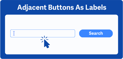
Using Adjacent Buttons to Label Fields
When a button next to an input field has a clear label, it can act as the field's label, helping users understand its purpose without adding extra text. These buttons usually come after the <input> element.
Conclusion
Implementing clear labels and instructions for form fields is crucial for creating an accessible and user-friendly web experience. By following WCAG 3.3.2 guidelines, websites properly labeling fields can reduce errors and frustration, making the form-filling process smoother and more efficient for visitors.