3.2.6 Consistent Help
Some form of help is available from every page.
What is it?
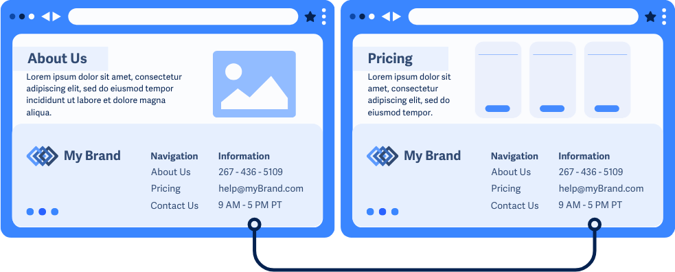
If a website offers options or info to help users with questions or issues, their placement on relevant pages should be consistent and stay in the same general order compared to the other elements on the page. For example, if the hours of operation are in the footer of the homepage, they should stay in the footer on all other pages that include those hours.
Help options or details can include:
- Contact forms or chat systems to reach human support teams
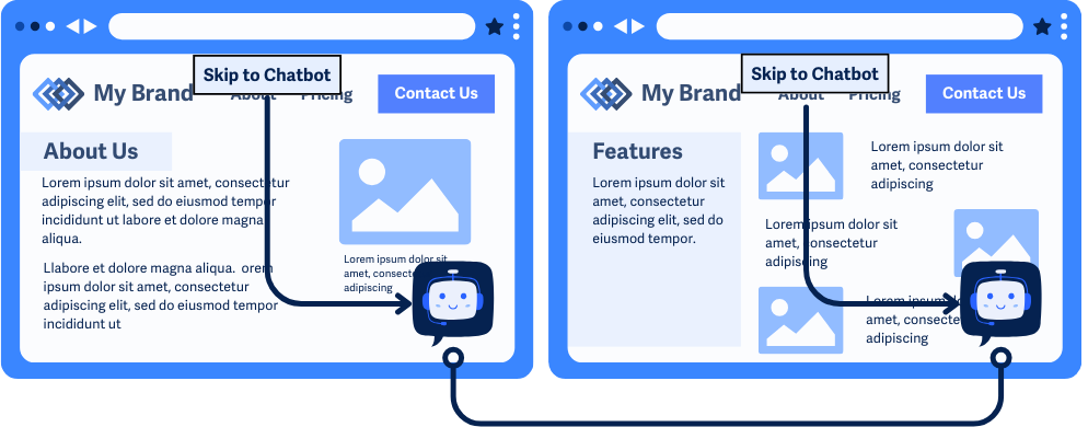
- Chatbots to reach automated systems
- Contact info such as phone number, email address, hours of operation
- Self-help options such as documentation pages or frequently asked questions sections
Keep in mind, this rule doesn’t require your website to offer help options or details, but if they’re available, they need to be in a consistent spot. This also only applies to relevant and related sets of pages—if your site has a subdomain with totally different content or functions, then the location can be different.
The goal of this rule is to make sure that the placement of help details and options is consistent and easy to find.
Why does it matter?
When help options or details are scattered across different pages, it can be tough for users to find the help they need. Moving around contact links, chatbot popups, or FAQ sections across similar pages can confuse users as they browse a site.
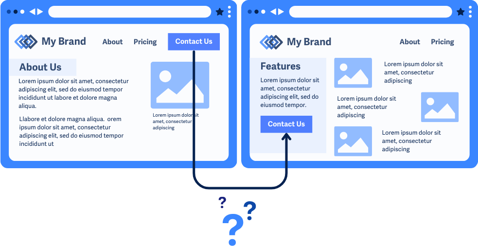
For example, imagine seeing a “Contact Us” link in the header of the homepage. Then, you visit the features page and have a question. You’d expect the “Contact Us” link to still be in the header, but it’s now at the bottom of the sidebar instead. You might get frustrated and leave the page without asking your question.
Who is affected?
People with cognitive disabilities. People with low or limited vision. People who are blind.
People with cognitive disabilities may have trouble finding help when they’re stuck or have questions, so keeping help options in the same spot lets them avoid searching for those options on each page.
People with low or limited vision or who are blind might use assistive technology to navigate through pages. Keeping help options in the same place programmatically makes it easy for them to find the links they need, no matter which page they’re on.
How to implement 3.2.6
This section offers a simplified explanation and examples to help you get started. For complete guidance, always refer to the official WCAG documentation.
Help Options in Consistent Location
First, go through the pages on your site and figure out which groups of pages make up related sets. For example, marketing pages like “Home,” “Features,” and “About” could be part of the same set. Or, a blog where each post uses a similar template would be considered a unique set of pages.
Next, find all the helpful options or information that fall under these categories (if any):
- Contact Details
- Contact forms or messaging systems
- Self-help options, such as FAQ sections or links to a documentation page
- Chatbots
As you review each page within the relevant set, make sure these options are in the same spot both visually and programmatically. This means that the placement looks the same across pages and that the tabbing order is similar, too.
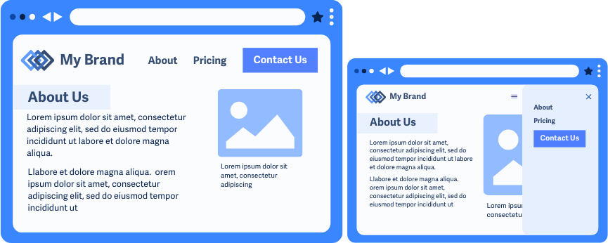
Changing Browser Size or Zoom Settings
Resizing a page can cause the layout to change or shift, which means that contact information or help options might move out of the expected location. However, this is just a side effect of responsive and adaptive designs and is considered an exception for this success criterion.
But just note, while the help options do not have to be consistent across the different zoom levels or window sizes. They should still be consistent within the set of pages at the same zoom level and particular window size you’re testing with.
Conclusion
To wrap it up, WCAG 3.2.6 is all about keeping help options in the same spot across related pages on your website. This consistency makes it easier for everyone, especially those with cognitive or visual disabilities, to find the support they need without getting frustrated.