1.4.13 Content on Hover or Focus
When additional content appears on hover or keyboard focus (including long press on touch), it must stay visible until dismissed or no longer valid, be dismissible (e.g. using the Esc key), and remain visible when hovered or focused.
What is it?
When content appears on hover or focus, users should be able to:
- Dismiss it
- Interact with it without it disappearing
- Have enough time to read or engage with it
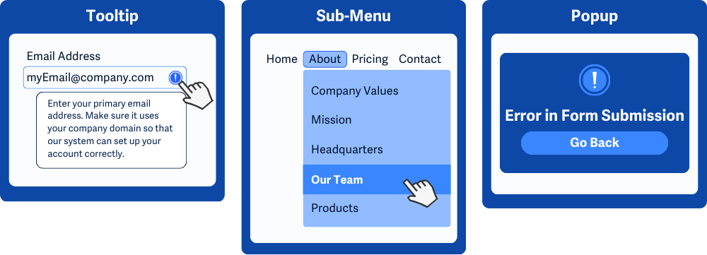
This applies to hover or keyboard focus-triggered content such as tooltips, sub-menus, or popups. It ensures that these elements are dismissible, hoverable, and persistent and don’t interfere with a user’s reading experience or cause them to miss content.
Why does it matter?
When content isn’t dismissible, hoverable, or persistent, it can create significant frustrations for users or make pages unusable. If users can’t dismiss extra content, it might block key parts of the page, making it impossible to interact with the original content. For example, a tooltip or popup that can’t be closed can completely hide important information or buttons.
When hoverable content disappears the moment the pointer moves away, users might never get the chance to read or interact with it fully. This is challenging for people who need more time to process the content or who rely on screen magnification, where moving the pointer might require panning across a zoomed-in screen.
If content isn’t persistent and vanishes too quickly, it can leave users confused or frustrated, especially those with cognitive or motor impairments. They might not even realize what happened or have the time to engage with the content.
Who is affected?
People with low or limited vision may need more time to read or dismiss content or may find it challenging to keep the pointer in the right spot on a zoomed-in screen.
People with motor impairments can find it difficult to maintain precise pointer movements to keep content visible for long enough to read or interact with it.
People with cognitive disabilities may find it hard to understand unpredictable content. They may not know what’s causing the content to show up or know that they need to read it quickly.
How to implement 1.4.13
About This Section
This section offers a simplified explanation and examples to help you get started. For complete guidance, always refer to the official WCAG documentation.
Make Content on Focus or Hover Hoverable, Dismissible, and Persistent
Check that any additional content that appears on keyboard focus or hover actions can be dismissed without shifting focus or moving the mouse away, doesn’t suddenly disappear, and the user has enough time to read or engage with it.
If the extra content is covering other information on the page, users might want to dismiss it to see what’s underneath without losing their current place.
For example, if you're focused on a button and a tooltip pops up, you should be able to hit Esc (or a shortcut) to close it while keeping focus on that button, instead of having to tab away or click elsewhere.
Hover-Triggered Action
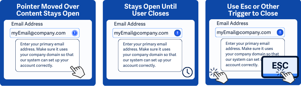
All content triggered by hover must meet three requirements. Here's what that means:
- Hoverable: You can move the pointer from the trigger onto the additional content without it disappearing.
- Persistent: The additional content remains visible until the user chooses to dismiss it or moves the pointer away from both the trigger and the extra content.
- Dismissible: The content can be dismissed without moving the pointer, usually by pressing
Escor another documented shortcut. (Note: WCAG lists "re-activating the trigger" as a possible method, but this only applies if the trigger can also be clicked/toggled. It doesn’t apply to pure hover-only triggers.)
Keyboard Focus-Triggered Action
All content triggered by focus must meet two requirements. Here's what that means:
- Persistent: The content remains visible until the user either moves focus away from the trigger or explicitly dismisses it.
- Dismissible: The content can be dismissed without shifting focus, usually by pressing
Escor another documented shortcut. Re-activating the trigger (e.g., pressing Enter/Space again) can also be valid here if the control is designed as a toggle.
ARIA role=”tooltip”
Use ARIA attributes like role="tooltip". This attribute signals to assistive technology, such as screen readers, that the associated content is a tooltip and makes it clear that it provides added information about a particular element.
When combined with aria-describedby attribute, you can link the tooltip to the trigger so that screen readers can announce the tooltip content when the trigger gains focus.
CSS pseudo-classes
Using CSS pseudo-classes like :hover and :focus allows you to control how elements behave and look when a user interacts with them.
:hoverApplies styles when a user hovers their pointer (mouse or trackpad) over an element.:focusApplies styles when an element receives keyboard focus, such as when a user tabs to a button or input field.
These pseudo-classes help style interactive states, but they don’t control behavior like dismissing content. Use JavaScript or ARIA attributes for those interactions.
Conclusion
Hover and focus-triggered content can be helpful—if it’s thoughtfully designed. By making it dismissible, hoverable, and persistent, you create a smoother, more inclusive experience for everyone.