1.4.4 Resize Text
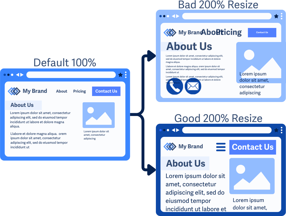
Text remains readable and usable when zoomed to 200%.
What is it?
Text on a web page should be resizable up to 200% without distorting the layout or losing functionality. This allows users who need larger text to read comfortably without the need for additional assistive tools like screen magnifiers.
Why does it matter?
When text can’t be resized, reading the content on the page can be difficult. Small, fixed-size text forces users to strain their eyes, which can lead to fatigue and frustration. If users are unable to read the content, they may abandon the site altogether.
On the other hand, if resizing is possible but breaks the layout, this can cause other issues, such as breaking interactive elements or causing text to overlap, which can lead to text still being unreadable or making it impossible to navigate the site.
Who is affected?
People with low or limited vision may find small text challenging to read, which can prevent them from understanding or interacting with the content.
How to implement 1.4.4
About This Section
This section offers a simplified explanation and examples to help you get started. For complete guidance, always refer to the official WCAG documentation.
Use Relative Measurements
Make sure text content can be scaled up to 200% with the browser zooming features without breaking the layout or usability. This is done by specifying font sizes, container sizes, and element positions using relative measurements such as rem, em, or %, vw, or vh.
Avoid using absolute units such as pixels, points, picas, inches, and centimeters when specifying element and layout styling.
Double-Check Across Screen Sizes
Check that text scaling works across all screen sizes, including responsive designs that adapt via media queries. Also, see that resizing text doesn’t lead to overlaps, cut-offs, or vertical text columns that reduce readability.
Images of Text
Avoid using images of text, as these don’t resize well and can lose readability when zoomed. This is also a success criterion of its own, check out WCAG 1.4.5 Images of Text for more information.
Conclusion
WCAG 1.4.4 allows text to be resized up to 200% without losing readability or breaking the layout. People with visual impairments or anyone who prefers larger text should be able to adjust it easily without dealing with broken page layouts or hard-to-read content. Using relative units for font sizes and designing flexible, responsive layouts can prevent these issues and create a smoother user experience.