What is it?
Keyboard focus indicators must be clearly visible for users who rely on keyboard navigation. As a user navigates a page with a keyboard, the element receiving focus must be easily seen by adding noticeable borders, outlines, or color changes and making sure the change has enough contrast from the original element.
Focus indicators visually identify the element that currently has keyboard focus. This success criterion ensures that indicator styles are clearly visible, not just present.
Comparing 2.4.7 Focus Visible
The main goal of WCAG 2.4.7 Focus Visible (Level AA) is to make sure that focus indicators exist and are applied to elements when they receive focus. WCAG 2.4.13, however, is about how clearly the focus indicator appears - not just that it's there.
Why does it matter?
For users who rely on keyboard navigation, knowing which element is focused on a webpage is essential. Without a clear focus indicator, users may become disoriented or make mistakes when navigating through interactive elements like buttons, links, or form fields.
Imagine using a website without knowing which link you’re about to click or which form field you're typing in. A clear and noticeable focus indicator ensures users can follow the flow of interaction, reduce errors, and engage more confidently with content.
Who is affected?
People with mobility impairment often rely on keyboard navigation to interact with websites. A visible and easily discernible focus indicator reduces strain and improves navigation, making interactions smoother and more accurate.
People with cognitive disabilities such as ADHD, dyslexia, or short-term memory limitations benefit from focus indicators that help them keep track of their position on a webpage and avoid distractions.
People with low vision, including those who rely on screen magnifiers, benefit from focus indicators that are large and high-contrast, making it easier to track focus as they navigate.
How to implement 2.4.13
About This Section
This section offers a simplified explanation and examples to help you get started. For complete guidance, always refer to the official WCAG documentation.
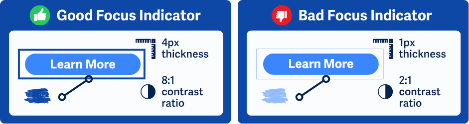
Size and Contrast For Focused Elements
To meet this success criterion, the focus indicator must be large enough to be visible and have sufficient contrast to meet WCAG 1.4.11 Non-text Contrast. There are two ways to meet this:
- The focus indicator must be at least
2pxthick and have at least3:1contrast with adjacent pixels, or - The entire element must change color and have at least
3:1ccontrast between focused and unfocused states.
Navigate through the webpage with a keyboard and ensure all focus indicators meet one of these requirements. This includes buttons, links, form fields, and custom components.
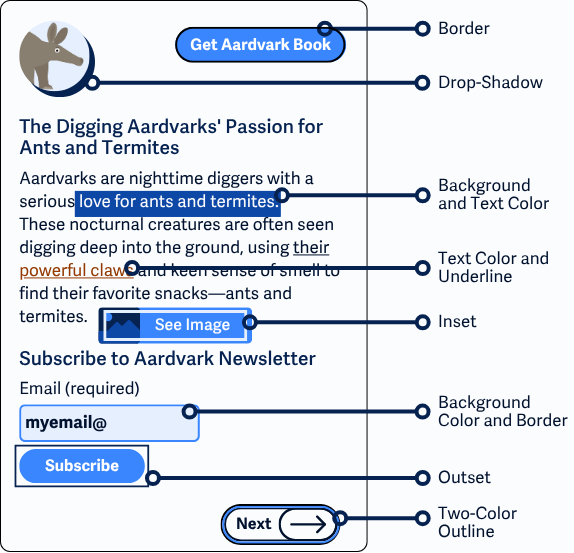
Inset Indicators
Inset focus indicators, such as a border inside a component, are harder to perceive. To meet the minimum area requirement, they must be large enough, typically at least 3px thick, to maintain visibility. If possible, use outside or offset indicators instead.
Don’t Rely on Browser or Operating System Defaults
Most browsers and operating systems automatically highlight standard controls like text fields and links when they receive focus. However, these defaults may be inconsistent across platforms and may not meet contrast or size requirements. Use custom styles to ensure compliance.
Style Focus Indicators with CSS
Use the CSS :focus-visible and :focus pseudo-classes to apply custom styles to elements when they receive focus.
:focus-visible is especially helpful because it targets keyboard navigation specifically, showing the focus ring only for users who need it.
a:focus-visible {
outline: 2px solid blue;
}
Focus indicators are also useful for mouse users. For example, when filling out a form, it’s helpful to clearly see which field is currently active.
input[type="text"]:focus {
outline: 2px solid red;
background-color: pink;
}
Two-Color Focus Indicators
This technique uses a dual outline or box shadow with 9:1 contrast between the two colors, making it highly visible on any solid background. It works best over flat backgrounds (not gradients or images).
Use a transparent outline so that the indicator still shows in forced-color (high-contrast) modes.
a:focus-visible {
outline: 2px solid transparent; /* Makes visible in forced-color modes */
box-shadow: 0 0 0 2px #ffffff, 0 0 0 4px #000000; /* Light and dark contrast colors */
}
Forced Colors Mode Consideration
In Windows High Contrast mode or similar forced-color settings, style like box-shadow may be overridden. Using outline: transparent ensures the browser still shows the default system focus style.
Conclusion
The Focus Appearance success criterion ensures that keyboard users can easily identify which element is focused, making it easier to interact with websites. By using sufficient size and contrast for focus indicators, and avoiding styles that are easily overridden, you improve accessibility for users with mobility challenges, cognitive disabilities, and low vision.