2.5.5 Target Size (Enhanced)
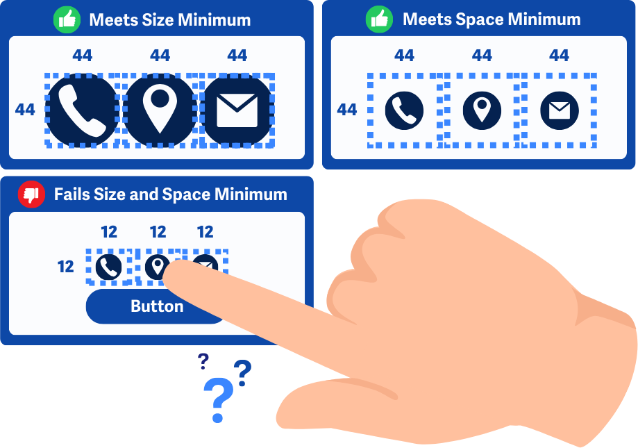
Targets for touch or mouse must be at least 44×44px, unless they are part of a sentence or block of text, near another target with the same function that meets the size, or in a context where size can’t be increased.
What is it?
Buttons, links, and other interactive elements must be at least 44 x 44 pixels. If that’s not possible, they should have enough empty space around them to make clicking easier.
Even if the visible part of an element is smaller than 44 x 44 pixels, it can still pass if the total clickable area around it (including padding) is at least 44 x 44 pixels. This ensures that users can still easily tap or click the element without hitting something else.
Comparing 2.5.8 Target Size (Minimum)
WCAG 2.5.8 Target Size (Minimum) is very similar to this success criterion, with the key difference being the target size requirements.
- 2.5.8 Minimum: 24 x 24 pixels, lenient Level AA
- 2.5.5 Enhanced: 44 x 44 pixels, stricter Level AAA
The numbering of WCAG success criteria doesn't always follow a logical order of complexity because the numbers are assigned based on when the criteria was introduced or revised. So, even though 2.5.5 is an enhanced criterion compared to 2.5.8, its lower number reflects when it was introduced.
Why does it matter?
Tiny buttons and links are frustrating to click or tap, especially on touchscreens like phones and tablets. When they’re placed too close together, it’s even more likely that you'll accidentally tap the wrong one.
People with limited hand control, like those with tremors, arthritis, or other mobility challenges, may struggle to click or tap small buttons. If elements are too close together, they could tap or click the wrong one or not be able to use it at all.
This rule applies to anything activated by a pointer, like a mouse, touchscreen, or stylus - not just fingers.
Who is affected?
People with mobility impairments, such as hand tremors or conditions affecting fine motor skills, can find it challenging to select targets that are too small, especially if they’re placed close to other elements.
People using smaller screens, such as tablets or mobile devices, will also find smaller targets challenging to use. When tapping with a finger, the space selected is not exact, potentially selecting unwanted elements. This is especially true for people with large fingers.
People in unstable or shaking environments, like moving vehicles, will struggle to select elements that are too small.
How to implement 2.5.5
About This Section
This section offers a simplified explanation and examples to help you get started. For complete guidance, always refer to the official WCAG documentation.
Enhanced Size and Spacing
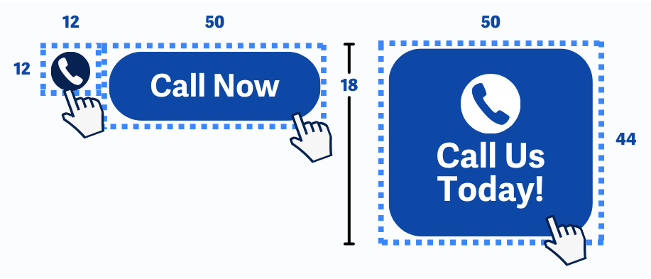
Make all buttons, links, and interactive elements at least 44 x 44 pixels. If that’s not possible, add extra space around them so they’re easier to tap.
To make sure buttons meet the size requirement, you can adjust CSS settings. Use the min-height and min-width CSS properties to set the minimum size. Or, add padding to help give them a total size of 44 x 44 with the extra spacing in between.
Equivalent Action Element
If a smaller target performs the same action as a larger, compliant target elsewhere on the page, it's allowed as an exception. However, at least one redundant control must meet the 44 x 44 pixel minimum.
Exception for Inline Elements
Links that appear within blocks of text, such as inline links in a paragraph, are exempt from the 44 x 44 pixel requirement. This exception exists because the size of inline text and how it wraps will vary based on screen size and zoom.
However, for standalone inline links or icons the rule still applies.

Exception for Essentials
Lastly, if it’s absolutely necessary or legally required for the target size and spacing to be smaller than 44 x 44 pixels, this rule can be skipped.
Conclusion
Bigger buttons and links aren’t just for people with disabilities–they make websites easier for everyone. Keeping buttons and links at least 44 x 44 pixels (or giving them enough space) helps users of all devices, making your website more user-friendly for all.