4.1.3 Status Messages
Status updates (like “form sent” or “5 items in cart”) must be coded using proper roles (like role="status" or role="alert"), be detectable by assistive technologies, and not require moving focus.
What is it?
Custom-coded elements should make their status messages—like success confirmation, progress updates, and error messages—known to users with assistive technologies. This should be achieved without needing to shift focus or interact with the page.
A status message is a notification that provides important information to users without changing focus. This includes messages like:
- Success messages, “Form submitted successfully”
- Error messages, “Invalid email address”
- Progress updates, “Uploading, 50% complete”
- Notifications about the application state, “Shopping cart updated: 3 items”
Unlike pop-ups that force users to interact before continuing, status messages should be smoothly announced without changing where the user is on the page. Assistive technologies should be able to detect and read them without requiring additional actions from the user.
Why does it matter?
Assistive technology may not notice or be aware of status messages or notifications unless they’re properly coded into custom elements. If the status messages are not communicated programmatically, users may not realize when actions are completed, when errors occur, or how they are progressing through a process.
For example, if a form shows an error message but it’s not announced to screen reader users, they might not know why the form won’t submit, leaving them frustrated and stuck.
Who is affected?
People who are blind or have low vision depend on assistive technology like screen readers to interact with the web. When custom elements do not support status messages, these users can miss crucial announcements about successes, errors, and progress updates.
How to implement 4.1.3
About This Section
This section offers a simplified explanation and examples to help you get started. For complete guidance, always refer to the official WCAG documentation.
ARIA Roles for Status Messages
Since screen readers don’t automatically detect changes in content, we need to use ARIA to ensure status messages are recognized and read aloud. The ARIA role attributes help by telling assistive technology what kind of message it is (success, error, progress, etc.). Using the correct role attribute value for each type of status message ensures that updates are properly conveyed without disrupting the user’s experience.
Below are some common roles and their use cases:
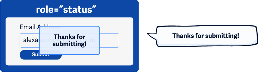
role=”status” for Success Messages
Use role=”status” for general updates that inform users without interrupting them. Its implicit aria-live value is polite, and its aria-atomic value is true, so it should automatically be fully announced without needing to add additional ARIA attributes.
This role attribute should be used when a successful submission is completed. Make sure the success message clearly informs users about what has happened.
<div role="status">Congrats! Your form has been successfully submitted.</div>
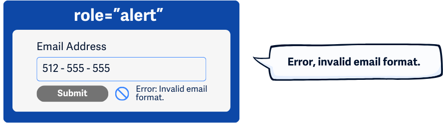
role=”alert” for Warning and Error Messages
Use role=”alert” for important warnings or errors that need immediate attention. This role ensures users are immediately notified when something goes wrong, so they don’t miss important issues like missing required fields or incorrect formats. This includes:
- Identifying required fields that weren’t completed
- Notifying users when they entered a field value that was not permitted or used the wrong format
- Providing correction text for inputs or spelling checks
<div role="alert">Error: Password must be at least 8 characters.</div>
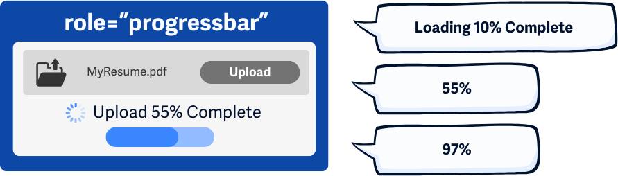
role=”progressbar” for Continuous Progress Messages
Use this role to indicate ongoing processes, like loading indicators or installation progress. This role attribute also has an implicit aria-live value of polite and an aria-atomic value of false, so the message will be announced when the user is idle and only shares the text that changes.
For example, if a file is uploading, a progress bar might say “Uploading 50%” and keep updating as the upload continues. This helps screen reader users understand how far along the process is.
<div role="progressbar" aria-valuenow="50" aria-valuemin="0" aria-valuemax="100">50% complete</div>
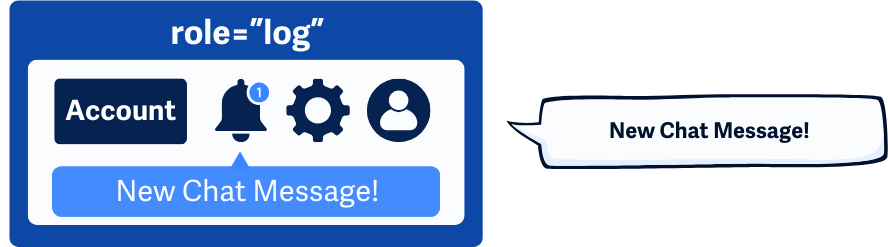
role=”log” for Sequential Progress Messages
Use this role for sequential updates, like chat messages or real-time events. Similarly to role=”progressbar”, this role also has an implicit aria-live value of polite and an aria-atomic value of false, so the message will be announced when the user is idle and only shares the text that changes within the element.
<div role="log" aria-live="polite">New message received.</div>
ARIA for Announcements
Use the aria-live and aria-atomic attributes when a status message updates to make sure assistive technologies recognize and announce the change:
aria-live="polite"for non-urgent updates that should be read when the user is idle.aria-live="assertive"for critical messages that should be announced immediately.aria-atomic="true"to make sure the whole message is read, not just the updated part.
<div aria-live="polite" aria-atomic="true">Your file has been uploaded.</div>
Some ARIA roles already have default settings for how updates are announced, but these defaults may not work in every browser or on every device. To ensure consistency, it’s best to explicitly set these attributes in your code.
Handle Form Errors
For validation errors, provide clear, programmatically accessible messages that use role="alert" for immediate error notifications. Make sure each field’s error message is linked using aria-describedby according to WCAG 3.3.1 Error Identification standards.
<input type="email" id="email" aria-describedby="emailError">
    <div id="emailError" <strong> role="alert" </strong> >Invalid email format.</div>
Without role=”alert” or aria-describedby, a user filling out a form might submit it and have no idea that an error occurred. They would be left wondering why nothing is happening.
aria-errormessage attribute
The aria-errormessage attribute is a new addition to ARIA and is intended to replace aria-describedby for error messages. However, browser support for aria-errormessage is currently limited, so aria-describedby remains the recommended approach for now.
Conclusion
Properly coded status messages ensure users stay informed about changes without unnecessary interruptions. Using ARIA roles and attributes helps make web interactions more accessible for everyone, improving usability and making the web easier to use for people relying on screen readers and other assistive technologies.