1.3.6 Identify Purpose
The purpose of regions and common elements must be defined in the code using semantic HTML or ARIA attributes, so that; assistive technologies can communicate their meaning, and; browsers can adapt or simplify the interface (e.g. hide non-essential content).
What is it?
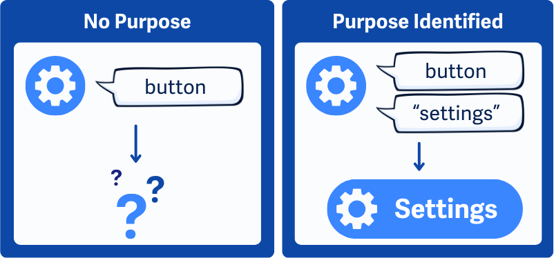
This guideline is all about giving extra meaning to buttons, icons, and page sections in a way that assistive technology can understand. You're not just telling the browser"This is a button." You're also saying what the button is for. For example, "This is a settings button." That way, assistive tech can:
- Show a familiar icon instead of something confusing
- Use a simplified label
- Let users hide parts of the page they don't need
The goal is to make it easier for people to personalize their experience, especially if they rely on tools that simplify content.
Quick Comparison: WCAG 1.3.6 Identify Purpose is closely related to a couple of other success criteria:
- 1.3.1 Info and Relationships ensures structure and relationships are clear
- 4.1.2 Name, Role, Value covers how components work with assistive technology
1.3.6, meanwhile, goes further. It defines why a component exists, helping users customize how things appear or behave.
Why does it matter?
If the purpose of a button, link, or icon isn’t clear, people may not know what it does, especially people with cognitive disabilities who rely on familiar layouts and symbols.
Without this extra information in the code, assistive technology can’t offer personalized options like:
- Replacing confusing icons with simpler ones
- Hiding non-essential content to reduce clutter
- Highlighting important actions
When components are clearly labeled in the code, people can adjust what they see to fit how they think and navigate.
Who is affected?
Some users depend more on icons than words. Others need a cleaner layout to focus or reduce overwhelm. Assistive tools can help, but only if the code clearly identifies what each element is for.
When that purpose is coded properly, tools can do things like simplify the page, show custom icons, or reduce distractions, making the experience more usable and less stressful.
How to implement 1.3.6
About This Section
This section offers a simplified explanation and examples to help you get started. For complete guidance, always refer to the official WCAG documentation.
Markup Elements to Clearly State The Purpose
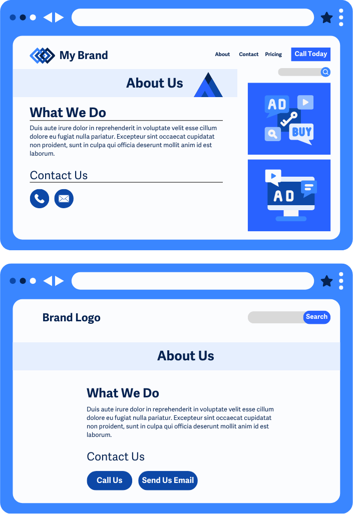
Instead of just labeling something a "button," let assistive technology know what it does, like "Next step" or "Open help."
Semantic HTML
Always use proper HTML tags. They carry meaning that tools can work with:
<button>for actions<a>for links<form>,<input>,<label>for forms<nav>,<main>,<footer>for page structure
Purpose-Driven Labels
Make your labels descriptive. Think of what someone might need to know if they can't see the page.
<button>Next Step</button>
<a href="/help">Visit Help Center</a>
Purpose-Driven alt Attribute on Icons
When using icons for links or buttons, don't describe the icon. Describe what it does.
<a href="/settings">
    <img src="gear-icon.svg" alt="Settings">
    </a>
A gear icon shouldn't say "gear", it should say "Settings".
ARIA Landmarks
Use ARIA roles to label sections of the page so users can skip over, hide, or focus on them.
<nav role="navigation">...</nav>
<main role="main">...</main>
<aside role="complementary">...</aside>
This helps assistive tools highlight or ignore areas based on user preferences.
Best Practices to Identify the Purpose of Elements
Some attributes are great add-ons for accessibility, but they aren't enough on their own to meet this guideline.
aria-invalid and aria-required For Form Fields
These attributes help users understand the state of a form field:
aria-requiredtells assistive technology that the form field must be filled outaria-invalidtells users that the field has an error
They're useful for feedback, but not a full solution for identifying purpose.
Microdata Markup
Microdata (like Schema.org) adds extra meaning behind the scenes, but assistive technology doesn't often use it to understand UI elements yet.
Still, it may become more useful in the future, especially for personalization tools as the web evolves.
Conclusion
WCAG 1.3.6 is about going beyond structure - it's about purpose. By coding what your buttons, icons, and sections are for, you help assistive tools adapt the interface and experience to each users' needs. That makes the web more personal, more usable, and way more inclusive, especially for people who benefit from a simplified experience that works just the way they need it to.