What is it?
WCAG 1.4.11 focuses on ensuring that visual elements, such as icons, graphs, and form elements, meet a minimum 3:1 contrast ratio against their surrounding background or adjacent elements. This criterion ties hand-in-hand with 1.4.3 Contrast (Minimum), which focuses on contrast for text.
WCAG 1.4.11 states that:
- Informational images need to portray enough contrast
- Elements that receive focus need to offer sufficient contrast for focus and hover states
- Icons should be perceivable
- Boundaries must be established between elements that communicate information, like the slices in a pie chart
- Text that appears over an image must have sufficient contrast with any part of the image it covers
1.4.11 also introduces a new challenge for links that appear in text, such as links that appear mid-paragraph in an article. While 1.4.3 requires that the link color have sufficient contrast with the background color, 1.4.11 also requires that links have sufficient contrast with the surrounding text if there is no other indication that the text is a link. For example, if you have elected to remove underlines from your links and to identify them by color alone, the link color must meet at least a 4.5:1 contrast ratio with the background color while at the same time meeting a 3:1 contrast ratio with the surrounding text. This can be so challenging that the conventional advice for links in text is to just use underlines for those links.
Why does it matter?
Sufficient contrast helps individuals with color blindness, low vision, or vision impairment perceive and distinguish non-text content from its surrounding background. Insufficient contrast can lead to eyestrain and fatigue, making it challenging to understand the information being presented. Shapes, symbols, form elements, and images are more distinguishable, which leads to a better understanding of the content. Identifying visual cues, icons, buttons, and form elements is essential for navigating and interacting with a website.
Imagine ending up in a situation where you are trying to fill out a form, but you have absolutely no idea where the form fields even are. This can, quite frankly, be frustrating and ruin the user experience overall. It’s also important to provide some clues as to how the interactive element or control works. For example, the small arrow on a select element or dropdown list helps communicate to users how that interactive element works and what to expect. If you can’t see the arrow, it would be difficult to understand that it will open up a list of options that you can choose from, and you may completely gloss over it.
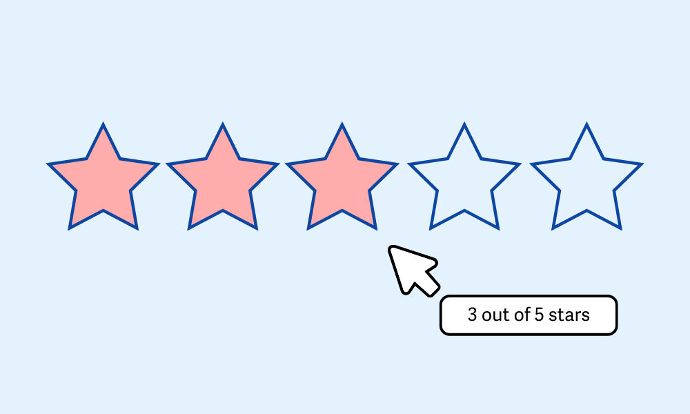
Let’s take a look at an example where we are presented with a star rating for a film we’re considering seeing.


This might not seem too bad…initially. However, for anyone with a visual impairment, it would be difficult to discern how many stars are actually filled. The color of the stars matches too closely with the stars that are not filled, which makes it confusing to understand.
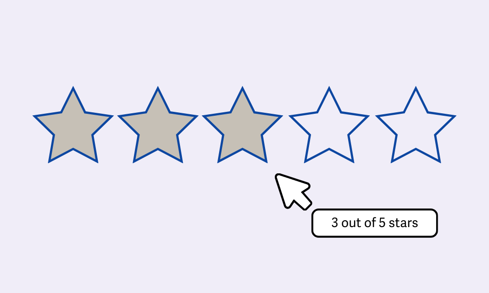
Such a situation can be easily rectified by ensuring the fill color of the star has a more dramatic contrast that meets the 3:1 minimum and ensuring the border also meets this in the grand scheme of things. A text alternative, though not required by 1.4.11, would also be helpful for meeting the requirements of WCAG 1.1.1.
WCAG 1.4.11 seeks to ensure that users with visual impairments will be able to read and identify elements without difficulty or eye strain. This guideline will ensure that users can access and discern the information presented on the page.
Who is affected?
Elements and controls with poor contrast can affect just about everyone, but it is in particular an issue for those with vision impairments. Limited vision is a condition that reduces and hinders a person’s ability to see details, colors, and contrast. If elements and the surrounding background have low contrast, it becomes so much harder to distinguish and understand the content.
For people with color blindness, low-contrast elements can also cause issues. Color blindness is a condition in which a person has difficulty distinguishing between certain colors, such as red and green. If the element and surrounding background are too similar, someone with color blindness may completely miss the information being conveyed.


Elements and controls that offer poor contrast can make it tedious for everyone to understand. Eye strain, headaches, and focus and concentration can all result from low contrast. By ensuring that there is a good contrast between non-text elements and controls on the page, web designers and developers can create awesome websites that are accessible for everyone to use and enjoy.
How to implement 1.4.11
About This Section
This section offers a simplified explanation and examples to help you get started. For complete guidance, always refer to the official WCAG documentation.
Use a Visible Focus Indicator
Often times, the default focus indicator in browsers is a thin, dotted black line. This can be quite difficult to see for most users when the element already has an outline or when the focusable element is inside a table cell - or even on dark backgrounds!
To address this, elements that receive focus should offer sufficient contrast from the background. This will allow users to distinguish these from other normal elements.
So, for example, when the focus ends up on a link located on a very dark background, the link could instead be outlined with a very bright color that is several pixels wide to set it apart.
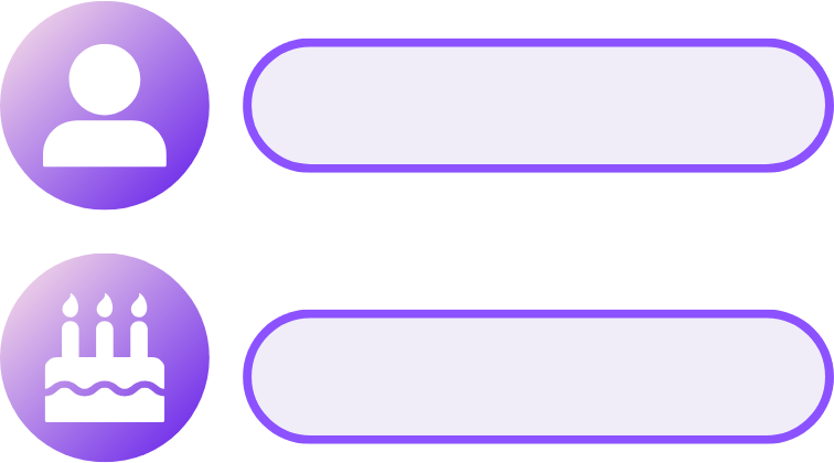
Specify Contrast Ratio for Icons
Icons are not exempt from meeting the criteria if they are required to understand the content. All graphical icons must provide enough contrast for users to discern. This includes icons being used on solid or even gradient backgrounds.
Let’s take a look at the example below. The icons are all quite fancy, but most importantly, the icon still contrasts with the background quite nicely. One tip would be to take the darkest color of the icon and ensure that the icon contrasts enough with it. Alternatively, if the icon was white, you would want to take the lightest part of the gradient and ensure that colors contrast enough.
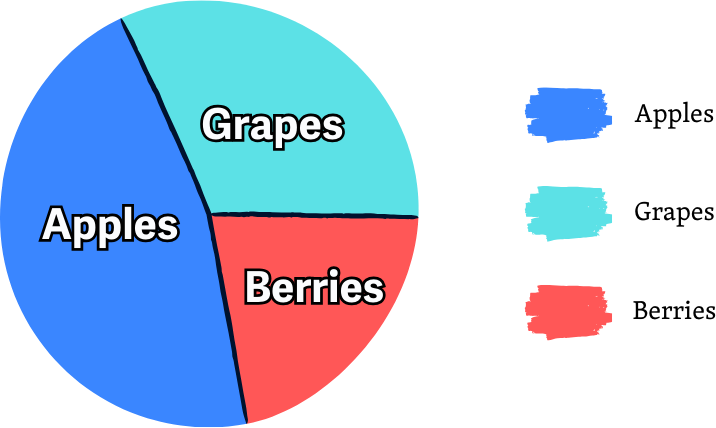
Do allow sufficient contrast for Boundaries
Pie charts are deliciously awesome to include in pages, but they are not so appealing when the slices are hard to tell apart. Ensuring that boundaries between adjoining colors offer sufficient contrast will aid greatly in being able to distinguish the information being presented.
Several ways to go about this are to ensure the slices offer enough alternating light and dark colors. If that doesn’t suit your fancy, borders can be utilized between the segments - but they still need to meet the required contrast of 3:1.

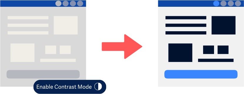
Provide a control with a sufficient contrast ratio
As a last resort, if a portion of the site is not designed to meet the necessary contrast level, you can provide a control that will let the user switch to a contrast-friendly version of the page. This way, all elements will conform to the required contrast level for users to easily read and distinguish.

Conclusion
Meeting the 1.4.11 criterion for controls and elements on the page will ensure that your non-text content is accessible for all users, allowing everyone to perceive and understand the information being communicated and to successfully use any interactive elements on your pages.