2.5.3 Label in Name
The visible text of a button, link, or form field must also be part of its accessible (programmatic) name.
What is it?
Any control or component that uses text labels must also use the same name programmatically in the code. The programmatic name is also called the “accessible name” of the component since this is what assistive technology uses to execute speech input.
This consistency means that people who rely on assistive technologies can learn about the controls and components on the page by hearing the visible labels and later using the matching names to interact with them.
The goal of this success criterion is to make sure the visual label of controls and components can be used as a way to trigger speech activation by making sure they match their programmatic or accessible name.
Common inputs that need to meet this criteria are:
- Buttons
- Form fields
- Links
- Search fields
- HTML input elements
- Custom input components that use
aria-labeloraria-labelledby
Why does it matter?
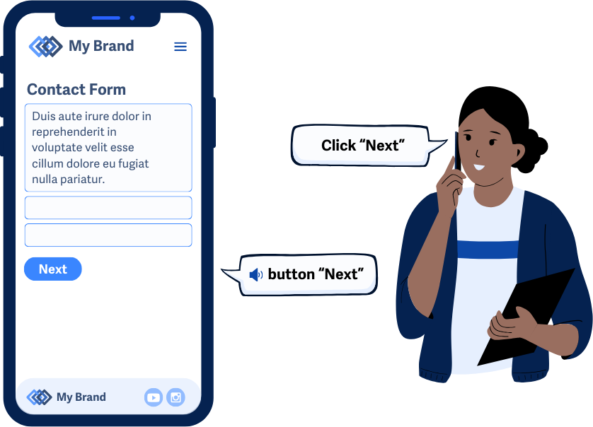
Consistency between visible labels and programmatic names improves the user experience for speech recognition users. This allows them to navigate by speaking the visible text they see on the screen. For instance, saying "Click Submit" works only if the visible label and the programmatic name are both “Submit”.
Screen reader users also benefit because what they hear matches what is visually present, reducing confusion and helping them navigate smoothly. When the visible labels don’t match the accessible name, then users can find themselves unable to activate specific controls or may move their focus to a different control.
This uniformity also helps users with cognitive disabilities by making the visible labels clear and making it easy to understand what they are doing. By making sure the text matches the programmatic name, we can put a bit more thought into the labels and make sure that they’re intuitive and explain the interaction.
Who is affected?
People with limited mobility who use speech recognition rely on the consistency of accessible names to navigate and interact with web elements on the page. By speaking the visible text they see on the screen, they can interact with controls and components without using a mouse or keyboard.
People who are blind and use text-to-speech technologies benefit from consistent labeling because it ensures that what they hear from screen readers matches the visual content, reducing confusion and improving navigation. Otherwise, they may end up in situations where the functionality of certain controls is unclear.
People with cognitive disabilities benefit from this uniformity as it minimizes the cognitive load required to understand and interact with webpage elements, making their online experience more intuitive and less mentally taxing.
How to implement 2.5.3
About This Section
This section offers a simplified explanation and examples to help you get started. For complete guidance, always refer to the official WCAG documentation.
Match or Include Label with Accessible Name
Matching a visible label to the accessible name is often done by following WCAG 1.3.1 Information and Relationships and using the correct semantic practices. Many elements get their accessible names by properly nesting them or using specific attributes. It’s best to use native elements and semantics to set the accessible name, as this ensures it exactly matches the visible label.
For every control or input component, check that the accessible name contained within the code or semantics matches the label adjacent to it. Alternatively, the accessible name just needs to contain the exact visible label text somewhere in the string.
aria-label and aria-labelledby
Elements can have their accessible name calculation overridden using aria-label or aria-labelledby, which take precedence over visible text labels. However, these should be used carefully to ensure the accessible name matches the visible label when needed.
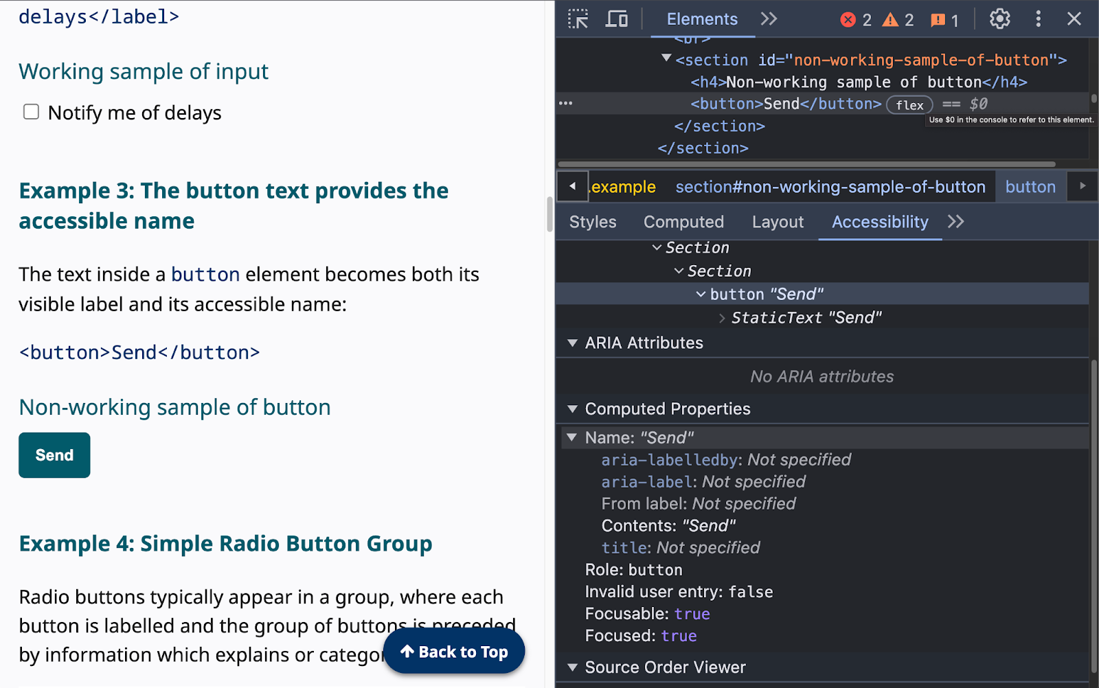
In this example, the button element’s default accessible name, “Send Message,” is overridden with the aria-label attribute to be “Click Me”.
<button aria-label="Click me">Send Message</button>
Finding the Accessible Name
An easy way to double-check this technique is to use the browser’s built-in accessibility tools. In Chrome, for example, inspecting an element and using the computed accessibility properties helps you determine the accessible name.
Accessible Name Computation
An element’s accessible name can come from a variety of sources, but there is a hierarchy, and some sources can take precedence over others. Here’s the computational sequence:
- Use
aria-labeloraria-labelledbyattribute - Use the associated
<label>element; in some cases, you may have to use the subtree’s labels - Use specific attributes for:
- General inputs:
Use thetitleattribute; if not, use the placeholder value - Button inputs:
Use thevalueattribute; if not, use the implementation-defined string - Image input and images:
Use thealtattribute; if not, use the implementation-defined string or the title attribute - Area elements:
Use thealtattribute - Iframe elements:
Use thetitleattribute - Table elements:
Use thetitleattribute - Section and grouping elements:
Use thetitleattribute - Text elements such as
<p>etc:
Use thetitleattribute
- General inputs:
- Implementation-defined strings: If the previous steps do not yield a usable text string, use an implementation-defined string (e.g., a localized string for "submit").
- No accessible name: If none of the above steps yield a usable text string, there is no accessible name.
See the full accessible name computation sequences in detail.
Position Labels Adjacent to Controls
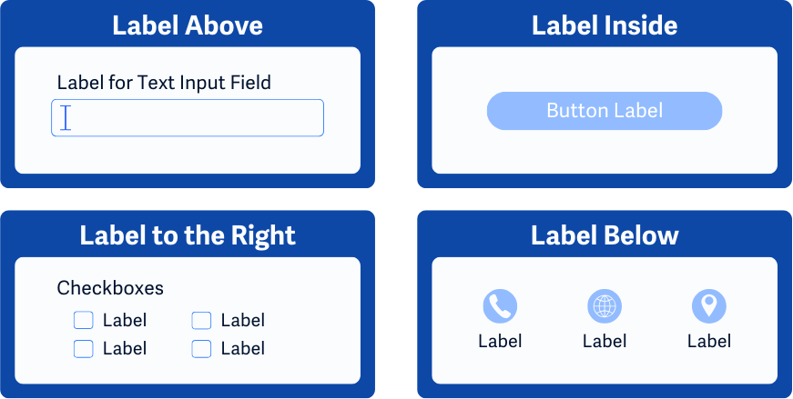
Conventionally, the visible label for controls or components is an adjacent text string. Most components inherently use these position standards as long as no CSS or scripting adjusts them. Check each control and input component on the page and make sure that their matching label is adjacent and appears intuitively.
Depending on the component you’re working with, the positions can be as follows:
- To the left or above combo-boxes, dropdown lists, text inputs
- To the right of checkboxes and radio buttons
- Inside of buttons and tabs
- Below icons serving as buttons
Conclusion
Implementing WCAG 2.5.3 by aligning visible labels with their programmatic names greatly enhances usability for users who rely on speech recognition or text-to-speech technologies. By making sure that the label names match the programmatic name we can make sure that controls and components on web pages can easily be interacted with. And, this practice also makes the page more intuitive and clear to understand for everyone since we can be more thoughtful on what we name each component and control.