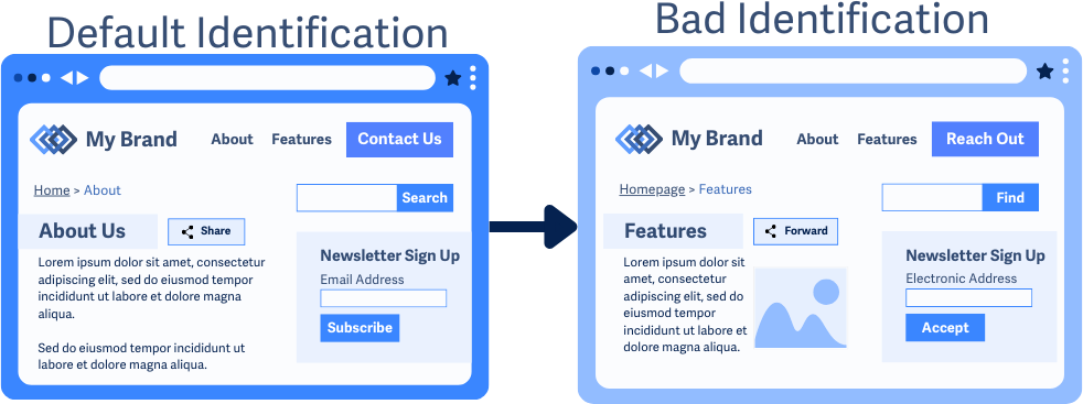
3.2.4 Consistent Identification
Elements with the same function must look, behave, and be labeled the same way across pages.
What is it?
Imagine browsing an online store where every button that adds something to your cart has a different name. Sometimes it’s “Add to Cart”, other times, it’s “Add to Bag”, and yet, other times, it’s “Buy This Now”. That would be confusing, right?
This success criterion ensures that interactive elements like buttons, links, and form controls, are labeled consistently across a website. If something performs the same action on multiple pages, it should always be identified the same way. That way, it’s easy to predict what they do.
This success criterion is closely tied to WCAG 1.1.1 Non-text content, which ensures that elements have text alternatives, and WCAG 4.1.2 Name, Role, Value, which ensures that assistive technology can properly identify and interact with elements. However, WCAG 3.2.4 focuses only on keeping labels, names, and text alternatives consistent for elements that do the same thing across different pages.
Interactive content or components that are commonly duplicated across web pages include:
- Buttons: Submit, Add to Cart, Share on Socials, Play/Pause Media, etc.
- Icons: Print, Save, Download, Trash, etc.
- Pagination: Go to Page 3, Previous Page, etc.
- Call-to-Action Links: Learn More, Sign Up, Get Started, etc.
- Breadcrumbs
- Tabs and Accordions
- Form Labels
Why does it matter?
When interactive elements change names across pages, it can be confusing, especially for people who rely on assistive technology, screen magnifiers, or cognitive recognition patterns.
For example, let’s say a user finds an “Add to Cart” button on a hat product page. When shopping for a T-shirt, they would expect the button to say “Add to Cart” again. But if it says “Buy Now” or “Add to Shopping Bag” instead, they might have to stop and figure out whether it does the same thing.
This inconsistency slows people down and makes websites harder to use, especially for:
- People using screen readers who rely on consistent names to find elements quickly
- People with cognitive disabilities, language barriers, or literacy challenges who may struggle to recognize new terms
- People using screen magnifiers who rely on pattern recognition and memory to navigate efficiently
Who is affected?
People with low or limited vision can rely on screen magnifiers and depend on recognizable patterns across pages.
People with cognitive disabilities or language or literacy barriers may find it challenging to remember or process new terms, and if buttons and links change names, it can be frustrating and confusing.
People who are blind are likely to rely on screen readers to interact with websites. If a button says “Add to Cart” on one page but “Buy Now” on another, they have to figure out if it does the same thing causing unnecessary work.
People who rely on assistive technology depend on clear, predictable names to move through a site. Changing labels or text alternatives can slow them down and make tasks harder than they need to be.
How to implement 3.2.4
About This Section
This section offers a simplified explanation and examples to help you get started. For complete guidance, always refer to the official WCAG documentation.
Keep Labels and Names Consistent Across Pages
If a button, link, or icon does the same thing on multiple pages, it should always be identified the same way.
Labels need to be consistent but not necessarily identical. Small variations are okay if they maintain clarity. For example, pagination buttons might read “Go to page 2”, “Go to page 3”, etc., instead of just "Next Page". The exact wording changes but maintains a predictable pattern.
Examples of inconsistent labels and names across pages would be:
- “Contact Us” button -> “Reach Out” button
- “Home” breadcrumb link -> “Homepage” breadcrumb link
- “Share” button -> “Forward” button
- “Search” button -> “Find” button
- “Email Address” field label -> “Electronic Address” field label
- “Subscribe” button -> “Accept” button

Conclusion
Consistency reduces confusion and makes navigation easier for everyone. When interactive elements are labeled the same way across a website, people can rely on familiar terms to navigate quickly and efficiently without unnecessary guesswork.

