What is it?
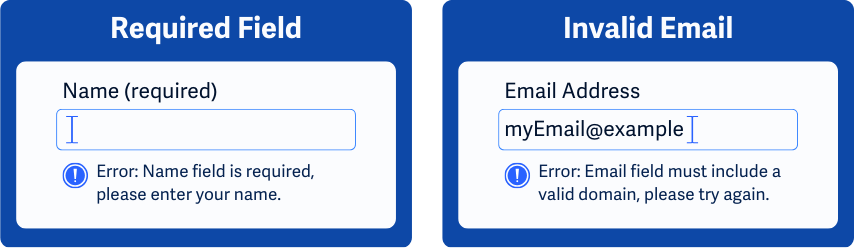
If a user makes a mistake while filling out a web form, any errors they have made need to be clearly identifiable. The error message should point out exactly what went wrong and how to fix it.
Error identification applies to both required fields that have been left empty and also to invalid data - the form needs to communicate which form field has the error and describe what's wrong in written text. Which in turn helps users find and fix their mistakes.
The goal of this success criterion is to help users easily identify errors in their input and understand how to resolve those errors.
Why does it matter?
When error identification for form fields isn’t handled properly, users can get frustrated and may abandon the form or website. Screen reader users might not realize there’s an error, colorblind folks may miss colored error cues, and users with cognitive disabilities can have difficulty understanding what went wrong.
Poor error handling can also lead to incorrect data being submitted by users or users repeatedly making the same mistakes, which makes the resolution process more tedious.
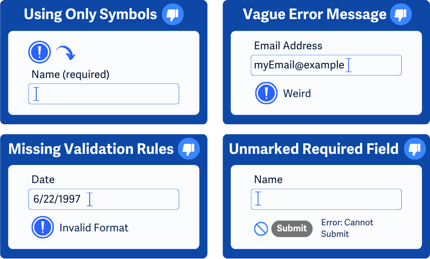
Improper error handling includes:
- Using only symbols or colors to denote errors
- Not indicating which field has an error
- Not indicating that the form has errors that prevent submission
- Not clearly indicating with text which fields are required for submission
- Lack of written validation rules for inputs (For example, “Error: the USA zip code field must include only 5 numerical digits”)
Who is affected?
People with limited vision, such as color blindness, may find it difficult to catch color cues used in error handling. Error messages that purely rely on color to signify issues can make it challenging for users with color blindness to identify them.
People who use screen readers to access web pages may not be able to pinpoint errors and understand where they’re coming from without clear error messages and information on which field is throwing the error.
People with cognitive disabilities require clear instructions on the error message and how to fix the issue. Otherwise, they may get stuck trying to figure out issues with their form.
How to implement 3.3.1
About This Section
This section offers a simplified explanation and examples to help you get started. For complete guidance, always refer to the official WCAG documentation.
Textual Error Handling
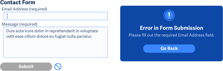
Users must be informed of any issues in the form, and the error message needs to identify which field has the issue using clear written text while retaining the data that has been filled in.
Additionally, adding an error notification near the page title helps screen reader users know there’s an issue before they try to navigate to another page. It can also be helpful if a script positions the keyboard to focus on the first field where an error occurred.
The textual error can be displayed in many different ways after the user tries to submit the form or continue to the next page in the form, including:
- Showing an alert box
- Displaying an error message near the problematic field
- Or list all the fields with errors together
Not Completing Required Fields
The user must be notified of any missed required or mandatory fields in a form and the error message needs to identify which field was missed using clear written text.
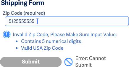
Invalid Input
The user must be informed of any instructions on how to resolve the invalid input, and the information must be easily understood. Some examples of helpful error messages relating to invalid inputs:
- If the input must match a set of allowed values, the error message should include the allowed options
- Describe what the correct data and formatting should look like
- Show similar correct values and explain how to enter them
Some common fields that use input validation are date, email address, phone, or address fields.
Error Navigation
To help users quickly find and correct input errors, error messages can also include links to the problematic fields. This way users don’t have to search for the errors or the fields and instead can skip directly to the field they need to fix.
Clear Feedback for Successful Submission
Lastly, providing clear feedback for successful form submissions gives users confirmation that they don’t have to search through the form or the page for errors. By showing clear and consistent feedback, users can quickly understand that their action was completed, saving them the time and effort of verifying manually.
ARIA to Highlight and Notify
aria-invalid attribute
While it's ideal to link error messages directly to fields, sometimes design or technical limitations make this difficult to accomplish. Setting aria-invalid to true for invalid fields helps assistive technology notify users about errors and direct users to the fields that need attention.
This attribute should only be set to true after a validation check, if the attribute is set to false or missing then assistive technologies won’t indicate an error.
When using aria-invalid, make sure that only the fields with errors have this attribute set to true and that the associated labels or instructions for each field clearly explain the error.
role = 'alertdialog'
Additionally, using role='alertdialog' creates a notification for users when an input error occurs. The alert dialog should be dynamically added to the DOM when needed, not included in the static HTML. And this modal dialog should have:
- An accessible name with
aria-labeloraria-labelledby. - A description with
aria-describedby. - At least one focusable control, with the focus moving to it when the dialog opens.
- Tab order limited to within the dialog while it's open.
- Focus returns to its original position when the dialog is closed.
aria-live attribute
The aria-live attribute notifies assistive technologies of new error messages in a live region, which are then automatically read out without needing user focus.
Conclusion
Clearly identifying errors with text descriptions helps all users understand what went wrong and how to fix it. This approach minimizes frustration and ensures that users, regardless of their capacity or device, can successfully complete forms. Providing clear feedback for both errors and successful submissions makes the web more inclusive, helping users quickly resolve issues and confirm their actions without unnecessary hassle.