What is it?
When users make an error in a form, simply telling them something is wrong isn’t enough—we need to guide them toward fixing it. Error messages should include helpful suggestions to correct the issue.
This applies to both missing required fields and invalid inputs. Instead of displaying a vague message like “Error: This field is incorrect,” the message should explain why the input is incorrect and how to fix it.
The goal of this success criterion is to prevent users from feeling stuck when they encounter an error. Users should always know what steps to take to resolve the issue. However, it’s important to note that this criterion only requires suggestions for fixing an error—it does not cover identifying errors. That responsibility falls under WCAG 3.3.1 Error Identification.
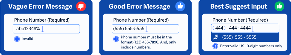
Going off of the image above:
- In the first example, the error message says “Invalid”. This is too vague and does not help users understand or fix the issue.
- In the second example, we have a good error message that gives users clear feedback on how to fix the phone field, “Phone number must be in the format (123) 456 - 7890. And, only include numbers.”
- The last example is the best option since it includes a helpful error description and offers a helpful suggestion that the user can select to auto-fill. A drop-down menu is shown with a phone number—presumably, one that they previously entered.
Why does it matter?
Without helpful error suggestions, users may become frustrated and abandon the form. People with cognitive disabilities may struggle to figure out what went wrong, while screen reader users may have difficulty understanding how to correct errors. Users with mobility impairments may also find it challenging to navigate back and forth to fix mistakes.
Poor error handling can lead to:
- Users repeatedly make the same mistake
- Incorrect data being submitted
- Users abandoning the form due to confusion or frustration
For example, an error message stating “Error: Invalid input” leaves users wondering: What’s invalid? How should I fix it? What format is required? A vague error message can make completing the form difficult or impossible.
Who is affected?
People with cognitive disabilities may struggle to understand generic error messages and need clear instructions to correct their inputs.
People with low vision or who are blind who rely on screen readers need explicit descriptions of errors and suggestions.
People with mobility impairments may find it difficult to navigate back and forth through a form. Clear, actionable error messages help them correct mistakes with fewer steps.
How to implement 3.3.3
About This Section
This section offers a simplified explanation and examples to help you get started. For complete guidance, always refer to the official WCAG documentation.
Give Helpful Suggestions
Error messages should describe the issue and suggest correct inputs whenever possible. This can include automatically suggesting spelling corrections and narrowing down options based on previous user input.
For example, if a user enters their zip code during an online food order, the system should suggest the nearest restaurant location for their order.
Or, if a user misspells their city name, such as “Chicargoo,” the field could suggest “Chicago” instead.
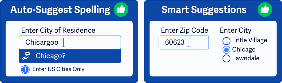
Within the image above:
- One example offers a spelling correction when the user accidentally enters “Chicargoo,” instead of “Chicago”.
- The second example uses a previously entered Zip Code input to offer smart suggestions for selecting the City. Instead of having the user enter the City name, the form automatically suggests a set of narrowed-down options.
Give Clear Error Descriptions
Users need to understand why their input is incorrect and how to fix it. Some examples of helpful error messages relating to invalid inputs:
- If the input must match specific allowed values, the error message should list those options to help users enter the correct information
- If a specific format is required, provide examples of the correct format
- Suggest alternatives or corrections when possible
Some common fields that use input validation are date, email address, phone, or address fields.
Use ARIA to Help Give Suggestions or Descriptions
For users who rely on assistive technology, ARIA (Accessible Rich Internet Applications) can help communicate errors effectively.
Use role='alertdialog' to notify users when an input error occurs. The alert should:
- Be dynamically added to the DOM when needed (not included in the static HTML).
- Have an accessible name using
aria-labeloraria-labelledby. - Include a description with
aria-describedby. - Contain at least one focusable control (such as a ‘Close’ button), with keyboard focus automatically moving to it when the dialog opens.
- Confine the tab order within the dialog while it's open.
- Return focus to the original position when the dialog closes.
Additionally, the alert should include helpful suggestions or clear error descriptions so that users relying on assistive technology can take the next steps to fix their input.
Implement Error Navigation
To improve usability, error messages should include direct links to the problematic fields. This allows users to quickly find and correct their mistakes without having to search the entire form.
Provide Clear Feedback for Successful Submission
Once users submit a form successfully, they should receive clear confirmation. This helps them understand that their action was completed and reassures them that no further corrections are needed.
Conclusion
Error messages shouldn’t just point out mistakes—they should help users fix them. Providing clear, actionable suggestions reduces frustration, helps users complete forms efficiently, and ensures a more inclusive experience for everyone.