4.1.2 Name, Role, Value
Interactive elements must have a clear name (what it is), the correct role (what it does), and any current value or state, so that assistive technologies can interpret and interact with them correctly.
What is it?
Custom-coded elements or components need to be compatible, understandable, and interactive for people who use assistive technology. This just means custom components should have the right names, roles, states, and values built into the code so they’re usable for people with assistive devices.
This helps users stay informed about changes and control elements properly. Standard HTML elements usually handle this fine, but custom components need a bit more attention to be accessible.
Custom components are more common than you would think though, for example expandable sections like accordions or tabs, popup dialogs or tooltips, sliders, progress bars, etc. are all custom elements.
For clarity:
- Name: How assistive tech recognizes a component
- Role: What the element does (e.g., button, checkbox, editable text)
- Value: The initial value of an interactive element, which can also serve as the Name if none is provided
- State: The current status of an element (e.g., checked/unchecked, on/off, selected)
Why does it matter?
Without special consideration of custom-coded components, users who rely on assistive technology may not be able to understand or interact with these elements.
This could lead to a variety of issues, such as the user:
- Not knowing that the component is on the page
- Not knowing how to activate or use the element
- Being unable to activate or use the element because it was built to work with a mouse only
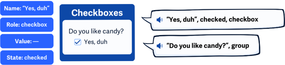
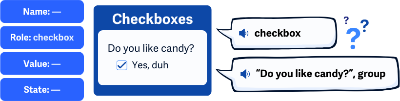
- Not knowing the value or state of the element - is a checkbox checked or not?
As a result, this can make navigating a page difficult or create barriers around certain functionality. For example, a custom checkbox whose current state isn’t programmatically determined would make it difficult for screen readers to communicate whether it’s checked or unchecked, which could lead to confusion, especially if that particular checkbox is required for form submission.
Who is affected?
People with limited vision or who are blind rely on assistive technology such as screen magnifiers, screen readers, or speech recognition software to interact with web pages.
People with limited mobility, such as RSI (repetitive strain injury), can find custom components difficult to interact with and control since they require precise movements. They rely on assistive devices that can accurately identify and interact with custom components for them.
People who do not use a standard computer mouse may not be able to operate custom interactive components. Alternate assistive devices need to be able to change a component's state and values, too.
How to implement 4.1.2
About This Section
This section offers a simplified explanation and examples to help you get started. For complete guidance, always refer to the official WCAG documentation.
Using Standard Components
The simplest way to meet this criterion is to use standard HTML elements and components. Assistive technology is already able to find their name, role, states, and values if they’re used properly.
When you follow the rules and use HTML the right way, tools like screen readers and other assistive technologies can interpret and display the content correctly. To do this, you need to:
- Use only HTML features that are officially supported, avoiding custom or non-standard features.
- Use elements and attributes in the way they're intended, not just for visual effects.
- Structure your HTML code correctly so browsers and assistive tools can process it.
Using Markup Features
If you’re working with standard components but missing names, roles, states, or values, check out some of the techniques below.
HTML Elements and Attributes for Forms and Links
Certain standard HTML attributes are a must when using <form> and <a> elements. These give users a better sense of how to interact with them by adding details like role, name, state, and value.
With each <form> and <a> element, make sure the name, value, and state attributes are set up according to the HTML element specifications.
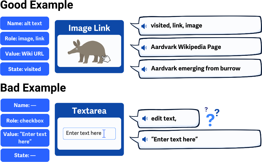
For example, when using an <a> element, ensure it has a Name and Value. You might use the alt and href attributes like this:
<a alt="Aardvark Wikipedia Page" href=" <a href="https://en.wikipedia.org/wiki/Aardvark"> https://en.wikipedia.org/wiki/Aardvark </a> ">
<img alt="Aardvark emerging from burrow" src="aardvark.png">
</a>
And here’s an example of a badly written textarea element, it’s missing an accompanying label element and using a vague value of “Enter text here” in the element itself. As it’s written, this element doesn’t have a Name because of the lack of a label. And, while it does have a Value, users might get confused since it’s being used as placeholder text, and they would have to delete it first:
<textarea>Enter text here</textarea>
Labeling for Interactive Components
Make sure form input fields have a clear, always-visible <label> element that explains:
- What the field or component is for
- Any instructions for using it
- Formatting rules for data entry or an example
The input label should always be visible to help all users understand the purpose. Using placeholders that disappear as soon as the user begins typing in a field is not sufficient for labeling input fields.
<label for="date">Enter Your Birth Date (dd-mm-yyyy), for example "22-06-1997"</label>
<input type="text" name="date" id="date" />
Using <title> Element with <iframe>
When using iframes, make sure their origin page includes a <title> element so users know what the <iframe> contains. The <title> element should be added to the embedded HTML page’s head section. That way, each <iframe> is labeled, and the user can choose which frame to enter or skip.
For example, here’s what the origin page should look like, of course, just overly simplified:
<head>
    <title>Advertisement</title>
</head>
<body>
    <h1>Here's my advertisement</h1>
</body>
And, you can create the iframe for this page elsewhere, and users will know the Name of this element through the origin page’s title element.
<iframe src="banner-ad.html" name="ad-iframe"></iframe>
ARIA Attributes for Names, Roles, and States
Note that ARIA is usually a backup method for accessibility, not the first choice. It’s best used alongside the main techniques listed above.
aria-labelledby attribute
The aria-labelledby attribute helps name and identify form controls and groups of elements.
In this case, the text <input> field does not have content that can be used as the name, so we use aria-labelledby so that assistive devices can reference the element with ID, “searchbtn”, to look for that element’s name, which is “Search”.
<input type="text" aria-labelledby="searchbtn">
    <input id="searchbtn" type="submit" value="Search">
aria-label attribute
The aria-label attribute is used to give an accessible name to interactive elements when there’s no visible label—maybe because of a design choice or because the visual context makes it clear what the element does. When using aria-label, make sure it accurately describes what the element does.
In this example, an aria-label is used here on an "X" button in a pop-up so assistive devices can tell users it closes the pop-up:
<div id="box">
    This is a pop-up box.
    <button aria-label="Close">X</button>
</div>
role attribute
The role attribute defines what an element does, and it follows specific values from the WAI-ARIA guidelines . These roles help users understand how to interact with custom elements, so pick a role that clearly matches what the element does.
Here’s an example where the role is "navigation" since the <div> contains links to help users move around the site:
<nav role="navigation" aria-label="Main Menu">
    <ul>
        <li><a href="#about">About</a></li>
        <li><a href="#services">Services</a></li>
        <li><a href="#contact">Contact</a></li>
    </ul>
</nav>
state and property attributes
When you use the role attribute, make sure to check the ARIA state and property attributes. These help users understand the current status of custom elements and get updates when things change.
You’ll need to review the ARIA role guidelines because certain roles have a set of required or supported states and properties . Make sure the required states are included and updated as the element changes.
For example, the checkbox role needs the aria-checked state to let users know if it’s checked or not. This state should update whenever the checkbox is clicked.
<div role="checkbox" <strong> aria-checked="false" </strong> id="customCheckbox" onclick="toggleCheck()" aria-labelledby="checkboxLabel">
<span id="checkboxLabel">Subscribe to newsletter</span>
</div>
<script>
    function toggleCheck() {
    const checkbox = document.getElementById('customCheckbox');
    const isChecked = checkbox.getAttribute('aria-checked') === 'true';
    checkbox.setAttribute('aria-checked', !isChecked);
    }
</script>
Conclusion
Making custom components accessible by correctly coding their names, roles, states, and values is key for users who rely on assistive technology. Standard HTML elements are usually fine, but custom ones need extra care. By using proper attributes or including ARIA, you can make sure all users, regardless of their abilities, can effectively navigate and interact with your website.