What is it?
Imagine giving instructions to people on how to find the right button to push on a panel full of buttons. If you say "press the green button," people with vision impairment or color blindness would not be able to locate the button. If you say "press the round button" people who cannot perceive or understand shapes would not be able to locate the button. If you cause the button to make a sound and tell people to locate the button by the sound, people with hearing impairments would not be able to locate the button.
Often when we are pointing people at certain content on a webpage we use sensory characteristics to describe how to find that information. We might say things like "follow the instructions in the right column" or "press the orange button to continue".
Sensory characteristics include things like shape, size, visual location, orientation, and sound. To follow WCAG 1.3.3, we need to ensure that we include multiple sensory characteristics when describing where and how to locate other content.
For example, rather than say "press the green button" we might say "press the round, green button that says 'continue'". By including multiple sensory characteristics along with the text of the button, we give people multiple ways to locate the button to which we are referring.
Why does it matter?
Not all users perceive information in the same way. When we rely on a single sensory characteristic like color or shape we leave out users who cannot process information through that particular sensory channel. By including multiple sensory characteristics, we ensure that our instructions are versatile enough to be understood by a wide and diverse audience.
Including multiple sensory characteristics also helps us to reduce ambiguity. If we say "click the round button" on the page that happens to have multiple round buttons, that can be confusing for any user. By including more specific information and multiple sensory characteristics, we make it more clear for everybody.
Let’s take a peek at what looks like a contractor form.
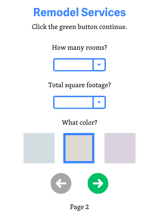
It looks pretty, but what is even going on here? Users who cannot perceive shape, color, size, or location won’t understand that there are additional steps to this form without any sort of cue. How troublesome it would be to even go through the process of hiring a contractor if they can’t even locate the next step and submit the form.
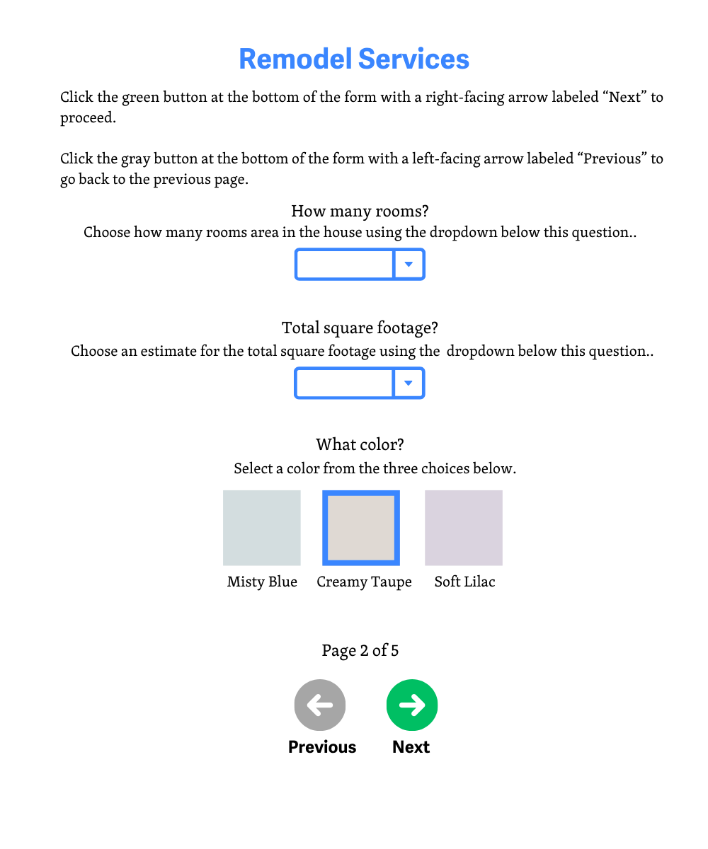
Now this is more like it. This addresses color, visual location, orientation, and even provides text for screen readers to convey the information to users who cannot perceive the information and rely on audio cues.
Who is affected?
Vision impairments and cognitive disabilities can make it difficult to see and perceive visual details such as color, shape, size, visual location, and orientation. Providing only one of these methods, without any way for assistive technology to detect and convey information via audio cues, makes it difficult for them to detect and comprehend information on the screen. For these users including text clues or text alternatives for the content being described can be very helpful.
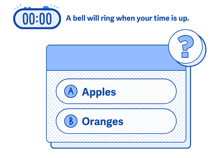
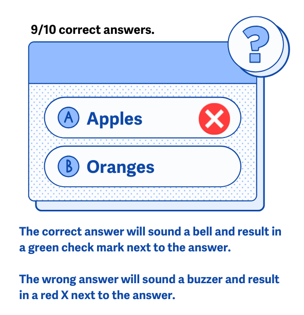
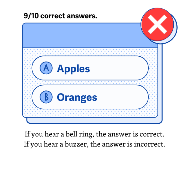
Similarly, hearing impairments make it difficult for users to understand and hear audio-only cues. For example, say they are enrolled in an online class and have to take a timed quiz. If the only cue that the quiz is done is just the sound of a bell, then that makes it difficult for them to hear whether or not they are over the time limit. In this case, providing a text alternative with the timer ticking down, and perhaps a message that appears to inform them of the time being met would be the best course of action here.
Content that doesn’t convey any additional sensory cues to communicate content can be a hindrance to users with low or limited vision, cognitive disabilities, and hearing impairment. Ensuring that there is an alternate form of sensory information they can rely on will provide them with a much more accessible experience.
How to implement 1.3.3
About This Section
This section offers a simplified explanation and examples to help you get started. For complete guidance, always refer to the official WCAG documentation.
Provide specific text the user can search for to help identify content
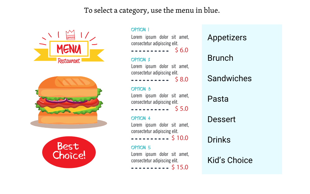
In addition to sensory characteristics like position, shape, and size, it can be helpful to refer to the specific text that appears on a button, in a link, or as a heading for a section of content. The text can be easily detected and described by screen readers and refreshable braille displays to ensure that everyone can find the content being referred to.
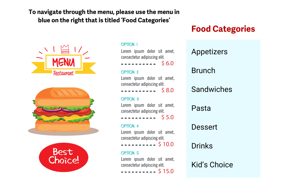
Here, we have an example of a menu that users can order online from.
Use a combination of sensory cues to convey information
Combining a variety of sensory cues to convey information to users is also beneficial. This way, you’re not just addressing a small audience, but covering a wide range of people who have visual impairments, cognitive disabilities, and hearing impairments. This is great for covering your bases to ensure that nobody is left out.
Conclusion
Meeting the 1.3.3 criterion for utilizing other sensory cues to convey information will ensure that your content is accessible to all users without frustrating and confusing them. Following these guidelines will allow everyone to perceive, understand, and focus on communicated information.