What is it?
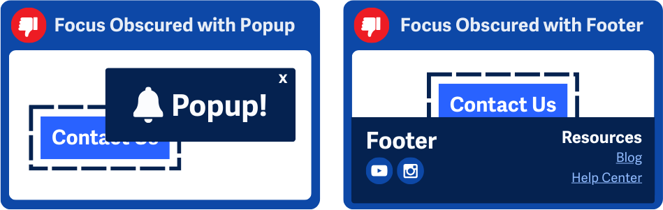
Any item receiving keyboard focus should always be fully visible on the user’s browser window. This guarantees that focused elements are hidden by other content like sticky headers, footers, or modals.
WCAG 2.4.11 Focus Not Obscured (Minimum)
WCAG 2.4.11 Focus Not Obscured (Minimum) allows focused elements to be at least partially visible. However, for this enhanced success criterion, focused elements must be fully visible to meet level AAA standards.
Why does it matter?
When focused elements are hidden or blocked from view, users relying on keyboards or assistive technology can't tell where their interaction is happening. This makes it harder to navigate and complete tasks, leading to frustration. Hidden elements can also make it seem like the system isn't responding—even though it is. If the user doesn't see a clear indicator of what's in focus, they may assume something's broken.
Who is affected?
People who navigate via keyboard or devices using keyboard-like input (e.g., voice control, sip-and-puff devices) need to see the focused element to understand their position on the page.
People with low vision who rely on magnified screens often see pages with reduced content. Ensuring that focused elements remain visible prevents them from being hidden or cropped.
People with cognitive disabilities need clear visual indicators of focus, which reduce confusion and help users stay oriented while navigating.
How to implement 2.4.12
About This Section
This section offers a simplified explanation and examples to help you get started. For complete guidance, always refer to the official WCAG documentation.
Test Focus Visibility
As users tab through a page, all focused elements should remain fully visible. Make sure other content, such as modals, banners, or dialogs, don't block focused elements.
- Design modal dialogs to take focus when they appear and prevent interaction with underlying content. This prevents hidden interactive elements behind the modal from taking focus.
- Ensure notifications like cookie banners are dismissible, preventing them from obscuring focusable elements.
- Check content magnified up to 200%, according to WCAG 1.4.4 Resize Text (Level AA), to ensure the resized layout doesn’t hide interactive elements.
- Use the
:focus-visiblepseudo-class to style focus indicators clearly without distracting mouse users.
Focused elements must be fully visible to meet the enhanced level AAA standard. Even if the focus is partially obstructed, this would be a failure in this success criterion.
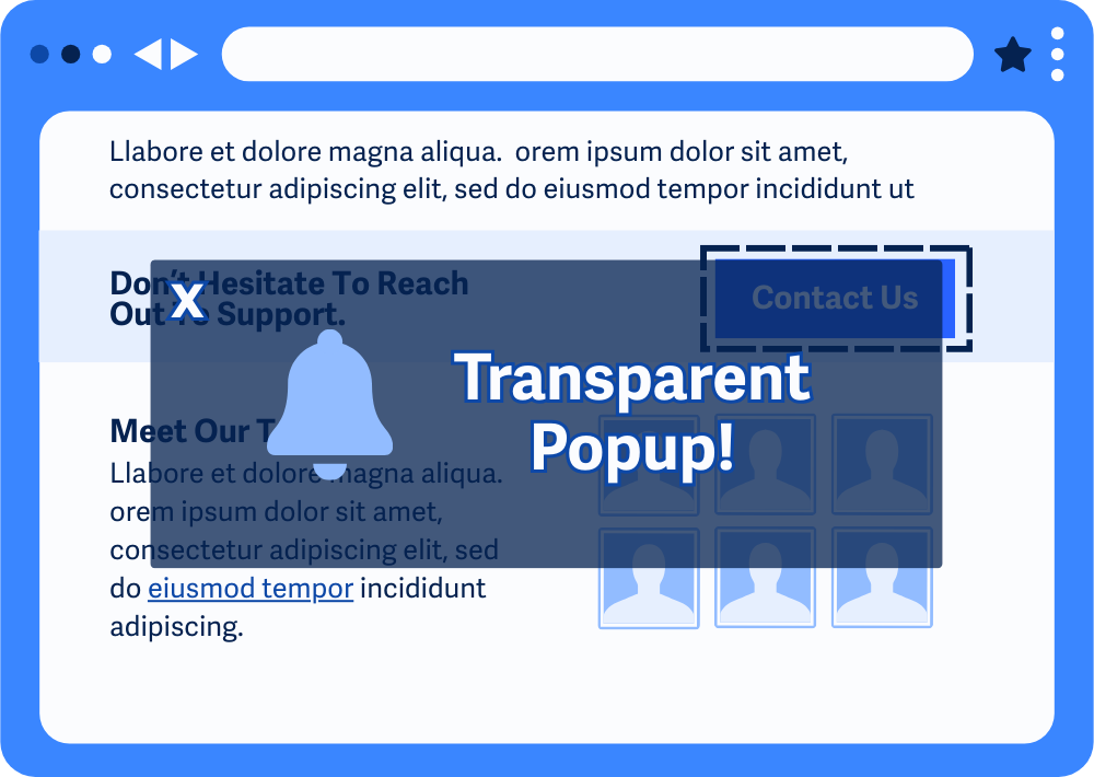
Transparent Elements
While transparent, or see-through, elements don't entirely hide the focused item, they may affect the visibility of focus indicators, potentially violating WCAG 1.4.11 Non-text Contrast and WCAG 2.4.13 Focus Appearance.
It's important to make sure that the focused element is always clearly visible and accessible, so that people can still clearly see which element is in focus.
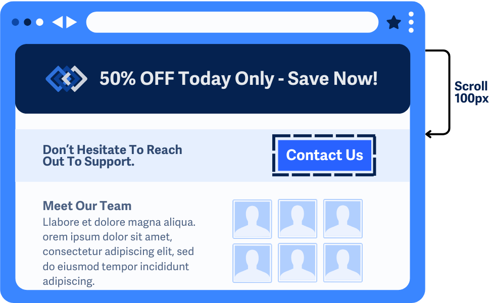
Scroll Padding with CSS
The scroll-padding property in CSS helps ensure focused elements remain visible when navigating a page. This property sets space around the scrollable area to prevent elements from being obscured by fixed components like sticky headers or footers.
In this example, the scroll-padding-top and scroll-padding-bottom values adjust the page layout to ensure interactive elements, like form fields or buttons, are visible when focused.
html {
scroll-padding-top: 100px; /* Space for a sticky header */
scroll-padding-bottom: 50px; /* Space for a sticky footer */
}
As a bonus, the scroll-behavior property helps create smooth scrolling transitions, so the sudden shift isn’t too harsh.
/* Example usage for smooth keyboard navigation */
body {
scroll-behavior: smooth;
}
Auto Scrolling with JavaScript
Most modern browsers automatically scroll focused elements into view, so additional scripting is usually not necessary. However, in some cases—such as with custom components, overlays, or long forms—default browser behavior may not work as expected. For these scenarios, you can use JavaScript to ensure focused elements remain visible.
Conclusion
Making sure focused elements are fully visible is a simple way to make interfaces more accessible and user-friendly. Following WCAG 2.4.12 Focus Not Obscured (Enhanced) helps remove barriers for keyboard users, people with low vision, and anyone with cognitive challenges. Using tools like scroll-padding in CSS and some JavaScript tweaks, you can create smoother, easier navigation.