What is it?
Users must have access to help when completing tasks that might be confusing or prone to mistakes. The goal is to provide context-sensitive help, which is help that appears right where and when the user needs it, connected to the specific input or task.
This guideline typically applies to forms or processes where what's required input isn’t obvious or must follow a particular format. It ensures that users aren't left guessing. Help might come in the form of:
- A link next to a confusing question
- A short explanation beside a complex set of fields
- Formatting hints or examples
Importantly, not every field needs help—but you are required to provide help when labels or instructions alone aren’t enough for the user to understand what to do.
You need to include help when:
- The input uses an uncommon format
- The field could be interpretd in more than one way
- The stakes of the task are high (legal forms, tax filings, job applications, etc)
- You've received user feedback or observed confusion during usability testing
Comparing WCAG 3.3.2 Labels or Instructions
WCAG 3.3.2 Labels or Instructions (Level A) ensures that every input has a clear label or instruction.
WCAG 3.3.5 Help (Level AAA) builds on this by requiring addition, optional guidance during comples tasks when labels and instructions alone aren't enough.
Why does it matter?
Not everyone fills out forms the same way. Some people might stumble on an unfamiliar question or get stuck on formatting rules, like how to write a date or enter a phone number. For users with cognitive disabilities, memory challenges, or reading difficulties, this uncertainty can be a significant barrier.
Providing help directly in the context where it’s needed keeps users from getting frustrated, abandoning the task, or entering incorrect info. It gives them the confidence to complete their tasks independently and successfully.
For example, a job application might include questions that are unclear to a first-time applicant. A small help link or note beside each field can provide clarity without disrupting the form-filling flow.
Who is affected?
People with cognitive disabilities may struggle to process unclear instructions or complex forms, making it harder for them to complete tasks without mistakes or frustration.
People who are less comfortable using digital tools may feel overwhelmed or uncertain without extra guidance and help.
Making help available benefits all users, but especially those who are most at risk of getting stuck or making mistakes.
How to implement 3.3.5
About This Section
This section offers a simplified explanation and examples to help you get started. For complete guidance, always refer to the official WCAG documentation.
Context-Sensitive Help Where It’s Needed
Offer relevant help next to form fields or components where users might need additional guidance. This can include:
-
A “Help” or “?” icon linked to supporting text
-
A brief explanation next to the input field or at the start of the form
-
A tooltip or expandable section
-
A built-in assistant, avatar, or wizard
- Formatting hints or concrete examples
Make sure the help content is easy to understand, is available on the same page, and is clearly associated with the relevant task.
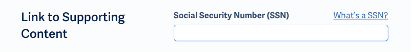
Add Help Links
It's a good practice to include at least one help link per form page that's relevant to the overall task. For especially tricky fields, you can add individual help links beside inputs.
Best practices:
- Place help links directly before or after the input field.
- Use
<label>to wrap the help link and the input to help screen reader users hear the help text as part of the field label. - Set external help links to open in a new tab or window to avoid losing data already entered.
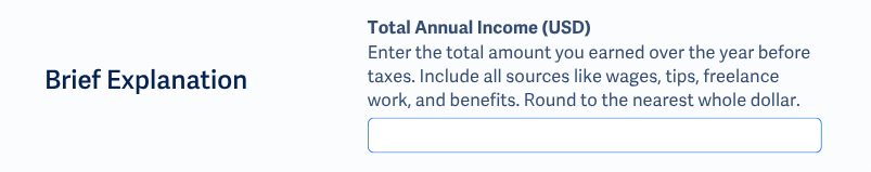
Include Brief Explanations
Some forms include sets of fields that follow the same rules. Adding a brief instruction block can prevent misunderstandings.
For example, this explanation can be included next to a set of fields for collecting the issued and expiration dates for a license:
“Need help? Use the date format mm/dd/yyyy. For example: 05/10/2025. You can usually find the issued and expiration dates printed on the front of your license. If your license doesn’t have an expiration date, leave that field blank."
Or, text can be included at the beginning of the form to set expectations for complex areas:
"Before you begin: Some sections of this form may ask for details like identification numbers, date ranges, or supporting documents. We’ll provide examples and tips along the way to help you enter the correct information. If you’re unsure about a field, look for the help icon next to it."
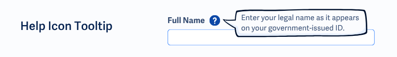
Help Tooltips or Expandable Sections
Help can also be provided through tooltips or expandable sections placed next to form fields or controls. These allow users to access additional guidance without cluttering the page.
- Tooltips show short hints when users hover over or focus on an icon, such as a question mark.
- Expandable sections, like a "More info" link, display longer explanations when clicked.
Just make sure tooltips and expandable sections are accessible to screen readers and keyboard users. They should be focusable, dismissible, and remain visible long enough to be read.
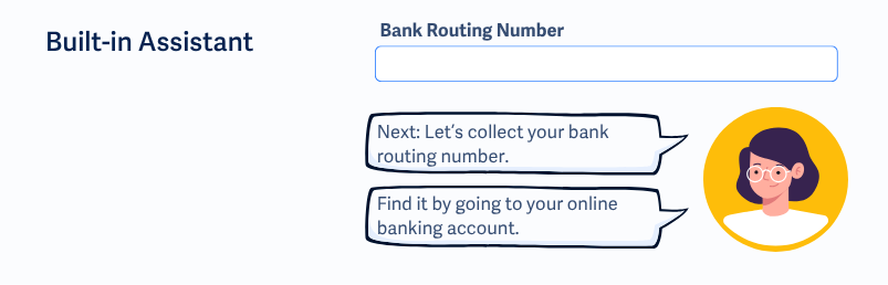
Built-in Assistant or Avatar
An assistant or avatar can be programmed to help the user through a form. It should support the ability to play, pause, rewind, etc., and must meet all relevant accessibility requirements for multimedia, such as captions or text alternatives.
For example, a tax form portal might include an avatar that explains how to fill out each section of the form, with a text transcript available below the video for users who prefer to read.
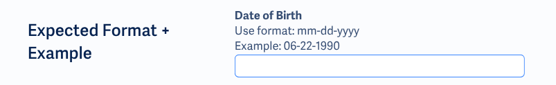
Show Users the Right Format and Examples
Avoid leaving users to guess what format is required. If a field requires a specific format, like a particular date structure or number pattern, make that clear right next to the input by describing it or showing a quick example.
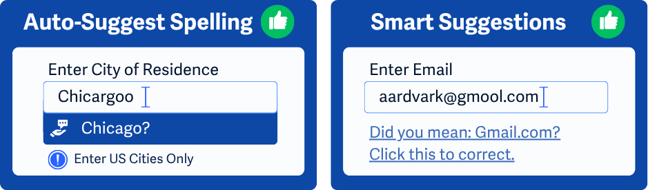
Spell Checking and Word Suggestions
Spell-check and suggestions support users who may have difficulty with typing, spelling, or memory.
This type of help can be offered in a few different ways:
-
A search field shows a “Did you mean: [corrected word]” message when the user submits a misspelled term.
-
A city input field offers a dropdown of suggested cities as the user types, with the closest match listed first.
-
A comments box highlights misspelled words and allows the user to right-click to choose from suggested corrections.
-
If a typo is detected, an email input field auto-suggests domain names like “gmail.com” or “outlook.com”.
Remember to Test the Help Itself
It's not enough to add help content. You also have to ensure that it works for everyone.
- Can screen readers reach it?
- Can it be opened, read, and closed with the keyboard?
- Does it stay open long enough to be read?
- Is the help content written in clear, simple language?
Conclusion
WCAG 3.3.5 Help is about supporting users when labels and instructions alone aren’t enough. By offering context-sensitive help that is easy to access, clearly written, and right where it’s needed, you can reduce confusion, cut down on mistakes, and build a better experience for everyone.